![[Compaq]](../../images/compaq.gif)
![[Go to the documentation home page]](../../images/buttons/bn_site_home.gif)
![[How to order documentation]](../../images/buttons/bn_order_docs.gif)
![[Help on this site]](../../images/buttons/bn_site_help.gif)
![[How to contact us]](../../images/buttons/bn_comments.gif)
![[OpenVMS documentation]](../../images/ovmsdoc_sec_head.gif)
| Document revision date: 10 November 2000 | |
|
|
|
|
|
|
Order Number: AA--PGZ9B--TE
This document is a supplement to the OSF/Motif Style Guide. It does not repeat the OSF/Motif Style Guide, but rather provides additional information concerning the style of OSF/Motif user interfaces. This document also provides guidelines concerning widgets included in the DECwindows Motif Version 1.2 for OpenVMS product.
Revision/Update Information: This is a revised manual.
Operating System:
OpenVMS AXP Version 1.5
VMS Version 5.5--2
Software Version:
DECwindows Motif Version 1.2 for OpenVMS AXP
DECwindows Motif Version 1.2 for OpenVMS VAX
Digital Equipment Corporation
Maynard, Massachusetts
The information in this document is subject to change without notice and should not be construed as a commitment by Compaq Computer Corporation. Compaq Computer Corporation assumes no responsibility for any errors that may appear in this document.
The software described in this document is furnished under a license and may be used or copied only in accordance with the terms of such license.
No responsibility is assumed for the use or reliability of software on equipment that is not supplied by Compaq Computer Corporation or its affiliated companies.
Restricted Rights: Use, duplication, or disclosure by the U.S. Government is subject to restrictions as set forth in subparagraph (c)(1)(ii) of the Rights in Technical Data and Computer Software clause at DFARS 252.227-7013.
The following are trademarks of Compaq Computer Corporation: Alpha AXP, AXP, Bookreader, DEC, DECterm, DECwindows, DECwrite, Digital, LinkWorks, OpenVMS, VAX, VAX DOCUMENT, VMS, and the DIGITAL logo.
The following are third-party trademarks:
Motif and OSF/Motif are registered trademarks of the Open Software Foundation, Inc.
UNIX is a registered trademark licensed exclusively by X/Open Company Limited.
Windows is a trademark, and Windows NT, NT, and Microsoft are registered trademarks of Microsoft Corporation.
All other trademarks and registered trademarks are the property of their respective holders.
ZK5637
This document us available on CD-ROM.
This document was prepared using DECdocument, Version V3.3-1e.
| Contents | Index |
This manual provides supplemental information to all who have read the OSF/Motif Style Guide. It is designed specifically for programmers and interface designers who develop DECwindows Motif applications and who seek to present a uniform and usable software interface that is consistent with other DECwindows Motif applications.
It is also for technical communicators such as writers and editors who need to be conversant with the Motif user interface style.
The OSF/Motif Style Guide provides a general set of guidelines, while the DECwindows Companion to the OSF/Motif Style Guide provides more detailed explanations and more illustrations to help you create a consistent user interface for your application. These detailed explanations and illustrations are recommendations offered to further the consistency and usability of user interfaces. Failing to follow them will not jeopardize the compliance of your user interface to the OSF/Motif style; however, it may jeopardize consistency across applications.
The DECwindows Companion to the OSF/Motif Style Guide covers the following topics:
For additional information, refer to the following manuals:
The following conventions are used in this manual:
| mouse | The term mouse is used to refer to any pointing device, such as a mouse, a puck, or a stylus. |
|
MB1 (BSelect)
MB2 (BDrag) MB3 (BMenu) |
MB1 indicates the left mouse button, MB2 indicates the middle mouse button, and MB3 indicates the right mouse button. (The buttons can be redefined by the user.) |
| Ctrl+x | A sequence such as Ctrl+x indicates that you must hold down the key labeled Ctrl while you press another key or a pointing device button. |
| boldface text | Boldface text represents the introduction of a new term or the name of an argument, an attribute, or a reason. |
| numbers | Unless otherwise noted, all numbers in the text are assumed to be decimal. Nondecimal radixes---binary, octal, or hexadecimal---are explicitly indicated. |
| UPPERCASE TEXT | Although uppercase letters are used in discussions of accelerators and mnemonics (for example, Ctrl+E), they are not meant to indicate case sensitivity when included in applications. |
Your screen objects, dialog boxes, and primary windows may not always appear exactly the same as those in this book because the examples of user interface objects in this document are an artist's rendition, and because user interface objects appear differently depending on whether Motif is being displayed on a monochrome or color terminal and on the colors set for a color terminal. |
Dialog boxes display messages and solicit user input. This chapter provides guidelines for designing effective dialog boxes.
Have your application provide dialog boxes when the following conditions exist:
To design dialog boxes effectively, you must know how to do the following:
This chapter also discusses the following topics related to implementing dialog boxes:
A DECwindows application consists of one or more primary windows and their associated dialog boxes. Dialog boxes are also known as secondary windows. Under the Motif window manager, secondary windows have the following characteristics:
All dialog box characteristics are provided by the DECwindows Motif
toolkit; that is, you do not have to do any coding to have secondary
windows minimize and restore with their parents as long as the dialog
box is a subclass of the BulletinBoard or Form widget.
1.1.1 Types of Dialog Boxes
There are two types of dialog boxes: modeless and modal.
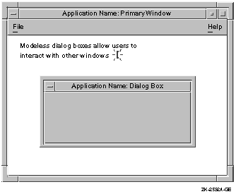
Modeless dialog boxes allow users to continue working in any of the application's windows. For example, Figure 1-1 shows an application in which users can type in a primary window even though a dialog box is displayed. Modeless dialog boxes allow users the most flexibility in structuring their work.
Make most of your application's dialog boxes modeless.
Figure 1-1 Modeless Dialog Boxes Allow Users to Work in Other Windows
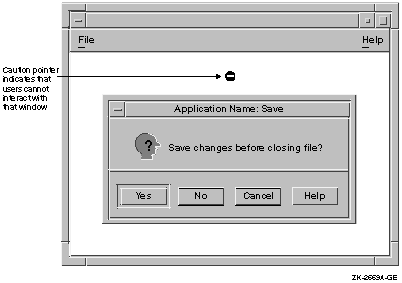
Modal dialog boxes prevent certain user interactions while the dialog box is displayed. You can make your dialog boxes either primary application modal or full application modal. Choosing which to use depends on the nature of your application and a given dialog box. An explanation of each dialog box follows:
Figure 1-2 Caution Pointer with a Modal Dialog Box
1.1.2 Placing Dialog Boxes
Once you have decided which of your dialog boxes to make modal and
which to make modeless, you must decide where to place them on the
screen and whether or not to nest them.
1.1.2.1 Placing a Single Dialog Box
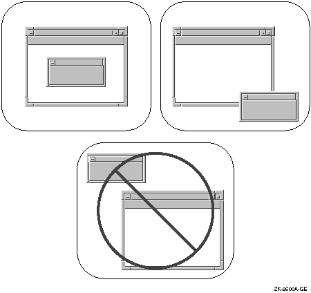
For dialog boxes that do not require users to see or use the information in the parent window, make the dialog box appear in the center of the primary window's work region, as shown in Figure 1-3. This location requires a minimum amount of mouse movement and a minimum shift of eye focus for users.
If, however, the dialog box does require users to be able to see or use the information in the parent window, place the dialog box to one side or below the parent window. The most appropriate location of the dialog box depends on the application.
Do not place dialog boxes in the upper left corner of the screen, that is, at 0,0, as shown in Figure 1-3. From the user's point of view, this placement is arbitrary and has little or no meaningful relationship to where they have placed the application's primary window.
Figure 1-3 Place Dialog Boxes Appropriately
The toolkit places dialog boxes in the center of the parent window if the window is an XmBulletinBoardDialog or an XmFormDialog. However, if the window is not a subclass of these widgets, the dialog box is placed in the upper left of the screen at 0,0. In such a case, you must set the x-coordinate and y-coordinate for the dialog box manually. |
When users move a dialog box, respect that placement whenever that box is used again. For example, if a dialog box appears in the center of the parent window by default, but users move it below the parent, the next time users call up that dialog box, have it display where they had last placed it; that is, below the primary window.
Save the dialog box placement with respect to its placement on the screen rather than its placement in relation to the parent. For example, if users move the parent window in the previous example from the center of the screen to the top right, and then call up the dialog box again, make the dialog box display where the user last placed it instead of just below the parent window.
To retain these settings, use XtUnmanageChild
to unmanage the dialog box when the user dismisses it. Then, when the
user performs an action that causes that dialog box to reappear, call
XtManageChild
to remap it. The dialog box placement and size will be the same as they
were before the dialog box was dismissed.
1.1.2.2 Nesting Multiple Dialog Boxes
When the amount of information is excessive for a single dialog box, create multiple dialog boxes. This method is called nesting. Organize nested dialog boxes by putting the necessary and common functions in the first dialog box, and the less common functions in subsequent boxes.
For the user's convenience, place the most important and most frequently used controls in the first dialog box. Involve users in the design of dialog boxes so you will know which controls they will use the most. Allow users to make basic choices in the first dialog box; do not require them to go to the secondary dialog box to finish basic operations. Also, make sure that the options available at any time are obvious to users.
If the dialog box contains more than five to seven optional actions in addition to activating a push button, consider nesting. An action can be filling in a text-entry control, choosing a radio button in a set of radio buttons, choosing one or more items in a list box, and so on. Limit the levels of dialog boxes to three.
Invoke the second (nested) dialog box from a clearly labeled push button on the primary box. If your dialog box invokes only one secondary dialog box, use a push button with an Options... label. See Figure 1-4.
Figure 1-4 Using an Options... Button to Indicate a Secondary Dialog Box
Use an ellipsis (...) to indicate that pushing the button invokes a dialog box. By convention, do not use an ellipsis with the Help push button.
You can have your application generate more than one secondary dialog box from one primary dialog box. If you do, however, clearly label the push buttons that invoke the dialogs. For example, you should label one Patterns... and give the other the Templates... label.
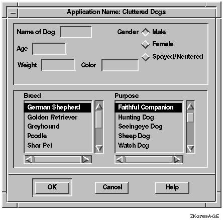
When you are deciding which controls to nest, design example dialog boxes and ask potential users what they think is the best arrangement, and which controls belong in the primary dialog box. For example, Figure 1-5 shows a dialog box that contains seven steps in addition to activating the push buttons. (Note that the three radio buttons for gender constitute one step.) It looks cluttered, and could intimidate users.
Figure 1-5 A Dialog Box with Too Many Steps
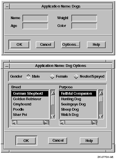
You can create a nested dialog box so that the primary dialog box contains only the steps that users perform frequently, and the secondary dialog box contains other, less frequently used steps. An example of the reorganized box is shown in Figure 1-6.
Figure 1-6 Nesting Used to Redesign a Dialog Box with Too Many Steps
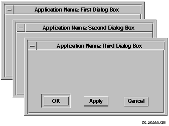
There are two techniques for placing nested dialog boxes:
Using both techniques together assumes that the nested dialog box is smaller than the primary dialog box. If it is not possible to make the nested box smaller than the first box, place the push buttons of the nested box as close as possible to the push buttons on the first box.
Figure 1-7 Nesting Dialog Boxes
Remember, if your secondary dialog box is not a subclass of an XmBulletinBoard, you need to specify the x-coordinate and y-coordinate of the dialog box. |
| Next | Contents | Index |
|
|
| privacy and legal statement | ||
| 5637PRO.HTML | ||