| Previous | Contents | Index |
The Help System passes in an integer, or status,
to indicate the status of the error processing operation, as follows:
| Value | Description |
|---|---|
| 1 | The Help System could not find the LinkWorks shareable image. |
| 2 | The Help System could not translate a specified value into a valid file specification. |
This chapter describes how to use the color mixing widget in an application. The chapter provides the following information:
In addition, the chapter describes how to modify the color mixing
widget to support various color models.
6.1 Overview of the Color Mixing Widget
The color mixing widget gives your DECwindows Motif applications a mechanism for querying end users for a color. For example, if your application includes a pie chart, you can use the color mixing widget to query users for the colors to be used in the pie chart. The color mixing widget gives users immediate feedback, displaying each new color as it is selected.
The color mixing widget lets a user choose from up to five different color models. It supports static color browsing, dynamic color interpolation (blending of hues), and standard color mixing. The different color models can be used separately or together. By default, the color mixing widget supports the color models described in Section 6.3. However, you can customize the color mixing widget to support other color models. (See Section 6.5.)
Although the color mixing widget supports a wide variety of color models, it communicates with your application in RGB (red, green, blue) values because, in the X Window System Version 11 colors are specified in terms of intensities of red, green, and blue. Intensity is expressed as a value of between 0 and 65535. As an application programmer, you need not care which color model the user uses to specify a color choice because the color mixing widget always translates that color into X11 RGB values.
The color mixing widget is intended for use by both novice and sophisticated color users. Novice color users do not need to understand color theory to generate their desired colors, while sophisticated color users can use their knowledge of RGB values or X11 named colors to choose colors.
The color mixing widget is designed to run optimally on an 8-plane color system that can display 256 colors simultaneously. However, the color mixing widget runs on all DECwindows supported configurations, including true color, grayscale, and monochrome systems. The color mixing widget automatically adjusts to the display, providing whatever color functionality the hardware can support.
DECwindows applications that use the color mixing widget include the
Session and Window Managers, DECpaint, DECwindows Mail, and the OpenVMS
DECburger demo application. You can run any of these applications to
become familiar with the function of the color mixing widget.
6.2 Color Mixing Widget Resources
The color mixing widget allocates up to 29 color cells to represent the colors in the various color models. It allocates the color cells in the following order:
The color mixing widget does not allocate any resources on your application's behalf. Your application is responsible for allocating the required system color resources to display colors. |
Color models are abstractions that enable unambiguous color specification. The color mixing widget supports the following color models:
Users of your application can use the color models independently to select a color. Users can also use any of the color models to select a color and then use the Color Picker model to smear (blend) the selected color into the color of choice.
The following sections describe the supported color models.
6.3.1 Color Picker Model
The Color Picker is the default color model for the color mixing widget on color systems. (Note that the Color Picker model does not display on noncolor systems or on systems with too few resources.) The Color Picker allows a user to pick a color from a static color spectrum (or another color model) and either use that color without change or use it to generate a new color. Users can also pick colors from the spectrum and smear them into each other to create their color of choice.
Users can select any color displayed by the Color Picker model as their color of choice.
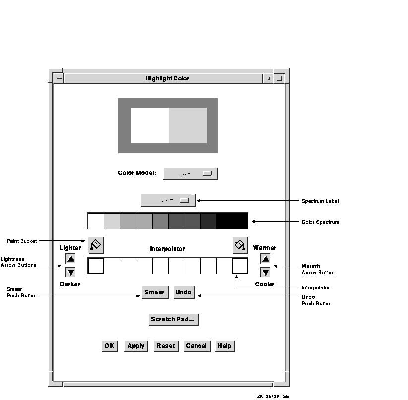
The Color Picker consists of a 10-color spectrum and its title, a color interpolator and its title, a smear button, an undo button, two paint bucket buttons, and arrow buttons to control the warmth and lightness of interpolator colors.
Figure 6-1 shows the components in a color mixing widget with the Color Picker model selected.
Figure 6-1 Components of the Color Mixing Widget (Color Picker Model)
The color spectrum is a static collection of colors. The spectrum pull-down menu allows the user to set the spectrum to one of four common color palettes:
These four color palettes allow users to select from a wide variety of
colors. The application can also add another palette, which becomes the
default palette accessible to the user through this menu. (The other
palettes still remain available.)
6.3.1.2 Selecting a Color Using the Color Picker Model
In the context of the color mixing widget, the term current selection refers to the color to be used as the new color, unless the user performs some action to modify that color or selects another color.
When a user clicks and releases MB1 on a spectrum tile or interpolator tile, that color becomes the current selection, and the tile becomes highlighted, identifying it as the selected color.
The user can use the selected color without modification or can perform one or more of the following actions:
Two paint buckets are used to load the interpolator with the color or colors to smear. First, the user clicks MB1 on a spectrum tile or interpolator tile. The color display widget displays the color of that tile. Clicking on a paint bucket then fills the interpolator end tile below it with the selected color. The user can fill both interpolator end tiles or one, in which case the color of the empty interpolator end tile defaults to white.
As an alternative to the paint buckets, the user can use an eyedropper to load the interpolator. Pressing and holding MB1 on a spectrum or interpolator tile, the original color tile, or the new color tile causes the pointer to become an eyedropper filled with the color of that tile. This eyedropper can then be moved to the interpolator and used to fill one of the two end tiles by releasing MB1. If the eyedropper is not positioned directly on one of the two end tiles, the closest end tile is filled with the eyedropper color.
When the interpolator end points are filled with the selected colors, activating the smear button causes a linear interpolation between these two colors. The results of this interpolation appear in the central interpolator tiles. The new colors generated by this process can then be selected, picked up with the eyedropper, smeared, and so forth.
The warmer, cooler, lighter, and darker buttons apply changes to each tile in the interpolator array. The warmer button adds red to the color of each tile, while the cooler button adds blue. The lighter and darker buttons modify the lightness component of each interpolator tile.
The undo button is used to undo the last interpolator action, which can
be a smear, the filling of an end tile, or the activation of one of the
warmth or lightness adjustment buttons.
6.3.2 HLS Color Model
In the HLS (hue, lightness, saturation) color model, a color is specified by three characteristics: hue, lightness, and saturation. Hue is color. Lightness describes the intensity of the color, that is, the amount of the color. Saturation describes the purity of the color or how much the color is diluted by white.
HLS expresses hue as a continuous spectrum of values arranged in a circular pattern. Red appears at 0 degrees (and again at 360 degrees), magenta is at 60 degrees, blue is at 120 degrees, cyan is at 180 degrees, green is at 240 degrees, and yellow is at 300 degrees. HLS expresses the lightness or intensity of a color as a percentage between 0 and 100 percent. One hundred percent lightness creates white light; zero percent lightness creates black.
To support the HLS color model, the color mixer subwidget contains three scales that represent the ranges of hue, lightness, and saturation. The hue scale presents color values as a range between 0 and 360. The lightness and saturation scales present their values as a range of percentages between 0 and 100.
Figure 6-2 shows the components in a color mixing widget with the HLS color model selected.
Figure 6-2 Components of the Color Mixing Widget (HLS Color Model)
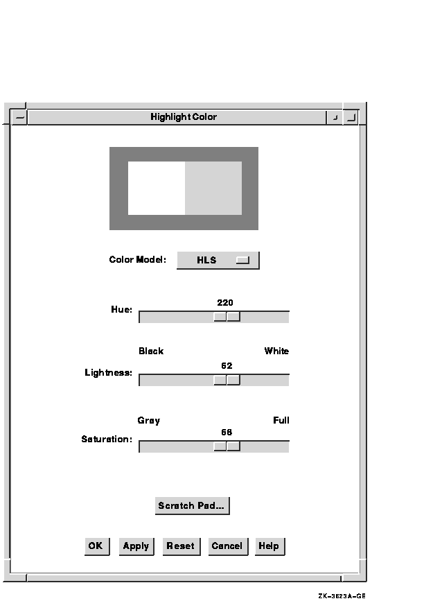
One oddity of the HLS color model is that full intensity colors are
specified at 50 percent lightness. HLS expresses the saturation or
purity of a color also as a percentage between 0 and 100 percent. One
hundred percent saturation is a pure color. A zero-saturated color is a
shade of gray, determined by the value of lightness.
6.3.3 RGB Color Model
The RGB color model is the default color model for the color mixing widget.
In the RGB color model, a color is specified as a mixture of different intensities of red, green, and blue. In the X Window System Version 11 (X11), you specify the intensity of red, green, or blue as a value between 0 and 65,535. Zero is the lowest intensity. Black is defined as a zero-intensity value for all three colors; white is 100 percent intensity for all three colors.
The color mixing widgets shown in Figure 6-2 and Figure 6-3 illustrate how the color "LightBlue" is specified in each color model. X11 specifies a number of "named" colors, such as LightBlue, by their RGB values.
In the HLS color model, LightBlue is specified as 220 on the Hue scale, 62 percent lightness, and 68 percent saturation. In the RGB color model, LightBlue is specified at 24672 intensity, green at 35209 intensity, and blue at 57825 intensity. Figure 6-3 illustrates how the scales in the color mixer subwidget express these X11 RGB values as percentages.
To support the RGB color model, the color mixer subwidget contains three scales that represent the ranges of intensity of red, green, and blue. Each scale presents these color values as a percentage between 0 and 100. In addition, when supporting the RGB color model, the color mixer subwidget also contains text widgets in which users of your application can enter RGB values directly as text. The text widgets and the scales are linked; a change in one effects a corresponding change in the other.
Figure 6-3 shows the components in a color mixing widget with the RGB color model selected.
Figure 6-3 Components of the Color Mixing Widget (RGB Color Model)

The Color Browser is a scrolled window that displays a list of X11 named colors. Each button in the scrolled window shows the name of an X11 color. If enough resources are available, the background is set to that color. You can use the scroll bar to scroll through this color list. Clicking MB1 on a color in the list causes the color display subwidget to become filled with that color. The Color Browser is available on all systems.
Figure 6-4 shows the components in a color mixing widget with the Color Browser color model selected.
Figure 6-4 Components of the Color Mixing Widget (Browser Color Model)

If the new color is not further modified by other color models, the X11 name of this color is also returned to the application as part of the colormix callback structure. Note that, in this callback, the Color Browser differs from the other color models, which return only RGB values and have a null value in the name field.
The location of the file containing the list of available colors depends on which X server is being used. On Digital UNIX systems, the file /usr/lib/X11/rgb.txt contains a list of the available DECwindows named colors. For OpenVMS systems, this information is in the VMS DECwindows Guide to Xlib (Release 4) Programming: MIT C Binding. If you are creating applications with eXcursion for Windows NT, check the documentation for that product to determine the X server that is being used. The RGB values for named colors are not guaranteed to exactly match the named colors for all server implementations. Not all servers support all of the named colors.
The DXmNbrowserItemCount resource determines the
number of visible items in the browser's color list. This resource can
be set only at widget creation time. The default is 5. Note that, if
you increase this number, each visible item requires the color mixing
widget to allocate an additional color cell.
6.3.5 Greyscale Mixer
The Greyscale mixer is a scale widget that allows generation of gray shades ranging from black to white. When the Greyscale mixer is selected, the current color selection is converted to an appropriate shade of gray, which can then be adjusted with the scale widget. All shades of gray generated by this model are a mixture of equal portions of red, green, and blue, which means they appear identically on both color and grayscale systems.
Figure 6-5 shows the components in a color mixing widget with the Greyscale mixer selected.
Figure 6-5 Components of the Color Mixing Widget (Greyscale Mixer)

The DXmNgreyscaleOnGreyscale Boolean resource, when
true, causes the grayscale mixing color model to be the default on
grayscale systems. The default is true. The Greyscale mixer is
available on all systems.
6.4 Color Mixing Widget Components
The color mixing widget is a dialog box that is preconfigured to contain the child widgets, called subwidgets, it needs to implement its functions. (When a widget contains other widgets, the widgets it contains are called subwidgets.) The color mixing widget contains the following subwidgets:
The scratch pad dialog box lets users pass colors among color models. For example, a user might use the scratch pad to save a series of colors selected with the Color Picker model and then get the RGB values for those colors in the RGB color model.
The user can also use the scratch pad to store intermediate colors for later use in color mixing. For example, the user might use the scratch pad to store five different shades of blue and then pick the preferred shade from the stored shades.
The scratch pad is accessible from all of the color models. Figure 6-6 shows the components of the scratch pad.
Figure 6-6 Components of the Scratch Pad

Users can click on the paint bucket above the scratch pad color tile to store the currently selected color in the scratch pad. The scratch pad adds that color to its list of stored colors. Users can scroll through the stored colors.
Note that, for the Color Picker model, the currently selected color can be derived from any of the color tiles in the model. However, when using other color models, only the new or original color tiles can be selected. |
To set the new-color tile of the color display subwidget to a scratch pad color, a user scrolls to that color and clicks on the scratch pad color tile. The new-color tile changes and the scratch pad tile becomes highlighted. In the Color Picker model, this highlighting indicates that the user can use the paint bucket buttons to put the scratch pad color into one of the interpolator end tiles.
The Clear button resets the list of stored colors and sets the scratch
pad back to its initial state. The Cancel button unmanages the scratch
pad dialog box without changing its contents.
6.4.2 Color Display Subwidget
The default color display subwidget is a dialog box widget (work area style) that contains two window widgets: one to display the original color and one to display the new color. The color displayed in the new-color window widget changes to represent the new color as it is defined.
When you create the color mixing widget, you can specify the initial values of both the original color and the new color. If you do not specify an initial value for the new color, the color mixing widget sets it to match the original color. The DXmNmatchColors resource is a Boolean value that, when true, causes the new-color tile to match the color of the original color tile when the color mix widget first becomes visible. DXmNmatchColors is true by default.
You can also specify the background color of the color display subwidget (which is gray by default).
When displayed on a grayscale device, the color display subwidget represents the color values as shades of gray. On static gray and monochrome devices, the color display subwidget is not visible in the color mixing widget.
You can replace the default color display subwidget with a widget of your own design. For information about this topic, see Section 6.5.1.
| Previous | Next | Contents | Index |