

Common Desktop Environment: Style Guide and Certification Checklist
8 Application Messages
Contents of Chapter:
- Error Messages and Informational Messages
-
- Error Messages
-
- Guidelines for Error Messages
-
- Access to Online Help
-
- Helpful Hints
-
- Informational Messages
-
- Guidelines for Informational Messages
-
- Other Message Dialogs
-
- Work-in-Progress Feedback
-
From time to time, an application needs to present feedback to keep the user informed about the progress of ongoing activities and to alert the user to situations that require intervention. The Common Desktop Environment Motif interface provides many ways to provide such feedback to the user. This section describes the use of error messages, informational messages, and other message dialog boxes.
Error Messages and Informational Messages
Error messages and informational messages are appropriate in different situations. Present an error message when it is crucial to bring the information to the user's attention because the intended action cannot be carried out without user intervention. Present informational messages to describe progress, indicate short-term status, or give helpful suggestions. Informational messages should be gentle and nondisruptive to the flow of activity. Therefore, you must assume that the user may not notice informational messages. If it is important that your users see a particular piece of information, present it in an error dialog box or in another type of message dialog box.
Error Messages
Use error messages to present crucial messages to the user when user intervention is necessary for the successful completion of an operation. Error messages are intended to bring a problem to the user's attention and to help the user resolve the problem.
Guidelines for Error Messages
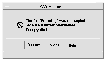
Use a Motif error dialog box to present application error messages. Figure 8-1 shows a typical error dialog box. Keep in mind the basic three-part structure for error messages. Whenever possible, each message should tell the user:
- What happened
- Why it happened
- What should be done to correct the problem
Figure 8-1 An error dialog box

The text describes the error, why it happened, and offers to retry the operation. A Help button in the lower right will bring up appropriate online documentation.
Recommended
gd:
- Error messages displayed by your application indicate the possible cause of the error and indicate the possible actions the user can take in response. See link.
Keep the information in the ErrorDialog clear and concise. The idea is to alert users to the problem, have them quickly understand the problem, and learn how to recover from it. A large amount of text makes it more difficult for the user to focus on the critical information.
Recommended
gc:
- Messages displayed by your application do not assume that the user has any expert knowledge about computer systems in general, or the UNIX system in particular. See link.
It is appropriate to assume that the user has knowledge about basic terms used within the desktop, such as files or programs. Such knowledge can be assumed to have been learned by the user through tutorials, online help and user documentation. However, terminology that is typically understood only by an expert or frequent computer user should be avoided unless the application is specifically targeted at computer professionals. Likewise, messages returned to your application by the underlying operating system should not be passed through to the user, but instead, should be "translated" into language that can be understood by the novice user.
Try to make the error message specific to the immediate situation and as helpful as possible. For example, if the user has entered an invalid name, the error message should not simply state that an invalid name was entered. Instead, tell the user which character was invalid. If the rules for valid names are simple, describe them in the error message; otherwise, describe the rules in the online help and give the user access through the Help button.
In many cases, the only user response to an error dialog box will be to click the OK button to dismiss the dialog box. However, often it may be possible to offer to resolve the problem for the user. If you have buttons for user actions, be sure to also include a Cancel button.
Optional
ge:
- Your application uses audio feedback, in addition to any messages
displayed, to signal error conditions and events.
See link.
Some applications, such as network monitors or stock watch programs, may need to grab the user's immediate attention to some event. Both visual and audio alarms should be used to signal the user. The user should be able to acknowledge the alarm and cause it to cease.
Optional
gh:
- Urgent conditions that require immediate attention by the user, no matter which application or desktop service the user is currently accessing, are brought to the user's attention using audiovisual notification. The alarm is signaled in the current workspace regardless of the workspace in which the application resides.
See link.
Some applications, such as network monitors or stock watch programs, may need to grab the user's immediate attention to some event. Both visual and audio alarms should be used to signal the user. The user should be able to acknowledge the alarm and cause it to cease.
Keep in mind that the user may be running several applications at once, and may be focused on another application while your application is running in the background and encounters an error. The application name should appear in the title bar, to help the user identify the source of the error message.
Once users have read an error message, they may need to access other parts of their system to resolve the problem. Whenever reasonable, posting an error dialog box should not block further interaction with your application and, if at all possible, it should not block other applications.
Optional
gq:
- Your application writes error messages to the Common Desktop Environment error log when it is not appropriate to display these to the user in a message dialog box, but when the message may nevertheless be useful in diagnosing problems. See link.
You might also write error messages that are displayed to the user in the error log if it would be valuable to the user or an administrator to refer to these messages at some later time. Messages written to the error log should provide additional information about the error and should state the context in which the error occurred.
Access to Online Help
Recommended
gj:
- Your application provides a Help button in all message dialog boxes, except those that contain self-explanatory messages. See link.
Applications should be designed with both the expert and novice user in mind. The novice user must be able to access additional information clarifying the message, the circumstances under which it might have been displayed, and what the user should do in response to the message.
The brief description of the problem in the ErrorDialog should be sufficient for the experienced user, but may not contain enough information to enable less experienced users to resolve the problem. Rather than confusing the dialog with additional text, use the Help button to take the user directly to the online documentation for a more detailed description of the error, its causes, and methods for resolving the issue. Users who still need additional help can browse the general online help facilities from there. A few notices may not need Help buttons because the text of the message will cover the condition sufficiently.
For more information on how to access online help directly from the error dialog box see the Help System Author's and Programmer's Guide.
Helpful Hints
Optional
gh:
- Urgent conditions that require immediate attention by the user, no matter which application or desktop service the user is currently accessing, are brought to the user's attention using audiovisual notification. The alarm is signaled in the current workspace regardless of the workspace in which the application resides. See link.
Applications should not send messages to command entry windows or to the UNIX console (that is, applications should not write to the default UNIX files stdout or stderr). Applications are often launched by double-clicking icons in the File Manager, Front Panel, or Application Manager, which means users will not see messages that are written to stdout or stderr. Even if the application is launched from a terminal window, the user may subsequently close the terminal window, and messages appearing there will often not be seen. Worse, if the user does not have a console window running (the console window is difficult to launch in Common Desktop Environment), messages intended for the console may blast across the screen and make everything look ugly.
Informational Messages
Use informational messages in the window footer to present progress, status, or helpful information to the user. Informational messages should not be used to present crucial information, because informational messages are deliberately designed to be nonobtrusive and many users may not notice them.
Guidelines for Informational Messages
Recommended
gi:
- Your application uses footer messages only to communicate status, progress, or information (help) messages. It does not use the footer to present error messages. See link.
Motif provides a message area at the bottom of the main window, but this is rather clumsy and ugly. A more elegant approach is to provide a wider margin below the data area of the main window where status information can be unobtrusively displayed, as shown in Figure 8-2. For other examples of the use of informational messages, see the status message area in the Common Desktop Environment Mailer.
Figure 8-2 An informational message in the lower margin of a window

The text "Loading earth.gif..." is displayed at the start of the load and the text "Done" is added when the load completes. The entire message is removed 5 seconds later.
Informational messages in the footer area should be left-justified and displayed in a light font in keeping with their unobtrusive nature. Note that the margin where informational messages are displayed should not accept mouse focus. Progress messages in the footer area should normally be displayed only while the operation is in progress. Notices and other information that is no longer valid should be removed within a few seconds to avoid confusion about whether the information is current.
Other Message Dialogs
Recommended
gk:
- Your application uses the appropriate style dialog box for the display of messages to the user. See link.
Optional
gl:
- An information dialog box is used to display status, completion of activity, or other informative types of messages to which the user need not necessarily respond other than to acknowledge having read the message. See link.
Minimally, information dialog boxes should have an OK button so that the user can dismiss the dialog box. If there is additional information available about the situations under which the message is displayed or other references for the topic to which the message relates, then a Help button should be included.
Optional
gn:
- A question dialog box is used to ask questions of the user. The question is clearly worded to indicate what a Yes response or a No response means. The buttons displayed are Yes, No, and Help. Help provides additional information as to what the application will do in response to a Yes or No choice. See link.
Where possible, you should replace the label for the Yes and No buttons to make it clear what action will be performed as a result of choosing either option. For example, if the user has made changes to a document and has not saved these but has chosen the application's Exit option, you might display a question dialog box that asks, "Changes have not been saved. Do you want to save these before exiting?" The buttons should be Save, Discard, Cancel, and Help. These labels allow the more experienced user to click the correct button without having to carefully read the question and relate it to the button labels.
Optional
go:
- A warning dialog box is used to communicate the consequences of an action requested by the user that may result in the loss of data, system or application accessibility, or some other undesirable event. The dialog box is presented before the action is performed and offers the user the opportunity to cancel the requested operation. The buttons displayed are Yes, No, and Help, or Continue, Cancel, and Help. Help provides additional information on the consequences of performing the action requested. See link.
The use of Yes and No or Continue and Cancel depends on the wording of your message. The labels for Yes and No should be replaced as suggested previously. Continue may be replaced with a label more specific to the action that will be performed.
Optional
gp:
- A working dialog box is used to display in-progress information to the user when this information is not displayed in the footer of your application's window. The dialog box contains a Stop button that allows the user to terminate the activity. The operation is terminated at the next appropriate breakpoint, and a confirmation might be displayed asking whether the user really wants to stop the activity. The confirmation message might state the consequences of stopping the action. See link.
Work-in-Progress Feedback
Recommended
gt:
- If any command chosen by the user is expected to take longer than 2 seconds to complete, but less than 10 seconds, your application displays the standard busy pointer as feedback that the command is executing. See link.
The user must receive assurance that your application has "heard" the request and is working on it. If the results of the request cannot be displayed immediately, some feedback must be provided. The busy cursor should be displayed within 0.5 seconds of execution of the command.
Recommended
gu:
- If any command chosen by the user is expected to take longer than 10 seconds to complete, your application displays a working dialog box or other feedback of similar character that indicates that the application is working on the request. The feedback should reveal progress toward completion of the activity. See link.
If an activity is expected to take a significant amount of time (10 seconds or more), your application should display feedback stronger than the busy pointer. Displaying the busy pointer for long amounts of time may lead the user to conclude that the application has become "hung." A progress indicator should be displayed in these scenarios that indicates that the application is still functioning and is working on the user's request. The progress indicator should show how much of the activity has been completed and what amount remains.
Recommended
gv:
- When your application displays work-in-progress feedback to the user, it does not block access to other applications and services within the desktop environment. See link.
Multitasking should always be supported and thus your application should allow the user to access other services while it is busy performing some activity. Preferably, the user is also able to access other features within your application even though it is currently working on another request. When this is supported, your application should display an enhanced busy pointer that indicates that the application is busy but still willing to accept input.


Generated with CERN WebMaker


