

Common Desktop Environment: Programmer's Guide
Contents of Chapter:
- Using Common Desktop Environment Motif
-
- Motif Libraries
-
- Features Added to Motif
-
- Enhancements to Existing Motif Functionality
-
- Visual Enhancements
-
- Text Field and Arrow Button Widget (DtSpinBox)
-
- Library and Header Files
-
- Demo Program
-
- Compatibility with Motif 2.0
-
- Convenience Functions
-
- Classes
-
- Resources
-
- Callback Structures
-
- Example of DtSpinBox Widget
-
- Text Field and List Box Widget (DtComboBox)
-
- Library and Header Files
-
- Demo Program
-
- Compatibility with Motif 2.0
-
- Convenience Functions
-
- Classes
-
- Resources
-
- Callback Structures
-
- Example of DtComboBox Widget
-
- Menu Button Widget (DtMenuButton)
-
- Library and Header Files
-
- Demo Program
-
- Convenience Functions
-
- Classes
-
- Resources
-
- Callback Structures
-
- Example of DtMenuButton Widget
-
- Text Editor Widget (DtEditor)
-
- Library and Header Files
-
- Demo Program
-
- Classes
-
- Convenience Functions
-
- Resources
-
- Inherited Resources
-
- Localization Resources
-
- Callback Functions
-
The Common Desktop Environment provides Motif (based on Motif 1.2) OSF patch-level 1.2.3 libraries (with bug fixes) and enhancements. In addition, the Common Desktop Environment provides four custom widgets you can use to provide certain OPEN LOOK and Microsoft
 Windows functionality. This chapter describes these Motif custom widgets.
The widget library, libDtWidget, contains four widgets that combine or enhance functionality of existing Motif 1.2 widgets:
These widgets provide common functionality across all Common Desktop Environment applications. None of these widgets support subclassing.
The Custom Widgets library depends directly on the following libraries:
- Xm library for the Motif superclass support
- Xt library for creation and manipulation of widgets
- X11 Library for the base X Window System
- DtSvc for desktop support utilized by DtEditor
The Common Desktop Environment Motif toolkit consists of the Motif 1.2 widget library with enhancements to existing functionality, bug fixes, and two new features.
Common Desktop Environment Motif adds functionality to the Motif 1.2.3 release while maintaining source compatibility. Common Desktop Environment Motif is source and binary compatible with Motif 1.2 applications. Existing Motif 1.2 applications will compile using Common Desktop Environment Motif. Existing Motif 1.2 binaries will run without modification using Common Desktop Environment Motif.
Common Desktop Environment Motif also provides four custom widgets not found in Motif 1.2. The custom widgets are described in detail in this chapter.
Motif Libraries
Use the Common Desktop Environment Motif and X11R5 libraries to develop a Common Desktop Environment Motif-compliant application for the X Window System. The Common Desktop Environment Motif libraries are the Motif 1.2.3 libraries (with bug fixes) and enhancements.
Motif Library (libXm)
Common Desktop Environment provides all the Motif 1.2 header files.
Motif UIL Library (libUil)
The Motif User Interface Language (UIL) is a specification language for describing the initial state of a Motif application's user interface.
Include the uil/UilDef.h header file to access UIL.
Motif Resource Manager Library (libMrm)
The Motif Resource Manager (MRM) creates widgets based on definitions contained in User Interface Definition (UID) files created by the UIL compiler. MRM interprets the output of the UIL compiler and generates the appropriate argument lists for widget creation functions. Use libMrm to access the Motif Resource Manager.
Include the Mrm/MrmPublic.h header files to access libMrm in your application.
Features Added to Motif
The following features have been added to Motif 1.2.3 to support desktop applications:
- Complete internationalization of toolkit error messages.
- XmGetPixmap() and XmGetPixmapByDepth() use the environment variable XMICONSEARCHPATH or XMICONBMSEARCHPATH as the icon search path. If neither of these variables is set, XBMLANGPATH is used, which governs the Motif 1.2 behavior.See Common Desktop Environment Motif man page for more information.
Enhancements to Existing Motif Functionality
The Common Desktop Environment Xm library contains minor enhancements to Motif to enable better usability by OPEN LOOK and Microsoft Windows users. The usability enhancements include:
- Enabling button two on a three-button mouse to be used to extend the current selection. This functionality is equivalent to the OPEN LOOK ADJUST mouse button.
- Enabling Tab to be used to move through a group of PushButton widgets and gadgets, ArrowButton widgets and gadgets, and DrawnButton widgets.
- Enabling button 3 to activate a CascadeButton menu.
- Providing three new resources (pathMode, fileFilterStyle, and dirTextLabelString) for the XmFileSelectionBox widget, which gives it a new look and feel. See the Common Desktop Environment: Programmer's Overview for details about the new XmFileSelectionBox resources.
- Enabling interoperability with Microsoft Windows and OPEN LOOK by providing multiple key bindings for Motif virtual keys.
Each of the preceding enhancements can be controlled by a resource: either a widget resource (for XmFileSelectionBox) or an application-wide resource (all other cases). The default values for this resource provide behavior and an API that is identical to that of Motif 1.2. For information on these enhancements and resources, see the XmDisplay(3x) and XmFileSelectionBox(3x) man pages.
Visual Enhancements
Common Desktop Environment changes the Motif 1.2 look in the following ways:
- RadioBox fill color is changed to show state more clearly.
- RadioBox shape is changed from diamond to circular.
- A check glyph is added to the CheckBox to show state more clearly.
- CascadeButtons and menu items are changed to have an etched-in border when active.
- Thumb is removed from the read-only Scale to distinguish it from the Scale.
- Default shadow thickness is changed to 1 pixel.
- Default highlight thickness is changed to 1 pixel.
- Default PushButton visual draws the highlight inside the button's default shadow.
An application-wide resource can control each of these enhancements. The default values for these resources provide behavior and an API that is identical to that of Motif 1.2.
For information on these enhancements, see the XmDisplay(3), XmPushButton(3),XmPushButtonGadget(3),XmToggleButton(3), XmToggleButtonGadget(3), and XmScale(3) man pages.
Use the DtSpinBox for cycling through a list of text items or incrementing and decrementing a numeric entry. DtSpinBox is a subclass of the XmManager class and is used to display a text field and two arrows.
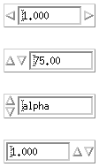
The DtSpinBox widget is a user interface control used to increment and decrement an arbitrary text or numeric field. You can use it, for example, to cycle through the months of the year or days of the month. Figure 7-1 shows examples of the DtSpinBox widget.
Figure 7-1 Examples of the DtSpinBox widget

Library and Header Files
The DtSpinBox widget is in the libDtWidget library. The header file is Dt/SpinBox.h.
Demo Program
A demo containing an example of the DtSpinBox widget is in /usr/dt/examples/dtwidget/controls.c.
Compatibility with Motif 2.0
To use the Motif 2.0 widgets, change the Dt names for the class, types, and creation routines to Xm. For example, change all occurrences of DtSpinBox to XmSpinBox in your code. This information is supplied in case you choose to port your application to Motif 2.0, but it is not a recommendation that you do so.
Note: Common Desktop Environment does not guarantee strict API or binary compatibility between the Common Desktop Environment widgets and the Motif 2.0 widgets.
Convenience Functions
Table 7-1 lists the convenience functions for the DtSpinBox widget. See the DtSpinBox(3X) man page for more information.
Table 7-1 DtSpinBox Convenience Functions

Classes
DtSpinBoxWidget inherits behavior and resources from the Core, Composite, Constraint, and XmManager classes.
The class pointer is dtSpinBoxWidgetClass.
The class name is DtSpinBoxWidget.
DtSpinBoxWidget does not support subclassing.
Resources
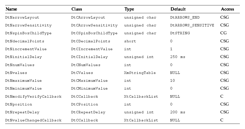
The DtSpinBox widget defines the following set of widget resources. Table 7-2 lists the class, type, default, and access for each resource.
- DtNarrowLayout specifies the style and position of the DtSpinBox arrows.
- DtNarrowSensitivity specifies the sensitivity of the arrows in the DtSpinBox.
- DtNspinBoxChildType specifies the style of the DtSpinBox.
- DtNdecimalPoints specifies the position of the decimal point within the integer value when the child type is numeric.
- DtNincrementValue specifies the amount to increment or decrement the position when the child type is numeric.
- DtNinitialDelay specifies the amount of time in milliseconds before the arrow buttons begin to spin continuously.
- DtNnumValues specifies the number of items in the DtNvalues list when the child type is a string.
- DtNvalues supplies the list of strings to cycle through when the child type resource is a string.
- DtNmaximumValue specifies the upper bound on the DtSpinBox range when the child type is numeric.
- DtNminimumValue specifies the lower bound on the DtSpinBox range when the child type is numeric.
- DtNmodifyVerifyCallback is called just before the DtSpinBox position changes. The application can use this callback to implement new application-related logic, including setting a new position, spinning to, or canceling the impending action.
- DtNposition has a different value based on the child type resource. When the child type is a string, DtNposition is the index into the DtNvalues list for the current item. When the child type is numeric, DtNposition is the integer value of the DtSpinBox that falls within the maximum and minimum value range.
- DtNrepeatDelay is the number of milliseconds between repeated calls to the DtNvalueChangedCallback while the user is spinning the DtSpinBox.
- DtNvalueChangedCallback is called whenever the value of the DtNposition resource is changed through the use of the spinner arrows.
See the DtSpinBox(3X) man page for more information.
Table 7-2 DtSpinBoxWidget Resources

Callback Structures
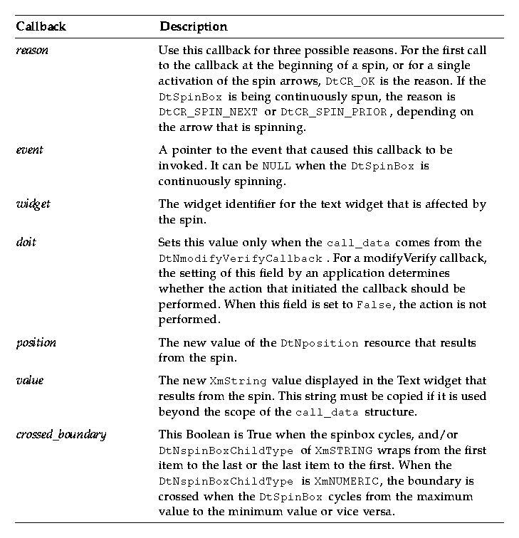
The callback structure follows and is described in Table 7-3.
typedef struct {
   int       reason;
   XEvent    *event;
   Widget    widget;
   Boolean   doit;
   int       position;
   XmString  value;
   Boolean   crossed_boundary;
} DtSpinBoxCallbackStruct;
Table 7-3 DtSpinBox Callbacks

Example of DtSpinBox Widget
The following example shows how to create and use a DtSpinBox widget. You can find this code as part of the controls.c demo in the /usr/dt/examples/dtwidget directory.
/*
 * Example code for SpinBox
 */
#include <Dt/SpinBox.h>
static char *spinValueStrings[] = {
   "alpha", "beta", "gamma", "delta",
   "epsilon", "zeta", "eta", "theta",
   "iota", "kappa", "lambda", "mu",
   "nu", "xi", "omicron", "pi",
   "rho", "sigma", "tau", "upsilon",
   "phi", "chi", "psi", "omega"
};
static void ModifyVerifyCb(Widget, XtPointer, XtPointer);
static void CreateSpinBoxes(Widget parent)
{
    Widget titleLabel, spinBox;
    XmString *valueXmstrings;
    int numValueStrings;
    XmString labelString;
    Arg args[20];
    int i, n;
    /* Create value compound strings */
    numValueStrings = XtNumber(spinValueStrings);
    valueXmstrings = (XmString *)XtMalloc(numValueStrings
    sizeof(XmString*));
    for (i = 0; i < numValueStrings; i++) {
       valueXmstrings[i] =
       XmStringCreateLocalized(spinValueStrings[i]);
    }
    /* Create title label */
    labelString = XmStringCreateLocalized("SpinBox Widget");
    n = 0;
    XtSetArg(args[n], XmNlabelString, labelString); n++;
    titleLabel = XmCreateLabel(parent, "title", args, n);
    XtManageChild(titleLabel);
    XmStringFree(labelString);
   /*
    * Create a SpinBox containing string values.
    */
    n = 0;
    XtSetArg(args[n], DtNvalues, valueXmstrings); n++;
    XtSetArg(args[n], DtNnumValues, numValueStrings); n++;
    XtSetArg(args[n], DtNcolumns, 10); n++;
    spinBox = DtCreateSpinBox(parent, "spinBox1", args, n);
    XtManageChild(spinBox);
   /*
    * Create a SpinBox containing numeric values to 3 decimal places.
    * Position the arrows on either side of the displayed value.
    */
    n = 0;
    XtSetArg(args[n], DtNspinBoxChildType, DtNUMERIC); n++;
    XtSetArg(args[n], DtNminimumValue, 1000); n++;
    XtSetArg(args[n], DtNmaximumValue, 100000); n++;
    XtSetArg(args[n], DtNincrementValue,1000); n++;
    XtSetArg(args[n], DtNdecimalPoints,3); n++;
    XtSetArg(args[n], DtNposition,1000); n++;
    XtSetArg(args[n], DtNarrowLayout,DtARROWS_SPLIT); n++;
    XtSetArg(args[n], DtNcolumns, 10); n++;
    spinBox = DtCreateSpinBox(parent, "spinBox2", args, n);
    XtManageChild(spinBox);
   /*
    * Create a SpinBox containing numeric values to 2 decimal places.
    * Position the arrows on the left of the displayed value.
    * Disallow alternate user changes by adding a modify/verify
    * callback.
    */
    n = 0;
    XtSetArg(args[n], DtNspinBoxChildType, DtNUMERIC); n++;
    XtSetArg(args[n], DtNminimumValue, 1500); n++;
    XtSetArg(args[n], DtNmaximumValue, 60500); n++;
    XtSetArg(args[n], DtNincrementValue,1500); n++;
    XtSetArg(args[n], DtNdecimalPoints,2); n++;
    XtSetArg(args[n], DtNposition,7500); n++
    XtSetArg(args[n], DtNarrowLayout,DtARROWS_FLAT_BEGINNING); n++;
    XtSetArg(args[n], DtNcolumns, 10); n++;
    spinBox = DtCreateSpinBox(parent, "spinBox3", args, n);
    XtManageChild(spinBox);
    XtAddCallback(spinBox, DtNmodifyVerifyCallback, ModifyVerifyCb,
       NULL);
   /*
    * Create a SpinBox containing string values.
    * Position the arrows on the left of the display value
    */
    n = 0;
    XtSetArg(args[n], DtNvalues, valueXmstrings); n++;
    XtSetArg(args[n], DtNnumValues, numValueStrings); n++;
    XtSetArg(args[n], DtNarrowLayout, DtARROWS_BEGINNING); n++;
    XtSetArg(args[n], DtNcolumns, 10); n++;
    spinBox = DtCreateSpinBox(parent, "spinBox4", args, n);
    XtManageChild(spinBox);
   /*
    * Create a SpinBox containing numeric values to 3 decimal places.
    * Position the arrows on the right of the displayed value.
    */
    n = 0;
    XtSetArg(args[n], DtNspinBoxChildType, DtNUMERIC); n++;
    XtSetArg(args[n], DtNminimumValue, 1000); n++;
    XtSetArg(args[n], DtNmaximumValue, 100000); n++;
    XtSetArg(args[n], DtNincrementValue,1000); n++;
    XtSetArg(args[n], DtNdecimalPoints,3); n++;
    XtSetArg(args[n], DtNposition,1000); n++;
    XtSetArg(args[n], DtNarrowLayout, DtARROWS_FLAT_END); n++;
    XtSetArg(args[n], DtNcolumns, 10); n++;
    spinBox = DtCreateSpinBox(parent, "spinBox5", args, n);
    XtManageChild(spinBox);
   /*
    * Free value strings, SpinBox has taken a copy.
    */
    for (i = 0; i < numValueStrings; i++) {
       XmStringFree(valueXmstrings[i]);
    }
    XtFree((char*)valueXmstrings);
}
/*
 * modify/verify callback.
 *
 * Allow/disallow alternate user changes
 */
static void ModifyVerifyCb(Widget w, XtPointer cd, XtPointer cb)
{
    DtSpinBoxCallbackStruct *scb= (DtSpinBoxCallbackStruct*)cb;
    static Boolean allowChange = True;
    scb->doit = allowChange;
    if (allowChange == False) {
       printf("DtSpinBox: DtNmodifyVerifyCallback.
       Change disallowed.\n");
       XBell(XtDisplay(w), 0);
    }
    allowChange = (allowChange == True) ? False : True;
}
Use the DtComboBox widget to display a list and the current selection from the list. You can use this widget for display only, or as a selectable control.
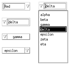
The DtComboBox widget is a combination of a text field and a list widget that provides a list of valid choices for the text field. Selecting an item from this list automatically fills in the text field with that list item. Figure 7-2 shows examples of a DtComboBox widget.
Figure 7-2 Examples of text field and list box widget (DtComboBox)

Library and Header Files
The DtComboBox widget is in the libDtWidget library. The header file is Dt/ComboBox.h.
Demo Program
A demo containing an example of the DtComboBox widget is in /usr/dt/examples/dtwidget/controls.c.
Compatibility with Motif 2.0
The DtComboBox widget is similar to the Motif 2.0 release of XmComboBox. The APIs are designed so that an application can easily switch to the Motif 2.0 version of these widgets. To use the Motif 2.0 widgets, change the Dt names for the class, type, and creation routines to Xm. For example, change all occurrences of DtComboBox to XmComboBox in your code. This information is supplied in case you choose to port your application to Motif 2.0, but it is not a recommendation that you do so.
Note: Common Desktop Environment does not provide strict API or binary compatibility between the Common Desktop Environment widgets and the Motif 2.0 widgets.
Convenience Functions
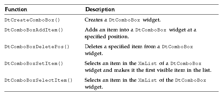
The DtComboBox widget provides the following convenience functions, described in more detail in Table 7-4.
See the DtComboBox(3X) man page for more information.
DtComboBox Widget Convenience Functions
Table 7-4 DtComboBox Widget Convenience Functions

DtComboBox is a subclass of the XmManager class that is used to display XmList or XmScrolledList.
Classes
DtComboBox inherits behavior and resources from Core, Composite, Constraints, and XmManager classes.
The class pointer is dtComboBoxWidgetClass.
The class name is DtComboBoxWidget.
DtComboBoxWidget does not support subclassing.
Resources
DtComboBox provides the following resources. Table 7-5 shows the class, type, default, and access for these resources.
- DtNmarginHeight specifies the number of pixels added between the top and bottom of the text widget and the start of the shadow.
- DtNmarginWidth specifies the number of pixels added between the right and left sides of the text widget and the start of the shadow.
- DtNselectedItem is passed through to the XmList to set the XmNselectedItemCount and XmNselectedItems as the single item in the DtNitems that matches this specified XmString in the list.
- DtNselectedPosition is passed through to the XmList to set the XmNselectedItemCount and XmNselectedItems as the single item at this specified position in the list.
- DtNselectionCallback is issued when an item is selected from the DtComboBox widget list.
- DtNcomboBoxType determines the style type of the DtComboBox.
The list widget ID is accessible using the XtNameToWidget() function. The resources of these widgets can be set. See the DtComboBox(3X) man page for more information.
The codes in the access column show if you can:
- Set the resource at creation time (C)
- Set by using XtSetValues (S)
- Retrieve by using XtGetValues (G)
Table 7-5 DtComboBox Widget Resources

Callback Structures
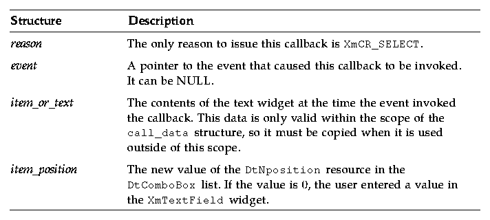
The callback structure follows and is described in Table 7-6.
typedef      struct {
   int       reason;
   XEvent    *event;
   XmString  item_or_text;
   int       item_position;
} DtComboBoxCallbackStruct;
Table 7-6 DtComboBox Callback Structures

Example of DtComboBox Widget
The following example shows how to create and use a DtComboBox widget. You can find this code as part of the controls.c demo in the /usr/dt/examples/dtwidget directory.
/*
 * Example code for DtComboBox
 */
#include <Dt/ComboBox.h>
static char *comboValueStrings[] = {
   "alpha", "beta", "gamma", "delta",
   "epsilon", "zeta", "eta", "theta",
   "iota", "kappa", "lambda", "mu",
   "nu", "xi", "omicron", "pi",
   "rho", "sigma", "tau", "upsilon",
   "phi", "chi", "psi", "omega"
};
static char *colorStrings[] = { "Red", "Yellow", "Green", "Brown", "Blue" };
static void CreateComboBoxes(Widget parent)
{
    Widget titleLabel, comboBox, list;
    XmString *valueXmstrings, *colorXmstrings;
      int numValueStrings, numColorStrings;
    XmString labelString, xmString;
    Arg args[20];
    int i, n;
    /* Create value compound strings */
    numValueStrings = XtNumber(comboValueStrings);
    valueXmstrings = (XmString *)XtMalloc(numValueStrings *
    sizeof(XmString*));
    for (i = 0; i < numValueStrings; i++) {
       valueXmstrings[i] =
       XmStringCreateLocalized(comboValueStrings[i]);
    }
    /* Create color compound strings */
    numColorStrings = XtNumber(colorStrings);
    colorXmstrings = (XmString *)XtMalloc(numColorStrings *
    sizeof(XmString*));
    for (i = 0; i < numColorStrings; i++) {
       colorXmstrings[i] =
       XmStringCreateLocalized(colorStrings[i]);
    }
    /* Create title label */
    labelString = XmStringCreateLocalized("ComboBox Widget");
    n = 0;
    XtSetArg(args[n], XmNlabelString, labelString); n++;
    titleLabel = XmCreateLabel(parent, "title", args, n);
    XtManageChild(titleLabel);
    XmStringFree(labelString);
    /*
     * Create an editable ComboBox containing the color strings.
     * Get the widget id of the drop down list, add some greek
     * letter names to it, and make more items visible.
     */
    n = 0;
    XtSetArg(args[n], DtNcomboBoxType, DtDROP_DOWN_COMBO_BOX); n++;
    XtSetArg(args[n], DtNitems, colorXmstrings); n++;
    XtSetArg(args[n], DtNitemCount, numColorStrings); n++;
    XtSetArg(args[n], DtNvisibleItemCount, 5); n++;
    XtSetArg(args[n], DtNcolumns, 10); n++;
    comboBox = DtCreateComboBox(parent, "comboBox1", args, n);
    XtManageChild(comboBox);
    list = XtNameToWidget(comboBox, "*List");
    XmListAddItems(list, valueXmstrings, 10, 0);
    XtVaSetValues(list, XmNvisibleItemCount, 10, NULL);
    /*
     * Create an editable ComboBox with no entries.
     * Get the widget id of the drop down list, add some greek
     * letter names to it and select the third item in the list.
     */
    n = 0;
    XtSetArg(args[n], DtNcomboBoxType, DtDROP_DOWN_COMBO_BOX); n++;
    XtSetArg(args[n], DtNorientation, DtLEFT); n++;
    XtSetArg(args[n], DtNcolumns, 10); n++;
    comboBox = DtCreateComboBox(parent, "comboBox2", args, n);
    XtManageChild(comboBox);
    list = XtNameToWidget(comboBox, "*List");
    XmListAddItems(list, valueXmstrings, 7, 0);
    XtVaSetValues(list, XmNvisibleItemCount, 7, NULL);
    XtVaSetValues(comboBox, DtNselectedPosition, 3, NULL);
    /*
     * Create a non-editable ComboBox containing some greek letter names.
     * Position the arrow on the left.
     * Select the `gamma' item in the list.
     */
    n = 0;
    XtSetArg(args[n], DtNorientation, DtLEFT); n++;
    XtSetArg(args[n], DtNitems, valueXmstrings); n++;
    XtSetArg(args[n], DtNitemCount, numValueStrings); n++;
    XtSetArg(args[n], DtNvisibleItemCount, 8); n++;
    comboBox = DtCreateComboBox(parent, "comboBox3", args, n);
    XtManageChild(comboBox);
    xmString = XmStringCreateLocalized("gamma");
    XtVaSetValues(comboBox, DtNselectedItem, xmString, NULL);
    XmStringFree(xmString);
    /*
     * Create a non-editable ComboBox with no entries.
     * Position the arrow on the right.
     * Add the greek letter names to the list and select the fourth item.
     */
    n = 0;
    XtSetArg(args[n], DtNorientation, DtRIGHT); n++;
    XtSetArg(args[n], DtNvisibleItemCount, 8); n++;
    comboBox = DtCreateComboBox(parent, "comboBox4", args, n);
    XtManageChild(comboBox);
    for (i = 0; i < numValueStrings; i++) {
       DtComboBoxAddItem(comboBox, valueXmstrings[i],
       0, True);
    }
    XtVaSetValues(comboBox, DtNselectedPosition, 4, NULL);
    /*
     * Free value and color strings, ComboBox has taken a copy.
     */
    for (i = 0; i < numValueStrings; i++) {
       XmStringFree(valueXmstrings[i]);
    }
    XtFree((char*)valueXmstrings);
    for (i = 0; i < numColorStrings; i++) {
       XmStringFree(colorXmstrings[i]);
    }
    XtFree((char*)colorXmstrings);
}
Menu Button Widget (DtMenuButton)
Use the DtMenuButton widget to provide menu-cascading functionality outside of a menu pane.
DtMenuButton widget is a command widget that complements the menu cascading functionality of an XmCascadeButton widget. As a complement to XmCascadeButton widget, it can only be instantiated outside a MenuBar, Pulldown, or Popup (use XmCascadeButton widget inside a MenuPane.) Figure 7-3 shows examples of a DtMenuButton widget.
Figure 7-3 Examples of menu button widget (DtMenuButton)

Library and Header Files
The DtMenuButton widget is in the libDtWidget library. The header file is Dt/MenuButton.h.
Demo Program
A demo containing an example of the DtMenuButton widget is in /usr/dt/examples/dtwidget/controls.c.
Convenience Functions
DtCreateMenuButton() is a convenience function that creates a Common Desktop Environment widget.
DtMenuButton widget is a subclass of XmLabel class. Visually, DtMenuButton widget has a label string and a menu glyph. The menu glyph always appears on the right end of the widget and, by default, is a downward pointing arrow.
DtMenuButton widget has an implicitly created submenu attached to it. The submenu is a pop-up menu and has this DtMenuButton widget as its parent. The name of the implicitly created submenu is obtained by prefixing submenu_ to the name of this DtMenuButton widget. You can obtain the widget ID of the submenu by setting an XtGetValues on DtNsubMenuId resource of this DtMenuButton widget. The implicitly created submenu must not be destroyed by the user of this widget.
The submenu can be popped up by pressing the menu post button (see XmNmenuPost resource of XmRowColumn) anywhere on the DtMenuButton widget or by pressing the Motif Cancel key (usually Escape).
Classes
DtMenuButtonWidget inherits behavior and resources from Core, XmPrimitive, and XmLabel classes.
The class pointer is dtMenuButtonWidgetClass.
The class name is DtMenuButtonWidget.
DtMenuButtonWidget does not support subclassing.
Resources
DtMenuButtonWidget provides the following resources. Table 7-7 shows the class, type, default, and access for these resources.
- DtNcascadingCallback specifies the list of callbacks that are called before the attached submenu is displayed.
- DtNcascadePixmap specifies the pixmap that is displayed as the menu glyph. If no pixmap is specified, a downward pointing arrow is displayed.
- DtNsubMenuId specifies the widget ID of the pop-up menu pane to be associated with this DtMenuButton widget. You must create the pop-up menu pane with this DtMenuButton as its parent. You cannot specify this resource when the widget is created because the submenu is automatically destroyed by this widget when the resource is set.
See the DtMenuButtonWidget(3X) man page for more information.
The codes in the access column show if you can:
- Set the resource at creation time (C)
- Set by using XtSetValues (S)
- Retrieve by using XtGetValues (G)
Table 7-7 DtMenuButtonWidget Resources

Callback Structures
The callback structure follows and is described in Table 7-8.
typedef struct {
   int     reason;
   XEvent  *event;
} XmAnyCallbackStruct;
Table 7-8 DtMenuButtonWidget Callback Structures

Example of DtMenuButton Widget
The following example shows how to create and use a DtMenuButton widget. You can find this code as part of the controls.c demo in the /usr/dt/examples/dtwidget directory.
/*
 * Example code for DtMenuButton
 */
#include Dt/DtMenuButton.h
/* MenuButton custom glyph */
#define menu_glyph_width 16
#define menu_glyph_height 16
static unsigned char menu_glyph_bits[] = {
    0xe0, 0x03, 0x98, 0x0f, 0x84, 0x1f, 0x82, 0x3f, 0x82, 0x3f, 0x81, 0x7f,
    0x81, 0x7f, 0xff, 0x7f, 0xff, 0x40, 0xff, 0x40, 0xfe, 0x20, 0xfe, 0x20,
    0xfc, 0x10, 0xf8, 0x0c, 0xe0, 0x03, 0x00, 0x00};
static void CreateMenuButtons(Widget parent)
{
    Widget menuButton, submenu, titleLabel, button;
    Pixmap cascadePixmap;
    Pixel fg, bg;
    Cardinal depth;
    XmString labelString;
    Arg args[20];
    int i, n;
    /* Create title label */
    labelString = XmStringCreateLocalized("MenuButton Widget");
    n = 0;
    XtSetArg(args[n], XmNlabelString, labelString); n++;
    titleLabel = XmCreateLabel(parent, "title", args, n);
    XtManageChild(titleLabel);
    XmStringFree(labelString);
    /*
     * Create a MenuButton.
     * Add push buttons to the built-in popup menu.
     */
    labelString = XmStringCreateLocalized("Action");
    n = 0;
    XtSetArg(args[n], XmNlabelString, labelString); n++;
    menuButton = DtCreateMenuButton(parent, "menuButton1", args, n);
    XtManageChild(menuButton);
    XmStringFree(labelString);
    XtVaGetValues(menuButton, DtNsubMenuId, &submenu, NULL);
    button = XmCreatePushButton(submenu, "Push", NULL, 0);
    XtManageChild(button);
    button = XmCreatePushButton(submenu, "Pull", NULL, 0);
    XtManageChild(button);
    button = XmCreatePushButton(submenu, "Turn", NULL, 0);
    XtManageChild(button);
    /*
     * Create a MenuButton.
     * Replace the built-in popup menu with a tear-off menu.
     * Add a custom pixmap in the colors of the MenuButton.
     */
    labelString = XmStringCreateLocalized("Movement");
    n = 0;
    XtSetArg(args[n], XmNlabelString, labelString); n++;
    menuButton = DtCreateMenuButton(parent, "menuButton1", args, n);
    XtManageChild(menuButton);
    XmStringFree(labelString);
    /* Create a tear-off menu */
    n = 0;
    XtSetArg(args[0], XmNtearOffModel, XmTEAR_OFF_ENABLED); n++;
    submenu = XmCreatePopupMenu(menuButton, "submenu", args, n);
    button = XmCreatePushButton(submenu, "Run", NULL, 0);
    XtManageChild(button);
    button = XmCreatePushButton(submenu, "Jump", NULL, 0);
    XtManageChild(button);
    button = XmCreatePushButton(submenu, "Stop", NULL, 0);
    XtManageChild(button);
    XtVaSetValues(menuButton, DtNsubMenuId, submenu, NULL);
    /* Create a pixmap using the menu button's colors and depth */
    XtVaGetValues(menuButton,
         XmNforeground, &fg,
         XmNbackground, &bg,
         XmNdepth, &depth,
         NULL);
    cascadePixmap = XCreatePixmapFromBitmapData(XtDisplay
      (menuButton),DefaultRootWindow(XtDisplay
      (menuButton)),
      (char*)menu_glyph_bits,
      menu_glyph_width, menu_glyph_height,
      fg, bg, depth);
    XtVaSetValues(menuButton, DtNcascadePixmap, cascadePixmap,
    NULL);
}
The Common Desktop Environment text editing system consists of two components:
- The text editor client, dtpad, which provides editing services through graphical, action, and ToolTalk interfaces.
- The editor widget, DtEditor(3), which provides a programmatic interface for the following editing services:
- Cut and paste
- Search and replace
- Simple formatting
- Spell checking (for 8-bit locales)
- Undo previous edit
- Enhanced I/O handling capabilities that support input and output of ASCII text, multibyte text, and buffers of data
- Support for reading and writing files directly
Although the OSF/Motif text widget also provides a programmatic interface, applications that use the system-wide uniform editor should use the DtEditor(3) widget. The Common Desktop Environment Text Editor and Mailer use the editor widget. Use this widget in the following circumstances:
- You want the functionality, such as spell checking, undo, and find/change, that is provided by the DtEditor(3) widget.
- You do not want to write the code so that users may read and write data to and from a file.
- Your program does not need to examine every character typed or every cursor movement made by a user.
This section describes the text editor widget, DtEditor(3).
The Editor Widget library provides support for creating and editing text files. It enables applications running in the desktop environment to have a consistent method of editing text data. The DtEditor(3) widget consists of a scrolled edit window for text, an optional status line, and dialogs for finding and changing text, spell checking, and specifying formatting options. The text editor widget includes a set of convenience functions for programmatically controlling the widget.
Library and Header Files
The DtEditor widget is in the libDtWidget library. The header file is Dt/Editor.h.
Demo Program
A demo containing an example of the DtEditor widget is in /usr/dt/examples/dtwidget/editor.c.
Classes
Widget subclassing is not supported for the DtEditor widget class.
DtEditor inherits behavior and resources from Core, Composite, Constraints, XmManager, and XmForm classes.
The class name for the editor widget is DtEditorWidget.
The class pointer is dtEditorWidgetClass.
Convenience Functions
The DtEditor convenience functions are described in the following tables.
Life Cycle Functions
The DtEditor life cycle functions are described in Table 7-9.
Table 7-9 DtEditor Life Cycle Functions

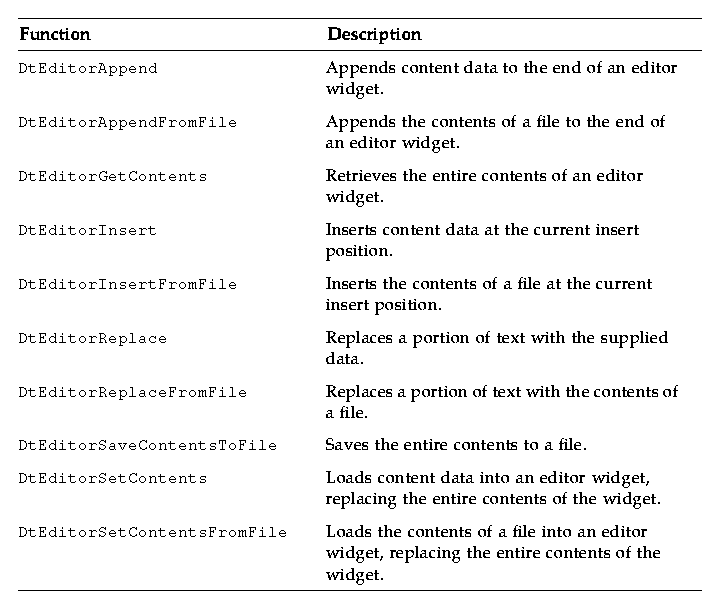
Input/Output Functions
The DtEditor input/output functions are described in Table 7-10.
Table 7-10 DtEditor Input/Output Functions

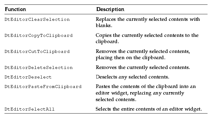
Selection Functions
The DtEditor selection functions are described in Table 7-11.
Table 7-11 DtEditor Selection Functions

Format Functions
The DtEditor format functions are described inTable 7-12.
Table 7-12 DtEditor Format Functions

Find and Change Functions
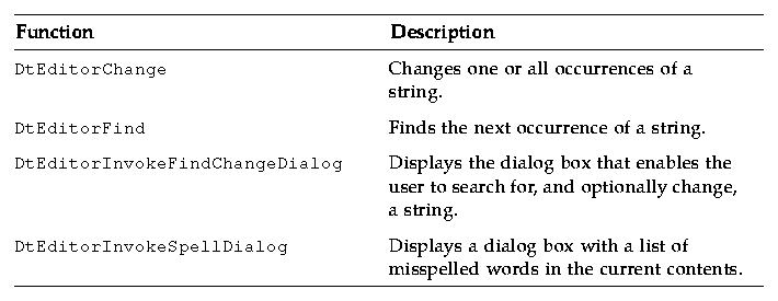
The DtEditor find and change functions are described in Table 7-13.
Table 7-13 DtEditArea Find and Change Functions (Continued)

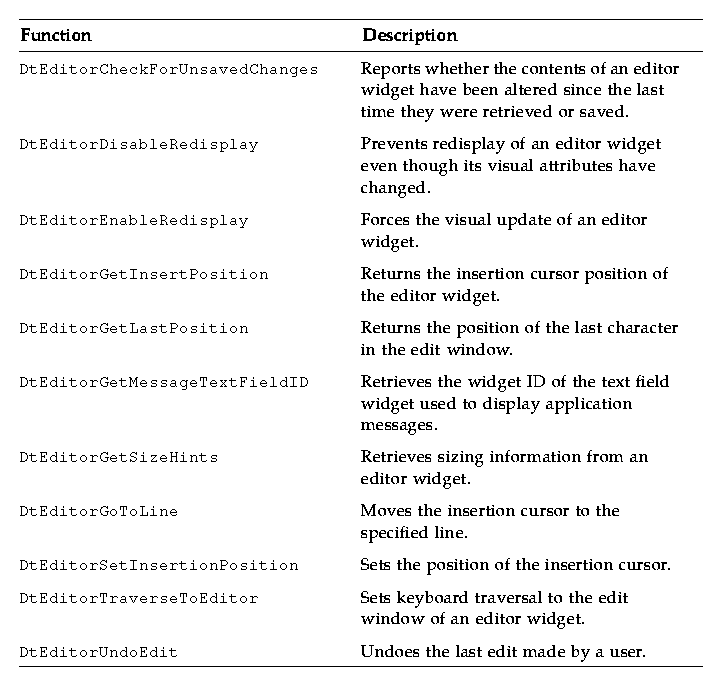
Auxiliary Functions
The DtEditor auxiliary functions are described in Table 7-14.
Table 7-14 DtEditor Auxiliary Functions

Resources
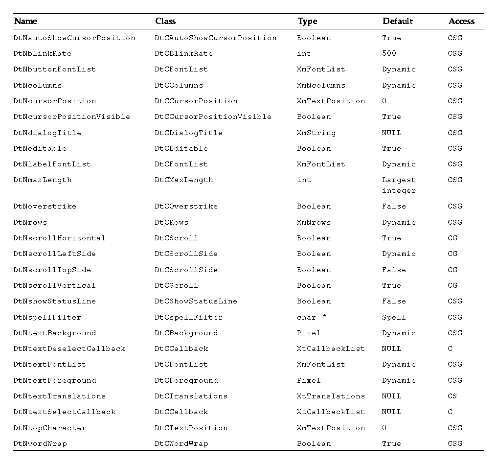
The DtEditor widget provides the following set of resources.
- DtNautoShowCursorPosition ensures that the text visible in the scrolled edit window contains the insert cursor when set to True. If the insert cursor changes, the contents of the editor may scroll to bring the insertion point into the window.
- DtNblinkRate specifies the blink rate of the text cursor in milliseconds. The time it takes to blink the insertion cursor on and off is twice the blink rate. When the blink rate is set to zero, the cursor does not blink. The value must not be negative.
- DtNbuttonFontList specifies the font list used for the buttons that are displayed in the dialog boxes of DtEditor.
- DtNcolumns specifies the initial width of the editor as an integer number of characters. The value must be greater than zero.
- DtNcursorPosition specifies the location of the current insert cursor in the editor where the current insert cursor is placed. Position is determined by the number of characters from the beginning of the text. The first character position is 0.
- DtNcursorPositionVisible marks the insert cursor position by a blinking text cursor when the Boolean value is True.
- DtNdialogTitle specifies the title for all dialogs displayed by DtEditor. These include the dialogs for word search and replace, misspelled words, and format settings.
- DtNeditable indicates that the user can edit the data when set to True. Prohibits the user from editing data when set to False.
- DtNlabelFontList specifies the font list used for DtEditor labels (the labels are displayed in the status line and DtEditor dialog boxes).
- DtNoverstrike when set to False, characters typed into the editor widget inserts at the position of the cursor (the default). When set to True, characters typed into the editor widget replace the characters that directly follow the insertion cursor. When the end of the line is reached, characters are appended to the end of the line. If the status line is visible, the DtNoverstrikeIndicatorLabel is displayed in the status line whenever DtNoverstrike is True.
- DtNrows specifies the initial height of the editor measured in character heights. The value must be greater than zero.
- DtNscrollHorizontal adds a scroll bar that enables the user to scroll horizontally through text when the Boolean value is True.
- DtNscrollLeftSide puts a vertical scroll bar on the left side of the scrolled edit window when the Boolean value is True.
- DtNshowStatusLine displays a status line below the text window when set to True. The status line contains a field that displays the current line number of the insert cursor, total number of lines in the document, and whether the editor is in overstrike mode. Users can type a line number in the line number display to go directly to that line.
The status line also includes a Motif XmTextField(3X) widget for displaying messages supplied by an application. This field is a convenient place for an application to display status and feedback about the document being edited. The ID of the text field is retrieved using DtEditorGetMessageTextFieldID(3). A message is displayed by setting the XmNvalue or XmNvalueWcs resource of this widget. If the text field is not needed, you can unmanage it by calling XtUnmanageWidget(3X) with its ID.
Table 7-15 lists the class, type, default, and access for each resource. You can also set the resource values for the inherited classes to set attributes for this widget. To reference a resource by name or class in an .Xdefaults file, remove the DtN or DtC prefix and use the remaining letters. To specify one of the defined values for a resource in an .Xdefaults file, remove the Dt prefix and use the remaining letters (in either lowercase or uppercase, but include any underscores between words).
The codes in the access column show if you can:
- Set the resource at creation time (C)
- Set by using XtSetValues (S)
- Retrieve by using XtGetValues (G)
See the DtEditor(3) man page for more information.
Table 7-15 DtEditor Resources

Inherited Resources
DtEditor inherits behavior and resources from the following superclasses:
- XmForm
- XmManager
- Composite
- Core
Refer to the appropriate man page for more information.
Localization Resources
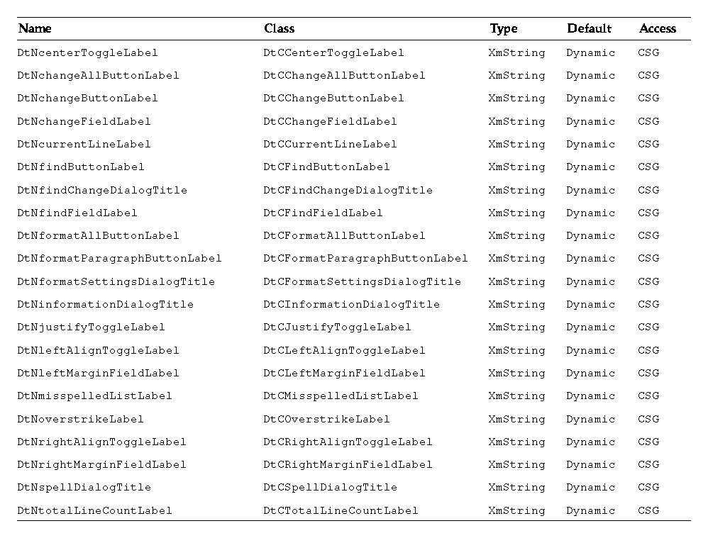
The following list describes a set of widget resources that are designed for localization of the DtEditor widget and its dialog boxes. Default values for these resources depend on the locale.
- DtNcenterToggleLabel specifies the label for the center alignment toggle button in the Format Settings dialog box. The default value in the C locale is Center.
- DtNchangeAllButtonLabel specifies the label for the button in the Find/Change dialog box that changes all occurrences of the Find string in the document. The default value in the C locale is Change All.
- DtNchangeButtonLabel specifies the label for the button in the Find/Change dialog box that changes the next occurrence of the find string in the document. The default value in the C locale is Change.
- DtNchangeFieldLabel specifies the label for the field in the Find/Change dialog box where the user specifies the replacement string. The default value in the C locale is Change To.
- DtNcurrentLineLabel specifies the label for the current line number field in the status line. The default value in the C locale is Line.
- DtNfindButtonLabel specifies the label for the button in the Find/Change dialog box that finds the next occurrence of the find string in the document. The default value in the C locale is Find.
- DtNfindChangeDialogTitle specifies the title for the Find/Change dialog box. If DtNdialogTitle is non-null, it is added to the front of this resource to form the title. The default value in the C locale is Find/Change.
- DtNfindFieldLabel specifies the label for the field in the Find/Change dialog box where the user specifies the search string. The default value in the C locale is Find.
- DtNformatAllButtonLabel specifies the label for the button in the Format Settings dialog box that formats the complete document. The default value in the C locale is All.
- DtNformatParagraphButtonLabel specifies the label for the button in the Format Settings dialog box that formats the paragraph containing the insertion cursor. The default value in the C locale is Paragraph.
- DtNformatSettingsDialogTitle specifies the title for the Format Settings dialog box. If DtNdialogTitle is non-null, it is added to the front of this resource to form the title. The default value in the C locale is Format Settings.
- DtNinformationDialogTitle specifies the title for the Information dialog box that is used to present feedback and general information to the user. If DtNdialogTitle is non-null, it is added to the front of this resource to form the title. The default value in the C locale is Information.
- DtNjustifyToggleLabel specifies the label for the justify alignment toggle button in the Format Settings dialog box. The default value in the C locale is Justify.
- DtNleftAlignToggleLabel specifies the label for the left alignment toggle button in the Format Settings dialog box. The default value in the C locale is Left Align.
- DtNleftMarginFieldLabel specifies the label for the left margin value field in the Format Settings dialog box. The default value in the C locale is Left Margin.
- DtNmisspelledListLabel specifies the label for the list of unrecognized and misspelled words in the Spell dialog box. The default value in the C locale is Misspelled Words.
- DtNoverstrikeLabel specifies the label in the status line that shows that the editor is in overstrike mode. The default value in the C locale is Overstrike.
- DtNrightAlignToggleLabel specifies the label for the right alignment toggle button in the Format Settings dialog box. The default value in the C locale is Right Align.
- DtNrightMarginFieldLabel specifies the label for the right margin value field in the Format Settings dialog box. The default value in the C locale is Right Margin.
- DtNspellDialogTitle specifies the title for the Format Settings dialog box. If DtNdialogTitle is non-null, it is added to the front of this resource to form the title. The default value in the C locale is Spell.
- DtNtotalLineCountLabel specifies the label for the display as part of the status line that shows the total number of lines in the document. The default value in the C locale is Total.
Table 7-16 lists the class, type, default, and access for each of the localization resources. The codes in the access column show if you can:
- Set the resource at creation time (C)
- Set by using XtSetValues (S)
- Retrieve by using XtGetValues (G)
See the DtEditor(3) man page for more information.
Table 7-16 DtEditor Localization Resources (Continued)

Callback Functions
The DtEditor widget supports three callback functions:
- DtEditorNHelpCallback
- DtNtextSelectCallback
- DtNtextDeselectCallback
If you want to present help information about the editor widget and its dialog boxes, set the XmNhelpCallback resource and use the reason field passed as part of DtEditorHelpCallbackStruct to set the contents of the Help dialog box. A pointer to the following structure is passed to XmNHelpCallback. The callback structure and is described in Table 7-17.
typedef struct {
    int       reason;
    XEvent    *event;
} DtEditorHelpCallbackStruct;
Table 7-17 DtEditorHelp Callback Structure

Use the DtNtextSelectCallback and DtNtextDeselectCallback resources when you want to enable and disable menu items and commands depending on whether text is selected. DtNtextSelectCallback specifies a function that is called whenever some text is selected in the edit window. DtNtextDeselectCallback specifies a function that is called whenever no text is selected within the edit window. The reasons sent by the callbacks are DtEDITOR_TEXT_SELECT and DtEDITOR_TEXT_DESELECT.


Generated with CERN WebMaker
