![[Compaq]](../../images/compaq.gif)
![[Go to the documentation home page]](../../images/buttons/bn_site_home.gif)
![[How to order documentation]](../../images/buttons/bn_order_docs.gif)
![[Help on this site]](../../images/buttons/bn_site_help.gif)
![[How to contact us]](../../images/buttons/bn_comments.gif)
![[OpenVMS documentation]](../../images/ovmsdoc_sec_head.gif)
| Document revision date: 10 November 2000 | |
|
|
|
|
|
|
| Previous | Contents | Index |
When a dialog box is displayed the second time, you should try to
preserve the values for all the fields. For example, when users display
a Create dialog box again, they might want to retain most of the values
that were already entered. Preserving these values saves users from
having to reenter all the information. In the case of a Directory
dialog box, users might want to display the same elements the second
time, but change the contents of one of the fields, such as the time
last modified.
1.5.6.7 Provide a Variety of Selection Controls
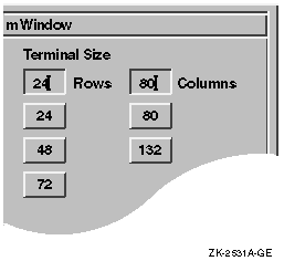
Provide selection controls (such as radio buttons or list boxes) and text-entry fields to gather the same information, when suitable. Doing so accommodates different user preferences for entering information. For example, Figure 1-37 shows a dialog box that allows users to customize the size of their windows by either typing in the size in a text field or by selecting the appropriate push button.
Figure 1-37 Provide a Variety of Selection Controls
Be careful, however, to avoid clutter by providing too much variety.
Also, do not overwhelm users with too many visual features, such as
flashing, bolding, and underlining. In general, avoid using flashing
because it distracts the user.
1.5.7 Creating Tab Groups
A tab group consists of any managed or primitive widget that is organized into a traversable group or field. In other words, a tab group is a group of controls that belong together. For example, a set of radio buttons is a tab group. To move from tab group to tab group in a dialog box, users press the Tab key (hence the name tab group).
Organize the controls in your dialog boxes into distinct tab groups. The toolkit makes two distinctions with regard to navigating dialog boxes with the keyboard:
Treat each of the following types of controls as its own tab group:
Follow these general rules for navigating between fields:
To retain the proper order, create children in the same order in which users tab through the dialog box. |
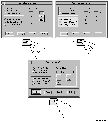
Refer to Figure 1-38 and Figure 1-39 to see how the input focus moves from tab group to tab group when users press the Tab key. The location cursor wraps from the bottom right tab group to the top left tab group when users continue to push the Tab key.
Figure 1-38 Use the Tab Key to Move Between Tab Groups
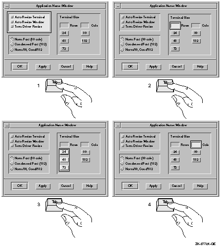
Figure 1-39 Use the Tab Key to Move Between Tab Groups--continued
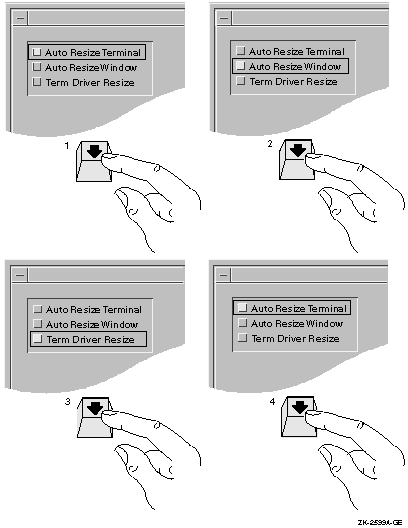
To move from component to component within a tab group, users press the arrow keys. For example, to move from one item to the next in a series of radio buttons, users press the down arrow key. However, to move from a radio button to the next tab group, users press the Tab key.
Refer to Figure 1-40 to see how the input focus moves from component to component within a tab group when users press the arrow keys. Notice that the location cursor wraps; that is, when users press the down arrow key to go to the last item in a series and then press the down arrow key again, the location cursor moves up to the first item in the series.
Figure 1-40 Use the Arrow Keys to Move Within Tab Groups
When creating labels and text for dialog boxes and other screen objects such as menus and title bars, follow these guidelines:
Use: Null Pointer Avoid: NULL POINTER |
Loading file /usr/sbin/uerf.hlp The file /usr/sbin/uerf.hlp cannot be found. Please check the file name and directory for spelling or other errors and try again. |
Levels with Periods Number of Columns Space Between Columns First Line Indent Dates Before 1993 |
Go Back Exit |
Show Room Go to Page... Save As... |
Side-by-Side Cross-References |
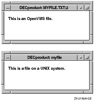
Title bars are used in both primary and secondary windows.
For primary windows, provide labeling as follows:
Figure 1-41 Putting Information in Title Bars
For secondary windows, provide labeling as follows:
For more information on naming dialog boxes, see Section 1.2.1.
1.8 Using the Working Dialog Box and the Wait Cursor
Use Working dialog boxes and wait cursors to give the user immediate feedback that your application is in process.
In most circumstances, if the action will take more than 15 seconds, use a Working dialog box to show work in progress. Since the length of time that an action takes is system dependent to a large extent, you might want to make the display of a Working dialog box be a customizable option.
When actions will take less than 15 seconds, let the user know the application is processing by changing the cursor to a wait cursor such as the DECwindows watch cursor. Continue to display the wait cursor until the action is complete. Use a wait cursor for the following types of actions:
Set the wait cursor on all windows where the user is waiting for an application to complete an action. For example, if the application is refreshing a directory, the wait cursor should be set in the directory window as well as all other windows that are visible and pending the completion of that refresh.
Use the following code example to set a wait cursor for the active window. The #ifdef is used when the application runs on an OpenVMS system. The other include statement applies to both UNIX and Windows NT systems.
|
This chapter provides guidelines for designing menus. It supplements the OSF/Motif Style Guide by discussing the following topics:
This chapter also discusses the OSF/Motif File, Selected, Edit, View,
Options, and Help menus, and recommends items to add to these menus. In
addition, you can include a Windows menu and your own
application-specific menus.
2.1 Naming Menus and Menu Items
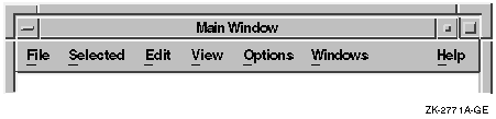
Use the standard terms for common menus, such as File, Selected, Edit, and Options. In left to right environments, place the menus in the recommended order, with File farthest to the left, followed by Selected, and then Edit. Application-specific menus should follow the Edit menu. Place the View, Options, and Help menus to the right of any application-specific menus. The Options and Help menus should always be farthest to the right. If you include a Windows menu, place it between the Options and Help menus. See Figure 2-1 for an example.
To position the Help menu at the far right of the menu bar, set XmNmenuHelpWidget to the name of the Help cascade button. |
Figure 2-1 Order of Menus in the Menu Bar
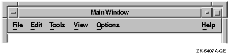
Additional menu bar items should be placed after Edit and before Help. When there is a View menu bar item, most additional items should be placed between Edit and View. In this way, users become accustomed to the File, Selected, and Edit menus appearing at the left and the View, Options, and Help menus appearing at the right. Figure 2-2 shows two application-specific menu bar items.
Figure 2-2 Sample Menu Bar with Application-Specific Items
When you are creating your own menus and menu items, avoid giving a menu the same name as a menu item. For example, Paste is an item on the Edit menu, so do not create a Paste menu in the menu bar.
Use verbs or adjectives for your menus and menu items instead of nouns. Verbs and adjectives give users a better idea of what action a command will perform.
Follow the guidelines for text presentation (such as capitalization and punctuation) in Section 1.6.
Use terminology that will be familiar to users. For example, if you are designing a simple drawing tool, avoid terms like chamfer or bevel, but if you are designing a drawing tool for graphic artists, use these terms. Whatever terms you choose, make sure they are distinct from each other. Ask users to review your choices of menus and menu items and to tell you if the terms are clear and distinct.
Give each menu and each menu item a mnemonic. Consider giving the most commonly used menu items accelerators.
To create a mnemonic and an accelerator, use the following code example:
|
For information on capitalization of menu items, see Section 1.6.
2.2 Organizing Menus and Menu Items
The way you organize your menus and menu items depends on your application. Choose the most appropriate guidelines from the following list to help you:
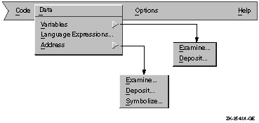
Consider providing a menu map, either on line or in hardcopy form. Some products provide one map of all menus and menu items, while others provide separate diagrams for each menu and its associated submenus. Figure 2-3 shows a map for one menu and its associated submenus.
Figure 2-3 A Menu Map
Use a horizontal ellipsis (...) to indicate that pushing the button invokes a dialog box or window that requires some action on the part of the user. For example, use an ellipsis with the Print menu item if it invokes a dialog box in which users must provide printer information before a file can be printed.
Do not use ellipses with the Help push button or Help menu item since Help does not require any action. (For information on designing online help, see Chapter 5.)
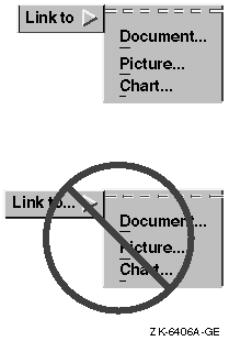
Do not take short cuts when providing ellipses in cascade buttons. Always use ellipses in cascade menu items. Figure 2-4 shows the appropriate way to use ellipses with cascade buttons.
Figure 2-4 Ellipses with Cascade Buttons
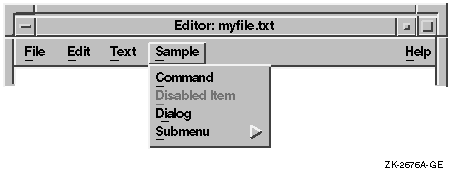
At a given time, your application can make a menu item unavailable to users; that is, it can disable the menu item. Users cannot choose a disabled menu item. Figure 2-5 illustrates a disabled menu item.
Figure 2-5 A Menu with a Disabled Menu Item
To disable a menu item, call XtSetSensitive with the widget ID of the widget. |
You can allow users to display a menu or submenu in which all items are disabled. With such a display, users can see what features your application provides. (This guideline does not necessarily apply to pop-up menus; for guidelines on pop-up menus, see Section 2.5.2.)
If your application does not support a standard menu item, do not display that menu item at all. For example, if your application does not support the Select All menu item, do not include Select All in a menu.
Use the following guidelines to determine whether to disable a menu item:
Some menu items invoke dialog boxes; your decision to disable such menu items depends on whether the dialog box that is invoked is modal or modeless:
| Previous | Next | Contents | Index |
|
|
| privacy and legal statement | ||
| 5637PRO_003.HTML | ||