


Required
6-1:
A main window contains a client area and, optionally, a menu bar, a command area, a message area, and scroll bars. The client area contains the framework of the application. The use of a main window ensures interapplication consistency.
Required
bd:
Required
6-2:
For example, a text editor might allow the user to edit multiple documents, each in its own main window. Each window is then treated as a separate application and can be closed or iconified when it is not being used.
Required
6-3:
For example, a debugger might provide separate main windows for editing source code, examining data values, and viewing results. Each window can be iconified when it is not being used, but it is up to the application to decide whether each window closes separately or whether closing one window closes the entire application.
Required
be:
Resize corners should be included in any main window that incorporates a scrolling data pane or list. Any changes to the overall size of the window should result in a corresponding increase or decrease in the size of the scrollable portion. Additionally, your application might reorganize elements within the window based on the increased or decreased amount of space (for example, it might reorganize a row of buttons into two rows).
Required
6-4:
A menu bar organizes the most common features of an application. It contains a list of menu topics in buttons; each button is associated with a distinct pull-down menu containing commands that are grouped by common functionality. The use of a menu bar is not required, but it is strongly recommended.
Required
6-5:
The use of other types of buttons in the bar precludes user browsing of the menu structure.
Recommended
bn:
Standard menu bar entries should be presented in the following order:
File Edit View Options Help
You should exclude from your menu bar any item shown in the preceding text if your application does not support the associated function. For example, if your application does not support the ability to display its data in different views, then you should not include a View menu.
You may add application-specific menus in between any of the standard menu items, with the following exceptions:
-- The File menu, if present, is located in the first menu position on the left.
-- The Help menu is located on the far right position.
-- If File and Edit are present, they should be next to each other.
For example, your application may have:
File Edit <category1> <category2> View Options <category3> Help
Recommended
bo:
Possible replacements for the File menu:
Replacement1: <app-label> Selected
Replacement2: <app-label><obj-type>
Replacement3: <obj-type>
You may use Replacement1 if your application has more than one object type. Items on <app-label> would be used for global actions that are not specific to an object type. The items in Selected are actions that pertain to objects that are currently selected, and may change depending on what objects are selected. If nothing is selected, this menu should have a single item that says (none selected). If an item is selected, but there are no items that apply to that object, this menu should have a single item that says (none).
You may use Replacement2 if your application has a single object type. Actions that are global to the application are on <app-label>, and actions that are specific to the object type are on <obj-type>.
You may use Replacement3 if your application has a single object type, and does not require an <app-label> menu. For example, a Print Manager might contain a Printer menu.
All other menubar guidelines that apply to File-oriented applications also apply to non-File-oriented applications. Thus, the following menubar would be valid:
<app-label> Selected Edit <category1> View <category2> Help
Applications that are complex or are extremely domain-specific (for example, an application for medical imaging and diagnosis of cat scan data) may require other approaches to their menu bar design. For example,
<app-label><category1><category2> Selected Edit <object-type> Options Help
Recommended
bp:
Required
6-7:
Items should be presented to the user in the order listed below. In all cases where a dialog is recommended to be displayed to the user, and the dialog has functionality outlined in Chapter 7, "Common Dialogs", your application should use a dialog box.
Required
bq:
The user must always be given the opportunity to explicitly state whether unsaved changes should be saved or discarded. A dialog box similar to the one described should also be displayed if the user chooses Open from the File menu, but has not saved changes to the current file.
Recommended
br:
Any of the preceding three menu choices should be provided only if the objects managed by your application are able to reside as separate entities outside of your application's main window. For example, a printer object created by a printer management application might be able to be placed in a Folder window and function as an application unto itself. Your application should also support drag and drop as a method for performing any of these actions.
Required
6-8:
Recommended
bs:
Recommended
bt:
Recommended
bu:
Recommended
bv:
This is the Common Desktop Environment-recommended Help menu and should be used instead of the Motif 1.2 Help menu. Items should be presented to the user in the order listed.
The Overview, Using Help and About items are required. The Table of Contents, Tasks and Reference items are recommended. You can choose to have separate Mouse and Keyboard topics, or have a single combined Mouse and Keyboard topic. You should not use all three items.
Pop-up menus provide access to frequently used functions and should be used pervasively throughout the Common Desktop Environment desktop environment. A pop-up menu may contain a collection of options that appear in different menus available from the menu bar. For example, it may contain items from both the File and Edit menus.
Recommended
by:
Recommended
bx:
Recommended
cb:
Recommended
ca:
Optional
cd:
<choices that manage the object such as Open, Save, and Properties>
----------- separator ----------------
<standard edit menu choices such as Cut, Copy and Paste>
----------- separator ----------------
<other choices>
Optional
6-11:
Recommended
cc:
Required
6-12:
In the context of a selection, pop-up menu actions affect the entire selection.
Recommended
ce:
The use of an ellipsis helps set the user's expectation for the behaqvior of the interface. When they select an item without an ellipsis, they know that they can expect an immediate result.
Recommended
cf:
No menu should contain only one item. If your application provides a menu with only one item, you should consider moving that item into another menu or making it a button within the window. The longer the menu, the more effort is needed for the user to access choices near the bottom. If your menu has a lot of choices, break it up into two or more menus, or group some items into submenus.
Optional
cg:
Submenus may be used to group like items into a single secondary cascading menu where putting the items into the primary cascadingd menu would make it too long. However, if your submenu contains only two options, you should strongly look at removing the secondary cascadingd menu and putting the options into the primary cascadingd menu since it takes more effort for the user to access options located in a submenu.
Optional
ci:
The user should be able to tear-off frequently accessed menus so that these can remain posted on the desktop as the user uses your application.
Required
6-14:
Optional
cj:
If specific menu items within a menu are expected to be used frequently, not the menu as a whole, then your application provides keyboard accelerators for these items and displays the keyboard accelerators in the associated menu to the right of the item to which they relate. You should not use accelerators that have already been defined for system functions -- refer to Appendix A, Keyboard Functions, for a list of pre-defined key assignments.
Recommended
ck:
The names of items in the menu bar serve as titles for the options the menu contains. The name of the menu bar item should provide a term that accurately describes the concept of the category relating all of the menu items and should not be used as the name of any item within the menu itself.
Required
cl:
Dimmed controls cannot be activated by the user and should appear only when the inactive state is short-term (that is, there is something the user can do within the application or the desktop environment to make the control become active). When the control is persistently inactive (because of the current configuration of the application or system, or a particular set of companion software is not currently installed), the control should be removed from the menu rather than be dimmed.
Required
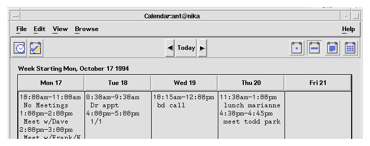
6-15:
Figure 6-1 Example from Common Desktop Environment Calendar.
Required
fd:
Required
fe:
Items in a toolbar are meant to provide quick access to operations that are already accessible to the user by other methods.
Required
ff:
Recommended
fg:
Tool bars should only be used when they improve or enhance user access to common operations, such as in an application with several large menus.
Tool bars should present a natural organization of actions. Grouping items that are dissimilar can confuse users because they do not expect to find the item they are looking for in that context.
Placing too many items in the tool bar can cause the user to have to search for the item they are looking for, rather then being able to quickly find it and use it. Keep the number of buttons to a minimum so that you don't increase the difficulty of your application when using a tool bar.
Cryptic icons add to user confusion. Keep the pixmaps as simple as possible. Remember that all graphics must be international in scope. When designing a graphic to represent a command, such as Save, remember that the icon has to represent a verb, as opposed to a noun like most other icons. This can make the icon more confusing to users.
Required
fh:
Recommended
fi:
This status line should provide immediate feedback to the user as to the purpose of the button that the mouse is currently over or that has the keyboard focus. When the arrow is over a tool bar icon, the status line should display a brief definition of what the icon represents or what will happen when the user clicks the icon.
Recommended
fj:
Recommended
fk:
Recommended
fl:
This ensures that all the buttons will be the same size.
Recommended
fm:
Optional
bf:
Note that this does not have to be the actual name of the executable invoked by the user.
Carefully consider how the title you choose for your primary window works when it is used in icons and pop-up windows. If the name of the pop-up window is too long, you may remove the application title, but remember that without the title users might have difficulty telling which pop-up windows belong with the originating primary window.
Optional
bg:
Optional
bh:
Optional
bi:
Pop-up windows should always indicate which primary window they are associated with (which primary window invoked that pop-up).
Optional
bj:
The hyphen is used to denote specific instances of a window or data. The colon serves to delimit general categories or commands. For example, a file manager might have the following title for a Properties dialog box:
File Manager : Properties - myfile
Recommended
bk:
Optional
bl:
Optional
bm:
Recommended
gt:
The user must receive assurance that your application has "heard" the request and is working on it. If the results of the request cannot be displayed immediately, some feedback must be provided. The busy cursor should be displayed within 0.5 seconds of execution of the command.
Recommended
gu:
If an activity is expected to take a significant amount of time (10 seconds or more), your application should display feedback stronger than the busy pointer. Displaying the busy pointer for long amounts of time may lead the user to conclude that the application has become "hung." A progress indicator should be displayed in these scenarios that indicates that the application is still functioning and is working on the user's request. The progress indicator should show how much of the activity has been completed and what amount remains.
Recommended
gv:
Multitasking should always be supported and, as such, your application should allow the user to access other services while it is busy performing some activity. Preferably, the user is also able to access other features within your application even though it is currently working on another request. When this is supported, your application should display an enhanced busy pointer that indicates that the application is busy but still willing to accept input.
Required
ep:
If any window within your application has focus, some control within that window must have focus. The user should not have to explicitly set focus to a control within the window.
Optional
eq:
Although use of inactive text cursors is allowed within the Motif style, it is better to hide the text cursor on focus out rather than display the inactive text cursor. This makes it easier for the user to quickly scan the screen or a window and determine which text field currently has focus.
Optional
er:
Once the user becomes adept at using your application, keyboard mnemonics provide the user a quick way to access functionality. Mnemonics also facilitate access to functionality from within keyboard-centric applications or windows. The user need not frequently switch between use of the mouse or use of the keyboard. Mnemonics should be provided pervasively throughout the user interface.
Optional
es:
Keyboard accelerators provide the user who has become expert at using your application a quick way to access application functionality without having to go through menus and dialog boxes.
Required
ev:
In general, you should not override the value of settings treated as global environment settings. These settings are controlled by the user through the Common Desktop Environment Style Manager. If you choose to ignore these settings and specify your own settings, then your application will be have inconsistently with other applications in the Common Desktop Environment desktop. If you nevertheless choose to provide your own values, then you must provide the user a way to make your settings consistent with the rest of the desktop.
Required
em: