


Common Desktop Environment: Style Guide and Certification Checklist
7 Common Dialogs
Contents of Chapter:
- Dialog Box Design and Layout
-
- Dialog Box Placement
-
- Dialog Box Interaction
-
- Expandable Windows and Dialog Boxes
-
- Guidelines for Expandable Windows and Dialog Boxes
-
- Components of Expandable Windows
-
- File Selection Dialog Boxes
-
- Contents
-
- File Selection Dialog Box Behavior
-
- Labeling
-
- Button Activation
-
- Selection and Navigation
-
- Guidelines for Specific File Selection Dialog Box Uses
-
- Print Dialog Box
-
- Standard Print Menu Items for Applications
-
- Guidelines for Common Print Dialog Functions
-
- Guidelines for Application-Specific Print Dialog Box Functions
-
- Some Sample Layouts
-
- The Properties Dialog
-
- Guidelines
-
- The About Dialog Box
-
- Guidelines for the About Dialog Box
-
Use dialog boxes (secondary windows) to support user tasks that require detailed interaction from the user and that do not lend themselves well to direct manipulation in the main window. For example, you may not require a dialog box to support the task of setting a margin if the task can be performed by directly moving a margin stop on a ruler. On the other hand, you might require a dialog to support formatting a document if the task requires that the user specify several formatting options.
Dialog Box Design and Layout
Optional
ct:
- Keep the size of your dialog boxes to a minimum. Remember that on low-resolution displays, dialogs may take up most of the screen real estate, and may even run off the edge of the screen if not designed correctly. See link.
Optional
cu:
- Avoid complexity in your dialog boxes. If your dialog box must support many functions, consider using an expandable dialog box (see "Expandable Windows"), or use more than one dialog in a nested fashion. See link.
Optional
cv:
- Avoid the use of resize handles in your dialog box. However, you may use resize handles when resizing is useful in allowing users to see more information; for example, when your dialog contains a scrolling list that is likely to be quite long, and users will frequently need to search the list. See link.
Recommended
cp:
- The title of dialog boxes used within your application adheres to the conventions listed in Table 10-3. See link.
Required
cq:
- Every dialog box in your application has at least one button that either performs the dialog box action and dismisses it or dismisses the dialog box without taking any action. See link.
Recommended
cr:
- If your application uses common dialog box actions, the actions have the following specified functionality and labels: See link.
- Label
- Functionality
- Yes
- Indicates affirmative response to a question posed in the dialog box.
- No
- Indicates negative response to a question posed in the dialog box.
- OK
- Applies any changes made to components in the dialog box and dismisses the dialog box.
- <command>
- Applies any changes made to the components in the dialog box, performs the action associated with <command>, and optionally dismisses the dialog box.
- The <command> button should be used in lieu of OK, Yes, or No as a button label when it provides more meaning to the user as to the action that will be performed when that button is clicked.
- Apply
- Applies any changes made to components in the dialog box and does not dismiss it.
- Retry
- Causes the task in progress to be attempted again.
- Stop
- Ends the task in progress at the next possible break point.
- Pause
- Causes the task in progress to pause.
- ResumeCauses a task that has paused to resume.
- Save As Defaults
- Saves the current settings as the default settings that will appear the next time the window is displayed. The settings are not applied to any selected object and the dialog box is not dismissed.
- A Save As Defaults button should be provided if it is expected that a user would want to use different default values for a set of controls within a dialog box than those that you provide as the factory settings. For example, a Save As Defaults button might be provided in a "New <object type>" window, allowing the user to indicate that whenever a new instance of that object-type is created, the current values should be displayed as the defaut settings instead of the values given by the application.
- Reset
- Cancels any changes that have not yet been applied by your application. The controls within the dialog box are reset to their state since the last time the dialog box action was applied. If no changes have been applied within the current invocation of the dialog box, the controls are reset to the state when the dialog box was first displayed.
- Reset to Factory
Cancels any changes that have not yet been applied. Components in the dialog box are reset to their default state and value as specified by the vendor that delivered the application (that is, the controls are restored to the original factory settings).
- Cancel
- Dismisses the dialog box without performing any actions not yet applied.
- Help
-
Provides help for the dialog box.
Recommended
cs:
- Any visible control that is not currently active or whose setting is currently invalid is dimmed. See link.
Dimmed controls cannot be activated by the user and should appear only when the inactive state is short-term (that is, there is something the user can do within the application or the desktop environment to make the control become active). When the control is persistently inactive (because of the current configuration of the application or system, or a particular set of companion software is not currently installed), the control should be removed rather than dimmed.
Optional
cw:
- Every dialog box in your application has exactly one default button that is activated when the Return key is pressed. See link.
The default button should be associated with the most likely response from the user and should not be potentially destructive or irreversible. Some applications may have dialog boxes that do not reveal a default button until a specific set of fields has been filled out or otherwise manipulated.
Optional
cx:
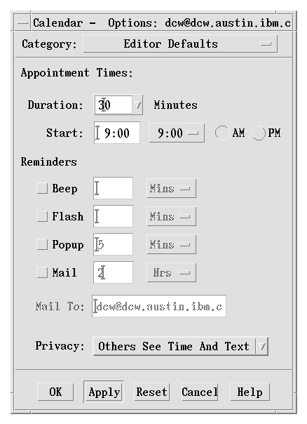
- If a dialog box displayed by your application has controls that are considered to be advanced features, use an expandable dialog box, or use a multiple page dialog box that provides a <category> option menu that allows a user to navigate to each page. See link.
Controls that relate to advanced features should not be displayed with the set of options initially displayed to the user. The typical user should be presented with only those options that are necessary to use the basic functionality of the application. Users looking to access advanced functionality within the dialog box may use the Category option button (see Figure 7-1). If the number of advanced controls is very few, or the settings for these controls are highly related to the settings of basic controls displayed in the dialog box (that is, the settings of the advanced controls change when the user changes settings for basic controls), you might choose to provide an expandable dialog box (see the section on Expandable Windows and Dialog Boxes).
Figure 7-1 An example of using a Category option menu in a dialog
Optional
dl:
- Controls within your dialog box are placed in a left-right, top-down layout based on the order in which the user is expected to fill out or choose options within the dialog box. See link.
This assumes that your application is being designed for a left-to-right language environment. Alternate design approaches may be necessary for other locales.
Required
dm:
- Push buttons that affect the dialog box as a whole, either by modifying its contents or layout, invoking the action of the dialog box, or dismissing the dialog box, are located at the bottom of the dialog box. See link.
In general, there should only be one row of buttons at the bottom of a dialog box. If your application has dialog boxes that contain several global buttons, it may be necessary to create two or more rows of buttons at the bottom of the dialog box. The last row should contain the standard dialog box buttons (OK, Reset, Cancel, and Help). If a dialog box contains buttons that are not related to the dialog box as a whole, but instead, relate to a specific control within the dialog box, the buttons should be located near the control to which they relate.
Required
dn:
- If your application provides an Apply button within a dialog box, it also provides an OK button or command button that performs the dialog box action then dismisses it. See link.
Optional
do:
- Your application does not use cascading buttons within dialog boxes unless there is absolutely no other design alternative that can be used without a negative impact on the layout of your dialog box. See link.
In general, cascade buttons should only be used within menus and menu bars. You should avoid their use in all other locations unless absolutely necessary.
Dialog Box Placement
Recommended
al:
- A secondary window is placed by the application relative to the associated primary window. It should be placed close to, but not obscuring, the component that caused it to be displayed and the information that is necessary to interact with the dialog box. See link.
Some suggestions are given in section 6.2.4.3, "Determining Dialog Box Location and Size," of the OSF/Motif Style Guide, Revision 1.2. Additional or modified recommendations include: See link.
Optional
am:
- If a dialog box does not relate to specific items in the underlying window, it should be placed below the menu bar (if there is one) and centered (horizontally) over the work area. See link.
Recommended
an:
- If a secondary window is allowed to be stacked below its associated primary window (not constrained to stay on top of the primary window), it should be placed such that it is not completely covered by the primary window. This recommendation takes precedence over other placement recommendations. See link.
Recommended
ao:
- If a menu or dialog box is already on display, reinvoking the command that caused it to be displayed automatically brings that window or menu to the front of the window stack without changing its position on the screen. See link.
Dialog Box Interaction
All of the navigation and selection guidelines that apply to applications in general should apply to your dialogs. In addition, as you design your application-specific dialog boxes, you should follow these guidelines to ensure maximum usability and accessibility.
Required
en:
- When your application displays a dialog box, it places the input focus at the first text field into which the user is allowed to type an entry, or at the first control within the dialog box with which the user should interact. See link.
Input focus should always be placed at a predictable and intuitive location. The user should not be forced to set focus at the control most likely to be used when the window is displayed.
Recommended
eo:
- As the user presses the Tab key within dialog boxes of your application, the input focus moves to different controls within the window in a left-right, top-down order. See link.
This assumes that your application is being designed for a left-to-right language environment. Alternate design approaches may be necessary for other locales.
Required
et:
- Dialog boxes displayed by your application never block input to other applications within the desktop (that is, they are not system modal) unless it is absolutely essential that the user perform no other action in the desktop until the user responds to the dialog box. See link.
Applications must allow the user the freedom to access information and tools within the user's desktop environment. Only in the most dire circumstances should an application ever block access to other applications and services within the environment.
Required
eu:
- Dialog boxes displayed by your application never block access to other functionality within the application (application modal) unless it is essential that the state of the application remains unchanged until the user responds to the dialog box. See link.
Required
6-18:
- A warning dialog box allows the user to cancel the destructive action about which the dialog box is providing a warning. See link.
Expandable Windows and Dialog Boxes
This section describes a standard method for providing expandable windows or dialogs in Common Desktop Enviroment. Expandable windows allow users to selectively display advanced or application-specific functionality in a separate portion of the window that is normally not visible when the window is initially displayed. Users can choose to display the entire window, or only the core functionality, according to their own needs and preferences. Applications can implement expandable windows fairly easily using existing toolkit components.
Use expandable windows only when your application needs to present a limited set of additional dialog box options. Consider using an alternate method if your dialog would grow unmanageably large, for example, larger than a typical low-resolution display could handle. Keep in mind also how your dialog will expand when translated into other languages. An alternative method for expandable dialogs is to use a multipage dialog and provide a Category button for switching pages.
Guidelines for Expandable Windows and Dialog Boxes
Recommended
fn:
- The primary pane of the dialog box or window should contain all of the controls needed to complete the task. This should include all critical and frequently used functionality. See link.
Recommended
fo:
- It is assumed that infrequently used features are placed in the secondary pane. The core functionality of the application should not depend on any controls placed in secondary panes. See link.
Required
fp:
- Command buttons are aligned along the bottom of the dialog box. When the window is expanded to show a secondary pane, then buttons are moved to the bottom of the secondary pane. See Chapter , "Application Design Principles" for information about layout of action buttons in dialog boxes. See link.
Recommended
fq:
- If important controls must be placed in the secondary pane, the application can specify that the window in question should be displayed in its expanded state by default. Users should still be able to shrink the window by pressing the Contract button. See link.
Components of Expandable Windows
To create an expandable window or dialog box, use the standard Motif widgets in conjunction with state variables and some simple rules that govern its behavior. In addition to the application-defined controls and displays that make up the content of the window itself, use a primary and secondary pane in the following way.
Primary and Secondary Panes
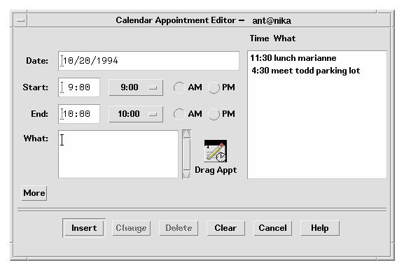
The primary pane should contain the core or base functionality required by nearly all end-users of the application. The primary pane is a standard Motif container that is the main component of the window or dialog. Only the primary pane is visible when the expandable window is initially displayed. An "expand button" allows the user to display a secondary pane providing access to the full functionality of the window or dialog. [See Figure 7-2]
Figure 7-2 Calendar Appointment Editor primary pane with Expand button (More)
Expanding the Secondary Pane
The secondary pane provides space for additional options or advanced functionality without increasing the difficulty of the core functionality in the primary pane. The secondary pane can be expanded in a vertical or a horizontal direction. To determine the appropriate direction in which to expand, consider the following questions:
- What are the reading patterns in the countries that will be using the applications?
- What makes the most sense based on the information in the dialog?
Recommended
fr:
- The secondary pane should expand in the direction most consistent with users' expectations, the reading pattern of the language in which it will be displayed, and the content of the information displayed. See link.
Recommended
fs:
- If possible, the panes should have the same default width. See link.
Required
ft:
- A separator should be used to separate the primary pane from the secondary pane. See link.
The user needs to have clear visual feedback as to which elements are part of the primary pane and which elements are part of the secondary pane of the expandable window.
Resizing the Expanded Window or Dialog
Required
fu:
- If a window is resizable, any sizing changes should be allocated to the pane containing scrolling lists or text fields whose displayed length is less than their stored length. If both panes contain scrollable controls, size changes should be distributed evenly between the two panes. If neither pane contains scrollable controls, the window should not be resizable. See link.
Figure 7-3 Calendar Appointment Editor with expand button (Less) and primary and secondary panes
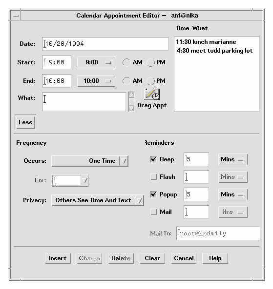
Expand Button
The expand button is used to display the secondary pane. The expand button is a standard Motif drawn button with a label that changes depending on the state of the window. The button labels for the two states should tell the user what will happen. For example, the button might say Options when the window is closed and Basic when the window is open. Clicking the Options button displays the bottom pane; clicking the Basic button hides the bottom pane. Labels should be opposites such as Expand and Contract, More and Less, or Basic and Options.
Required
fv:
- The expandable window should have one button that changes its label based on the state of the window. See link.
Required
fw:
- The expand button should have two labels that reflect the two states of the expandable window accurately. The current label should indicate to the user what will happen if the user clicks the button. See link.
Examples of possible labels are Basic and Options, Expand and Contract, and More and Less.
Optional
fx:
- The expand button may contain a graphic in addition to the label. This graphic should indicate the direction in which the window will expand or contract. See link.
Placing the Expand Button
Recommended
fy:
- The button should appear in the lower left-hand corner of the window or dialog box for expansion in the vertical direction and in the lower-right hand corner for expansion in the horizontal direction. See link.
Required
fz:
- If the window or dialog box contains a scrolling list positioned to the far right side of the pane, do not align the drawn button with the scroll bar. For example, the button should be aligned with the list, not the scroll bar. See link.
Window State
Required
ga:
- Applications must remember the state of each window or dialog box (expanded or not expanded) independently (not collectively). The state should be changed only by the user and should always be preserved until explicitly altered by the user. See link.
Recommended
gb:
- Applications should remember the state of each expandable window or dialog box across sessions, so that users don't have to manually configure the expandable windows each time the application is run. See link.
If appropriate, applications can provide a mechanism to allow users to set the state of an expandable window on a global basis in the application. This would be part of the application's Options.
File Selection Dialog Boxes
The Common Desktop Enviroment file selection dialog box is a subclass of the Motif file selection dialog box that has enhancements for improved usability. As long as your application uses the standard Motif file selection dialog box calls, the Common Desktop Enviroment enhanced version will appear in the Common Desktop Enviroment environment. There are additional guidelines to follow to make your dialog consistent and easy to use. Use the file selection dialog box whenever your application supports a task that involves choosing a file or directory. Examples are: Open, Include, Save As, and Copy To.
Contents
Required
7-10:
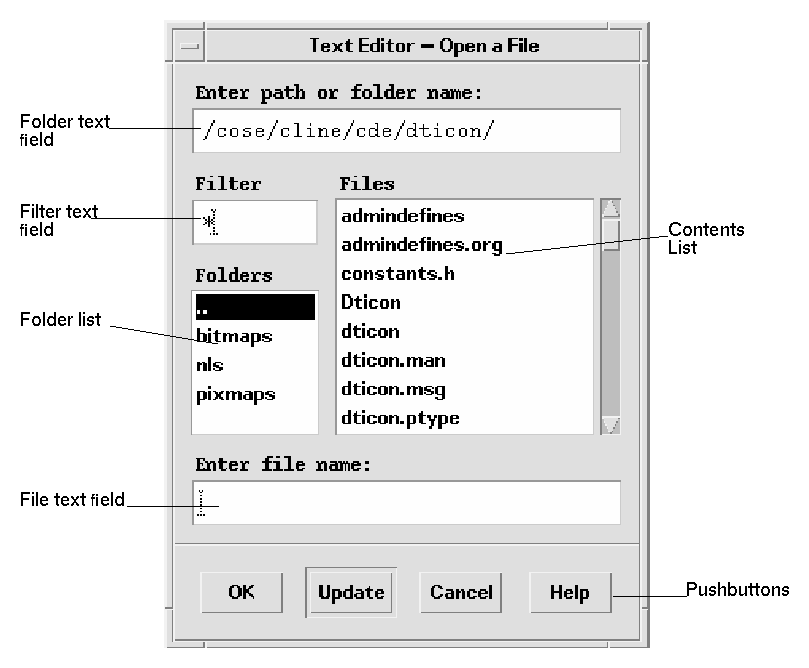
- If your application uses a file selection dialog box, it contains the following components: See link.
- A directory Text component showing the current directory path. The user can edit the directory Text component and press <Return> or <Enter> to change the current directory.
- A group of push buttons, including a command button, and Update, Cancel, and Help buttons. The command button is typically labeled Open or Save, but if there is another label that better describes the resulting action (such as Include), that label should be used. Activating the command button carries out the corresponding action and dismisses the file selection dialog box.
- For applications that allow saving to different formats, an option button allowing users to specify the format when saving a file.
- A file name Text component for displaying and editing a file name. This component is optional when the file selection dialog box is used to choose an existing file or directory.
Figure 7-4 Example of an Open file selection dialog box
Required
7-17:
- The file selection box displays the contents of a directory in the contents list when the file selection box is initialized, when the user presses Enter or Return in the directory text component, and when the user opens a directory in the contents list. The contents list is updated each time the contents of the directory changes. See link.
This specification ensures the consistent operation of a directory and file search in a file selection dialog box.
Optional
ht:
- Directory and file name lists should be presented alphabetically, case insensitive. The first item on the directory list should be the parent directory and it should be labeled "..". See link.
Recommended
de:
- The file selection dialog box should not display hidden (dot) directories or files, unless your users depend on using these types of files. If your application does support displaying hidden files, you should supply a check box allowing users to toggle between showing and not showing hidden files, or else allow users to toggle between showing and hiding files at a global level in your application. See link.
Recommended
df:
- The file selection dialog box should not show the full path names for files and directories, but should only show the relative names, except for the directory text field. See link.
The global Common Desktop Enviroment setting should be:
XmFileSelectionBox.fullPathMode: false
Unless your application overrides this behavior, your file selection dialog box should not show full path names in the list boxes.
Required
dg:
- In general, the file selection dialog box should recall the directory location that was previously set by the user. See link.
For example, if the user brings up Save As and navigates to /users/jay/letters to save the file, the next time the user brings up Save As, the file selection box should be in the directory /users/jay/letters. This information, however, should not be recalled once the user has closed the primary window, but should resort to the default directory.
If your application supports multiple primary windows, each window should recall the directory location that was set for that window.
File Selection Dialog Box Behavior
Optional
hq:
- The file selection dialog box should come up in a directory that makes sense for the task. For example, when saving a new file from an editor, the file selection box should come up in the user's home directory. If the user navigates to some other directory within the file selection box, the application should remember that directory the next time it is brought up. See link.
Optional
hr:
- Users should never be allowed to overwrite an existing file through the file selection box without a warning dialog box prompt. See link.
Optional
hs:
- Keyboard focus should be placed in the file name field each time users bring up a file selection dialog box. See link.
Labeling
Optional
hu:
- Labels should be clear. In the English language, use the following labels for the file selection dialog box fields and lists: See link.
- Component
- Label
- Directory text field
- Enter Path or Folder Name
- Filter text Field
- Filter
- Directory list
- Folder
- Contents list
- Files
- File text field
- Enter Filename:*
Optional
hv:
- Optionally, application developers can make this label more instructive and specific, such as Enter File to Open for Open dialog boxes. See link.(see following sections for specific recommendations).
These labels should be the default labels. If they are not set by default, you need to set them via resources in your application's app-defaults file.
Recommended
he:
- When the file selection box is used to specify an existing file (for example, to open a document), the command button is normally labeled Open and it should be the default action. See link.
Required
hj:
- When the file selection dialog box is used to specify a new file name (for example, a Save As dialog box), the command button is normally labeled Save and is the default action. This specification ensures the uniform appearance of a file selection box across applications. See link.
Button Activation
Recommended
hf:
- If the Open button is activated while the appropriate file is selected in
the contents list, the file is utilized by the application and the file
selection box is dismissed. See link.
Required
hg:
- If the Open button is activated while the appropriate file is selected in
the contents list, the file is utilized by the application and the file
selection box is dismissed. See link.
Selection and Navigation
Required
7-12:
- Double-clicking BSelect on an item in the contents list selects that item and activates the default action. In all cases, double-clicking BSelect on a directory in the contents list opens that directory and displays its contents in the contents list (the default action is Open). See link.
- When the file selection dialog box is used to choose an existing file, double-clicking BSelect on an appropriate file in the contents List chooses that file and dismisses the file selection dialog box (the default action is Open).
- When the file selection dialog box is used to choose an existing directory or to specify a new directory or file, the files list should not appear.
Required
7-13:
- The normal text navigation and editing functions are available in the text components for moving the cursor within each text component and changing the contents of the text. See link.
These actions provide a convenient way to choose a directory or file name from the corresponding List while focus remains in the Text component.
Optional
7-15:
- Your application allows the user to select a file by scrolling through the list of file names and selecting the desired file or by entering the file name directly into the file selection text component. Selecting a file from the list causes that file name to appear in the file selection text area. See link.
This method for selecting a file needs to be consistent across applications.
Required
7-16:
- Your application makes use of the selection when one of the following occurs: See link.
- The user activates the command push button while an appropriate item is selected in the contents List.
- The user double-clicks BSelect on an appropriate file in the contents list.
- The user presses Return or Enter while the file name text component has the keyboard focus and contains an appropriate item.
Guidelines for Specific File Selection Dialog Box Uses
The following guidelines apply for specific uses of the file selection dialog box, and should be observed in addition to the more general guidelines.
Open Dialog
Recommended
hm:
- If the user has opened the application without supplying a file name argument, the Open dialog box should use the user's home directory as the default directory. See link.
An exception to this rule might be made if a clearly more useful directory can be identified; for example, the icon editor might default to $HOME/.dt/icons. For applications that allow editing, never default to a directory in which the user does not have read and write permission, such as /usr/dt/bin.
Required
hn:
- If the user has opened the application with a file name argument, the Open dialog box should default to the directory in which that file resides. See link.
Save As Dialog
Optional
ho:
- When using the file selection dialog box in Save As capacity, provide a default name of Untitled, place the location cursor in the file name field and highlight the file name text to create a "delete pending type-in" mode. If the current directory already has a file of that name, create a name Untitled2, and so forth. See link.
Optional
hp:
- When using the file selection dialog box in a Save As capacity, add a file name extension if the application supports file typing by extension, and make this extension visible in the file name field. Do not highlight the extension to create a "delete pending type-in" mode, but allow users to modify the extension or delete it explicitly. See link.
After saving a file using "Save As", the application should use that newly saved file as the current file, and all subsequent edits and saves should apply to that newly created file.
The Save As dialog should use the same directory in which the current file resides.
Directory Selection Dialog
Recommended
hh:
- When the file selection dialog box is used to choose an existing directory (for example, to install a set of files into the chosen directory) or to specify a new directory, the command button should be given an appropriate label, such as Install, Choose, Create, or OK. If this button is activated while the appropriate directory is selected in the contents list, the directory is utilized by the application and the file selection box is dismissed. See link.
Required
hi:
- When the file selection dialog box is used to choose an existing directory, there must also be an additional button, labeled Update, that is enabled whenever a directory is selected in the contents list, and opens the directory. This Update button is the default action. See link.
Optional
hk:
- When the file selection dialog box is used to choose an existing file, files are shown in the contents list but they are all disabled. Double-clicking BSelect on a disabled file name has no effect. See link.
Print Dialog Box
These are guidelines for a common look and feel print dialog box, which may be used wherever a print action is available. The print dialog is not a widget. Developers are encouraged to use these guidelines as a starting point and to add functionality as appropriate for their applications. It is important, however, to remember that users expect consistency from one print dialog to another; therefore, the common area should be left as unchanged as possible. Use a print dialog box whenever users would want to select options for printing a file, a selection, or other type of object. If your application supports printing, you should use a print dialog box, and you may provide an optional nondialog method of printing directly, that is, "silent" printing.
Standard Print Menu Items for Applications
Print...: brings up a print dialog so the user can choose from the available options before printing the selected objects.
Print One: prints one copy of the selected objects, using the default print methods previously defined by the user. The user is not prompted for further information through a dialog.
Guidelines for Common Print Dialog Functions
Applications are expected to provide many different types of printing functions and capabilities. This section provides guidelines for the most commonly used types of print options so that appearance and behavior for these items is consistent across applications. These common items are grouped into a common area that is located in the top portion of the print dialog. Figure 7-5 shows a typical print dialog. The common area is the area above the separator line.
Figure 7-5 A basic print dialog. box
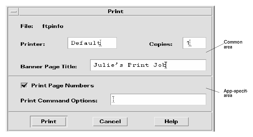
The common area contains the following components:
- Dialog Title: Print
- File: this is a noneditable field. It displays the file name (if available). If the user is printing a nonfile object, this field should display the object type if possible (for example, mail message, calendar appointment).
- Printer: A combination box; could also be a text field. It contains the name of the printer destination. The default entry is labeled Default, that is, whatever printer is the default destination. The user may select or type any other valid printer name. If it is a combination box, the list of printers could reflect what is appropriate for that printing job. The dialog should retain the last user entry or selection made.
- Copies: A spin box (numeric widget) where the user selects or types the number of output copies desired. Optionally, this could be a text field.
- Banner Page Title: A text field where the user may enter the text the user wants to appear on the banner page (that is, cover page) of their output. This field should pick up the default banner title if the user has set it elsewhere. Optionally, you could add a check box to turn the banner page off completely.
- Separator lines: Used between the common fields, the application-specific fields, and the buttons.
- The print dialog contains the following standard buttons:
- Print: Accepts the user's choices in the dialog, prints the selected objects, and exits the dialog.
- Cancel: Ignores the user's choices in the dialog, prints nothing, and exits the dialog.
- Help: Brings up an associated Help window.
- Optional buttons could include Reset, Print Preview.
Guidelines for Application-Specific Print Dialog Box Functions
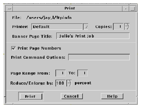
The standard print dialog application-specific area is the bottom half of the dialog box illustrated in Figure 7-6.
Depending upon the application or function, developers may choose to add more fields to the common Print dialog. The controls in the dialog are laid out horizontally; if more fields are needed, it is suggested that you add another separator line, then place the additional controls below it, as illustrated. If any additional push buttons are needed, they should go between the Print and Cancel buttons.
Optional Fields
Some possible optional fields include:
- Print Page Numbers
- This checkbox applies only when ASCII files are being printed. If the objects selected for printing are non-ASCII, this control should be dimmed. When turned on, output pages will be numbered.
- Print Command Options
- A text field where the user may type an
lp command or script name to override the instructions in the other fields. If you want to provide print methods besides lp, rename this field (Print Method, Use Print Command, and so on.).
- Priority
- This might be an option menu containing values for High, Medium, and Low, or might be a spin box containing numbers.
- Orientation
- An option menu containg the values Portrait and Landscape (see Figure 7-6).
- Resolution
- An option menu or a spin box containing numeric values, in dpi (see Figure 7-6).
- Sides
- An option menu containing the values Single and Double (see Figure 7-6).
- Paper Size
- An option menu containing the values Letter, Legal, and so on. (Figure 7-6).
- Paper Source
- An option menu containing the values Upper Tray, Lower Tray, and so on. (see Figure 7-6).
If the dialog box is to be used for an application, consider:
- Page Range
- Two text fields, from x to y (see Figure 7-7).
- Reduce/Enlarge
- A spin box containing values for percentages (see Figure 7-7).
- Print Preview
- A button that brings up a WYSIWYG representation of the output.
Some Sample Layouts
Figure 7-6 and Figure 7-7 show some example Print dialog box layouts.
Figure 7-6 Example print dialog box layout for general printing
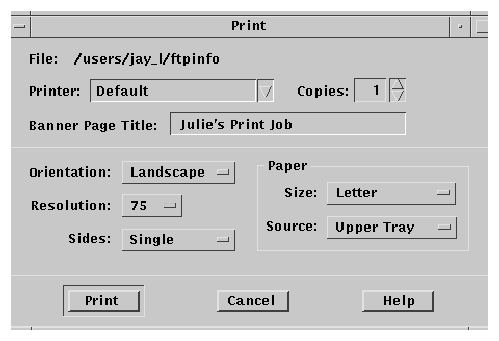
Figure 7-7 Example print dialog box layout for printing from applications
The Properties Dialog
User a properties dialog if your application provides settings that control the behavior of an application or the characteristics of an object.
Guidelines
Recommended
cz:
- If your application manages objects and allows the user to see or modify settings for these objects, these settings are displayed in an object properties window that is accessible from a Properties ... choice in the Edit, <object-type>, or Selected menus, as well as from the pop-up menu associated with the object. See link.
Recommended
da:
- If your application provides access to a Properties or Options window, this window includes the following set of buttons in the order listed, with the specified functionality, when supported by your application. See link.
- OK
- Applies any changes made to components in the DialogBox and dismisses it. OK may be replaced by a more appropriate label (for example, Add). The alternate label should be a verb phrase.
- Apply
- Applies any changes made to components in the DialogBox and does not dismiss it.
- Reset
- Cancels any changes that have not yet been applied by your application. The controls within the DialogBox are reset to their state since the last time the DialogBox action was applied. If no changes have been applied within the current invocation of the DialogBox, the controls are reset to their state as of when the DialogBox was first displayed.
- Reset to Factory
- Cancels any changes that have not yet been applied. Components in the dialog box are reset to their default state or value as specified by the vendor that delivered the application (that is, the controls are restored to the original factory settings).
- Cancel
- Dismisses the dialog box without performing any actions not yet applied.
- Help
- Provides help for the dialog box.
Recommended
db:
- If your application provides a Properties window that displays settings for a selected object, the Properties window tracks the current selection and modifies the state of any controls to accurately reflect the properties of the currently selected object. See link.
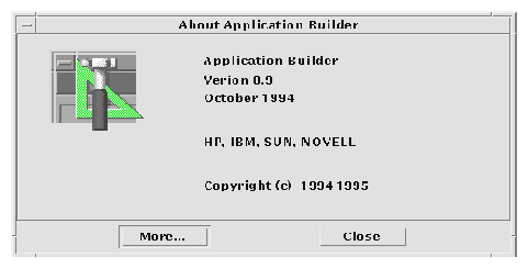
The About Dialog Box
The About dialog box is used to present version and other information about your application. Use as the dialog that comes up when the user chooses About <application name> from the Help menu.
Guidelines for the About Dialog Box
The About dialog box should contain a minimum set of information about the application that is visible in a single text pane.
That minimum set should be:
- Application name
- Version number
- Release date
- Copyright
Required
di:
- The About dialog box should contain a Close button. Other buttons are optional, such as Help and More. See link.
The following information might also be contained in the About box:
Recommended
dj:
- Information about the operating system or other aspects required to run the application, for example, Common Desktop Environment 1.0. See link.
Optional
dk:
- A More Information dialog box for additional information such as development team credits, licensing, client or xhost information. See link.
Figure 7-8 Example About dialog box
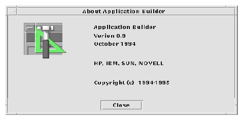
Figure 7-9 About dialog box with a More button
Generated with CERN WebMaker