


Common Desktop Environment: Style Guide and Certification Checklist
3 Drag and Drop
Contents of Chapter:
- Drag-and-Drop User Model
-
- Drag-and-Drop Feedback
-
- Type of Item Being Dragged
-
- Drop Zone
-
- Resulting Activity
-
- Success or Failure
-
- Parts of a Drag Icon
-
- State Indicator
-
- Operation Indicator
-
- Source Indicator
-
- Drag-and-Drop Mechanics
-
- Types
-
- Actions
-
- Matching Operations
-
- Determining Drag Sources
-
- Scrolling Lists
-
- Dialog Boxes
-
- Windows
-
- Dragging and Dropping a Multiple Selection
-
- Standard Supported Drop Zones
-
- The Front Panel
-
- File Manager
-
- No Drop-Only Targets
-
- Mouse Button Usage
-
- Placement upon Drop
-
- Ending a Drag
-
- Performance Guidelines
-
- Using Attachments in Your Application
-
- Attachment User Model
-
- Attachment Functionality
-
- Editing and Saving Attachments
-
- Attachment Menu Contents
-
Drag and drop enables the user to directly manipulate objects in the computing environment. This chapter discusses and provides guidelines for incorporating drag and drop into your application. If you plan to use drag and drop or attachments in your application, then you should read this chapter.
You should be familiar with the description of Motif 1.2 drag and drop as covered in the OSF/Motif Style Guide, Version 1.2. If you are not, read Section 4.3.4, "Drag Transfer," in that book. Where differences occur, this chapter supersedes the OSF/Motif Style Guide, Version 1.2.
Drag-and-Drop User Model
Direct manipulation of objects in the computing environment helps the user feel in control of the computer, which in turn helps the user feel more comfortable about trying new operations and about computers in general. It is also a more efficient method for peforming many operations.
To understand the drag-and-drop user model, you must understand the following terms:
- drop zoneAn area of the workspace that accepts a dropped icon. Drop zones are usually represented by the control or icon graphic, such as the Trash Can or the Print Manager control.
- drag iconThe composite cursor used during the drag. See "Parts of a Drag Icon" for details.
In the Common Desktop Environment, the user can select and drag icons in File Manager, mail messages and attachments in Mailer, appointments in Calendar, and text from text editors or text fields. These items can be dropped onto any drop zone that accepts them. For example, a document icon from File Manager can be dropped onto a folder icon in File Manager, onto the Print Manager icon on the Front Panel, or on the attachment list in Mailer.
When an item is dropped, some action happens with the dropped item. For example, the document might get printed, moved, or attached. The action taken depends on the object being dragged and where it is dropped.
Recommended
dq:
- You should provide a drag-and-drop (DND) method for all objects represented as icons. Provide a DND method for all elements that the user can directly manipulate. See link.
Recommended
dr:
- Any basic function that your application supports through drag and drop is also supported through menus, buttons, or dialog boxes. See link.
Drag and drop is considered an accelerator to functionality that is accessible through other user interface controls supported within your application. There should be no basic operation that is supported solely through drag and drop.
Drag-and-Drop Feedback
Visual feedback to the user is one of the critical elements for making drag and drop work. Without clear visual feedback, it is difficult for the user to predict the results of a drag-and-drop operation. Visual feedback must also be timely.
The user should be able to identify visually the following items during a drag-and-drop operation:
- Type of item being dragged--The drag icon should show the user what type of item is being dragged.
- Drop zone--The drop zone should visually indicate when the dragged item is over the drop zone, and whether the drop zone is valid or invalid for that item.
- Resulting activity--The drag icon should visually indicate what action will take place when the item is dropped.
- Success or failure--When the item is dropped, transition effects should indicate the success or failure of the drop.
Type of Item Being Dragged
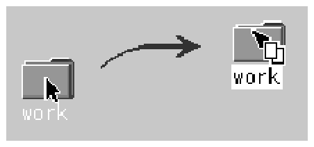
The visual feedback for drag and drop is based on the concept that what you see is what you drag. For example, if the user selects a folder icon in File Manager and starts dragging it, the drag icon should show the folder icon as part of the drag icon, as illustrated in Figure 3-1.
Figure 3-1 Drag icon showing the object being dragged
Required
dt:
- During a drag operation, your application changes the current pointer to a drag icon. See link.
Recommended
du:
- During a drag operation, your application changes the current drag cursor to include a source indicator. See link.
While this may seem like an obvious behavior, it is critical to give users feedback showing exactly what they are dragging. Providing this kind of consistency makes drag and drop more predictable to the user. Text drags are the exception in that the actual text is not dragged. Figure 3-2 shows a text drag icon.
Figure 3-2 Example of a text drag icon

Applications are responsible for supplying a graphic to be used in the drag icon. This graphic is usually one of the icons already supplied with the application, such as the 32x32 icons used in File Manager to represent documents. The graphic used depends on what is being dragged.
In cases where the user does not select an icon to start a drag, it is still appropriate to show a relevant graphic in the drag icon especially if that graphic will be used by the destination application upon drop. For example, in Calendar Appointment Editor, the user can select an appointment from the scrolling list, which does not show icons. An appointment icon is used as part of the drag icon. If the appointment were dropped on File Manager, File Manager would display the appointment using the same graphic.
Drop Zone
The user needs to know when the dragged item is over a valid drop zone. There are two pieces to this feedback; the drag icon and the drop zone. The drag icon changes from an arrow to a cannot pointer when the user moves the drag icon over anything but a valid drop zone. This behavior is sometimes referred to as drag over feedback. On the desktop, there is no differentiation between invalid drop zones and something that is not ever a drop zone. Figure 3-3 shows a sample cannot pointer drag icon.
Figure 3-3 Example of a cannot pointer drag icon

The drop zone feedback options (referred to as drag under feedback) indicate valid drop zones. The options include a solid line drawn around the site, a raised or lowered surface with a beveled edge around the drop zone, or drawing a pixmap over the drop zone. The beveled edge effect is used to make the drop zone look recessed. Figure 3-4 shows the recessed appearance. On the desktop, most drop zones use the recessed appearance when a drag icon is over the drop zone to indicate it is a valid drop zone.
Figure 3-4 Example of drop zone feedback from the Front Panel.

Recommended
dw:
- During a drag operation, your application changes the drop zone feedback to indicate a valid drop zone. See link.
Recommended
dv:
- During a drag operation, your application changes the current drag cursor to indicate invalid drop zones. It uses the standard Common Desktop Environment cannot pointer. See link.
Optional
dz:
- Any cursor change or drag-over effect your application uses occurs within .2 seconds of the mouse pointer reaching the target area and does not interfere, in any noticeable way, with the interactive performance of the drag operation. See link.
Resulting Activity
In the Common Desktop Environment, there are three operations that can be associated with the drag icon. These operations are explained in "Parts of a Drag Icon." The drag icon has alternate graphics, supplied as part of the desktop, used to indicate to the user when the operation is a copy or link. The default operation, move, requires no alternate icon graphics.
Success or Failure
The user needs an indication that the drag-and-drop operation either succeeded or failed. You should use transition effects to indicate the success or failure of the drop.
There are two kinds of transition effects: melt and snap back. The melt effect is used when the user drops a drag icon on a valid drop zone. The effect looks like the drag icon melts into the drop zone. The drag icon goes away and is replaced by whatever is appropriate for the destination application. Dropping a drag icon on the Print Manager control on the Front Panel may show nothing other than the melt in effect. Dropping a drag icon on the File Manager control would show the melt in effect followed by the icon appearing in File Manager.
The snap back effect is used when the drop fails. Drops can fail in two ways: because the drop zone is invalid, or because the data transfer fails. If the user drops a drag icon over an invalid drop zone, one that shows the cannot pointer drag icon, then the drag icon snaps back to the source application.
Once a drop occurs, the source and destination applications have to transfer the data. If the data transfer fails, there are two things that the destination application should do. The first is to indicate to the API that the drop failed so that the dropped item will get snapped back to the source application. The second is to put up an error notice to the user that clearly indicates why the drop failed and what, if anything, the user can do to correct the situation.
Sometimes the transition effect does not take place immediately. The icon appears where it is placed until the transfer is done. During this time, applications should set the cursor to the busy state. The icon cannot be moved or selected by the user until the transfer is complete; the busy cursor tells the user the transfer is in process.
Recommended
ea:
- In a collection that supports copy, move, or link operations that can be performed by dragging, the feedback presented to the user during the drag operation indicates whether a single object or multiple objects are being manipulated. See link.
Required
eb:
- After a successful transfer, the data is placed in the drop zone, and any transfer icon used by your application is removed. See link.
Required
ec:
- If your application removes data upon the completion of a drag and drop, it does so only if the drag-and-drop transfer has completed successfully. See link.
Required
ed:
- After a failed transfer, the data remains at the drag source and is not placed in the drop zone. Any transfer icon used by your application is removed. See link.
Recommended
ee:
- If the user drops an object at an inappropriate drop zone within your application's window, your application participates in the display of a snap back effect and also posts an error dialog box indicating the reason the drop was disallowed. See link.
Required
6-17:
- If your application provides any drag-and-drop help dialog boxes, they contain a Cancel button for canceling the drag-and-drop operation in progress. See link.
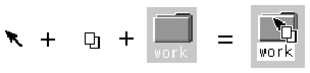
The drag icon is composed of three parts, as shown in Figure 3-5. Starting from the left, the drag icon is composed of the state indicator plus the operation indicator plus the source indicator (here shown as a folder icon). On the right is the composited drag icon.
Figure 3-5 Example drag icon showing the three parts
The state indicator is really a pointer for positioning combined with a valid or invalid drop zone indicator. The valid state indicator should resemble an arrow pointer with a hot spot so users can position the cursor in a predictable manner. The invalid state indicator, a cannot pointer (illustrated in Figure 3-3), appears when users are over an invalid drop zone.
Operation Indicator
The second part of the drag icon is the operation indicator. A drag operation can be a move, copy or link.
- move
- The item being dragged is moved to the destination.
- copy
- The item is copied to the destination.
- link
- A connection is retained between the destination and the source. This operation is defined to some extent by the application and is not commonly used.
See "Actions" to see how move, copy, and link map to user actions.
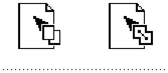
The operation indicator gives the user feedback on what operation is occurring during the drag. Figure 3-6 shows the copy and link feedback. Because most drags are move operations, an operation indicator is added to the drag icon only for copy or link operations.
Figure 3-6 Examples of copy (left) and link operation indicators
Note: Operation feedback is drawn on top of the state and source feedback. This is basic Motif behavior.
The user can force a drag to be a move, copy or link by pressing certain keys during a drag (Shift = move, Control = copy, and Shift+Control = link).
The source application can also force a copy. When the user forces an operation, the drop zone should match that operation for the drop to succeed; otherwise the drop zone should indicate the operation is invalid.
Required
4-36:
- If the move, copy, or link operation the user requests is not available, the transfer operation fails. See link.
Required
4-55:
- In a collection that supports selection, Shift+BTransfer Release or Shift+BSelect Release forces a drag move operation. If a move is not possible, the operation fails. See link.
Required
4-56:
- In a collection that supports selection, Control+BTransfer Release or Shift+BSelect Release forces a drag copy operation. If a copy is not possible, the operation fails. See link.
Required
4-57:
- In a collection that supports selection, Control+Shift+BTransfer Release pr Shift+BSelect Release forces a drag link operation. If a link is not possible, the operation fails. See link.
Recommended
s:
- In a collection that supports selection, if BTransfer Motion (or BSelect Motion) results in the start of a drag operation, feedback is presented to the user that indicates that a copy, move, or link operation is in progress. Whether the operation is a copy, move, or link depends on the type of object created at the drop zone and whether the source object is removed. See link.
Recommended
t:
- In a collection that supports selection, if Control+BTransfer Motion or Control+BSelect Motion results in the start of a drag operation, feedback is presented to the user that indicates that a copy operation is in progress. See link.
Recommended
u:
- In a collection that supports selection, if Control+Shift+BTransfer Motion or Control+Shift+BSelect Motion results in the start of a drag operation, feedback is presented to the user that indicates that a link operation is in progress. See link.
Source Indicator
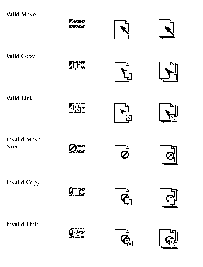
The source indicator is a representation of the selection (or the thing being dragged). It comes in several versions depending upon whether the selection represents single or multiple items and what kind of thing the selection is representing. Table 3-1 shows examples of drag icons.
Note: Since the drag icons are dynamically composited as cursors, screen shots cannot be taken; therefore, Table 3-1 is an approximation of what is seen on the screen and may not be completely accurate.
The hot spot is located on the top left corner (1,1) for the text drag icons. The hot spot for the single and multiple drag icons is located at the top left pixel of the invalid icon (3,3). Each drag icon has been tuned to increase user accuracy at targeting and positioning.
Table 3-1 The possible drag icons shown with generic source indicators
Drag-and-Drop Mechanics
There are several areas of the underlying application architecture that are useful to understand when designing drag and drop.
- What type of object is being dragged.
- What action takes place when the object is dropped.
- How to match operations between source and destination applications.
In the Common Desktop Environment, there are three types of draggable objects: files, buffers, and text selections.
Each application has its own objects that can be dragged and dropped. For example, Calendar uses appointments, Mailer uses mail messages, and File Manager uses folders and files. The folder and file icons in File Manager exist as separate entities in the underlying file system and are, therefore, treated as files when dragged and dropped. However, Calendar appointments and Mailer messages do not exist as separate entities in the file system. When these objects get dragged they are treated as buffers.
This difference can lead to some conflicts for the user. The user sees both of these types of objects as the same--both can appear as icons and both can be manipulated separately from other similar objects. Yet, due to the implementation, the user may see different results from a drag-and-drop operation based on which type of object is being manipulated.
Text selections fall into a different category because selecting a piece of text is very different to the user than selecting an icon. The user selects a range of text in a document window; the text does not represent the whole document, it only represents a piece of a document. Rarely does a user see the piece of text as a distinct object and the user does not expect a piece of text to behave like an icon when dropped. For this reason, the drag-and-drop model for text mirrors the cut, copy, and paste operations available from the Edit menu.
There are two actions that can take place when an object is dropped: insert or load.
The insert action inserts the dropped object into the destination, adding it to the current data in the application or document. The object is inserted when a user schedules an appointment, prints a document, attaches a document, pastes text, or appends a mail message. Such an action is a move or copy operation depending on the destination and the user. The user might decide to copy a piece of selected text, as opposed to moving it. The drag icon should indicate whether the operation is a copy or move.
The load action operates the same as if the user had chosen Open from the File menu, selected a file, and clicked the Open button. The dropped object gets loaded into the application. The user can edit it and save changes back to the original file. Load only works with files at this time, not with buffers or text. The user should see the copy drag icon when dragging an object over a drop zone that supports the load action.
Load does work with buffers; however, buffers are loaded as read-only. See the section on "Attachment User Model" for more details.
Matching Operations
When designing how drag and drop works in an application, you must understand how Motif figures out what operation gets done when the source and destination of a drag and drop don't match.
For each drag source, an application advertises which drag-and-drop operations are possible and on what destinations it can be dropped. For each drag destination, the application advertises the possible sources and the types of operations. If a source and its destination have two or more operations in common, Motif follows a specific order to determine which operation to use. That order is move, copy, link. The application cannot change the operation that is accepted based on the type of thing being dragged.
For example, application A might advertise that an element can be moved or copied. Application B advertises that the destination accepts copy or link. The intersection in this example is copy. If the destination in application B accepts move or copy, then the source is moved because the move operation comes first in the operation order.
In this example, the user could override the move operation by holding down a modifier key, for example the Control key to make the operation a copy. This will work if the copy operation is in the common set of operations. If the copy operation is not in the common set, then the drag becomes an invalid drag.
The only time matching operations may be a consideration is when you have a destination that could accept moves but prefers copies. In that case, the destination is better off only accepting copies.
It is wise to always accept copy. Accepting copy broadens the scope of acceptable drops. In most cases where a move is accepted, a copy would work just as well. Remember, move is implemented as a copy followed by a delete.
Determining Drag Sources
When you decide to use drag and drop in an application, you must decide what control elements can be dragged and how that element is to be represented. Typically, the user selects something like text or a file to drag, but the application may have other elements for which drag and drop may make sense, such as mail messages or appointments.
This section provides general guidelines for determining drag sources and then talks about specific elements that can be dragged.
Note: Drags are only sourced from human interface elements that have selectable components or items. Drags cannot be sourced from static labels like those on buttons or menus.
Before you decide on a drag source from your application, you must consider how the drag is to be integrated into the selection mechanism of your application. The user must be able to select or drag without any confusion as to the result of that action.
Required
4-58:
- When a drag move operation moves a selection within the same component, the selection moves along with the elements selected. See link.
In other words, when selected elements are moved with a drag operation, they should stay selected after the move. This mechanism offers a convenient way to move the selection within a component.
Required
4-59:
- In text-like collections, initiating a drag within a selected region drags the entire text selection. See link.
Required
4-60:
- In list-like and graphics-like collections, initiating a drag with either BSelect or BTransfer on a selected element drags the entire selection. See link.
To be consistent, drag-and-drop actions need to operate on the entire selection.
Required
4-61:
- In list-like and graphics-like collections, initiating a drag with BTransfer or BSelect on an unselected element drags just that element and leaves the selection unaffected. See link.
Required
4-62:
- When a drag is initiated in an unselected region and the pointer is over two possible draggable elements, the drag uses the draggable element highest in the stacking order. See link.
Required
4-67:
- When BTransfer (or BSelect) is released, the drop operation ordinarily occurs at the location of the hot spot of the drag icon pointer and into the highest drop zone in the stacking order. However, if a drop occurs within a selection and pending delete is enabled, the transferred data replaces the contents of the entire selection. See link.
Scrolling Lists
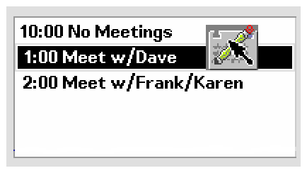
In the Common Desktop Environment, items in a scrolling list are text objects by default. They can be buffer objects, but they cannot be both text and buffers. For example, the Calendar Appointment Editor has a scrolling list of appointments that the user can select and drag. When the user drags an appointment, they are manipulating a buffer and the drag icon shows an appointment icon as the source indicator, as shown in Figure 3-7. A Mailer container window has a list of mail messages in the upper portion of the window. Users can select and drag one or more messages from this list. These messages are actually buffers and the drag icon shows a mail message as the source indicator. If multiple mail messages are dragged, then the drag icon shows the multiple source indicator.
Figure 3-7 Example of a scrolling list with an item selected for dragging
If your application uses a scrolling list to show mail message headers or list other kinds of objects, then you need to integrate dragging with extended selection. this behavior can be seen in the Mailer application.
Required
k:
- In a collection that uses range selection, pressing BSelect on an unselected element sets an anchor on the element, or at the position where BSelect was pressed, and deselects all elements in the collection. If BSelect is released before the drag threshold has been exceeded, then the element under the pointer should be selected. If BSelect Motion exceeds the drag threshold, then a new selection should begin. The anchor and the current position of the pointer determine the current range. As BSelect is dragged through the collection, the current range is highlighted. When BSelect is released, the anchor does not move, and all the elements within the current range are selected. See link.
Required
l:
- In a collection that uses range selection, pressing BSelect on an currently selected element should not cause all other elements in the selection set to be deselected. If BSelect is released before the drag threshold is exceeded, then, at that point, all other elements should be deselected and the element under the pointer should remain selected. If BSelect Motion exceeds the drag threshold, then no element should be deselected and a drag operation should begin. See link.
Dialog Boxes
Sometimes an application needs to be able to drag from inside a dialog box. For example, in the Calendar Appointment Editor, there are a series of text fields on the left side where the user enters information about an appointment. Allowing drags from this area lets the user drag text from the appointment description.
Figure 3-8 Example Calendar Appointment Editor dialog box
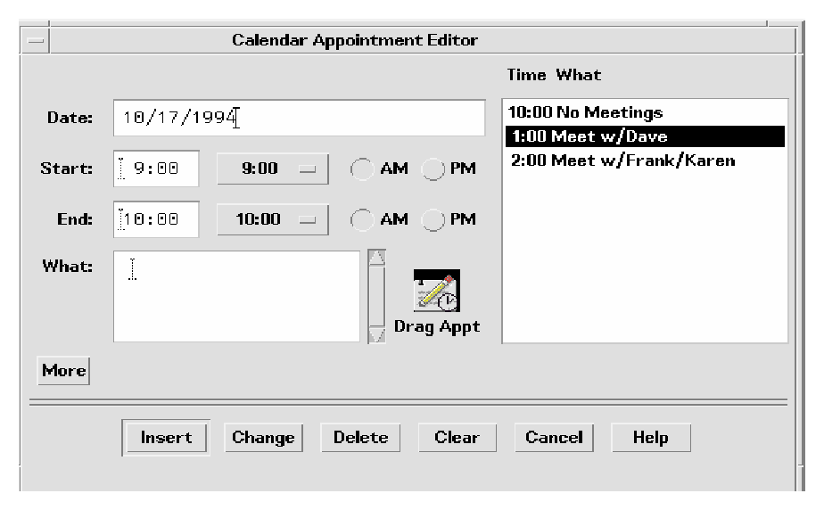
The recommended method for indicating that something can be dragged is to include an icon graphic in the dialog box. The icon graphic should be draggable. This icon graphic must be the same icon used to represent the data in File Manager. In Calendar, the appointment icon is shown just as it would appear in File Manager (see Figure 3-8), with a label under it. This is the same icon used in the drag icon source indicator.
Place the icon graphic in the dialog box adjacent to the information to be dragged. The upper right corner of the dialog box or window is the default position, but it can be changed depending on the application. In Calendar Appointment Editor, the icon is placed near the main text field to indicate that you can drag the text fields.
Recommended
ds:
- Use an icon graphic in a dialog box or window to indicate that objects within the dialog box or window can be dragged. Use the same icon graphic used to represent the draggable object in File Manager. Place the icon adjacent to any display of the contents of the object, if such display exists. If there is no such display, place the icon in the upper right corner of the dialog box or window, unless a more suitable placement is determined. The icon should be 32x32 in size and have a label under it. The label should indicate what kind of object the icon graphic represents. The icon graphic should also be used as the source indicator in the drag icon. See link.
Windows
In some applications, you may want to allow the user to drag the entire document or file. For example, in Icon Editor, it might make sense to allow the user to drag the file for the icon currently in the editor. The application should indicate to the user that the document or file can be dragged by incorporating an icon graphic in the window of the application. The icon graphic should be draggable. In the case of Icon Editor, one of the icons used for displaying the contents of the icon file could be used for the drag. The icon should follow the guidelines for an icon used in dialog boxes; that is, it should be the same icon used to represent the document in File Manager, be 32x32 pixels, have a label, be placed adjacent to the data being dragged, and be used as the source indicator in the drag icon.
Dragging and Dropping a Multiple Selection
When the user selects more than one item to be dragged, the drag icon should change to indicate there is more than one item selected.
Some drop zones may be able to accept only a single item. It is not possible for a drop zone to differentiate between a single and a multiple set of items being dropped. The drop icon does not display the cannot pointer; instead the items should melt in and then be snapped back by the destination application. The snap back should be followed by an error notice that tells the user why the drop failed.
Recommended
ef:
- Applications that accept only single items should reject all multiple-item drops. See link.
There is no consistent method to determine which of the selected items the user really wants to drop.
Standard Supported Drop Zones
The standard supported drop zones in the Common Desktop Environment are Front Panel controls, open windows, and folder, action, and certain other icons in File Manager. Dropping on minimized icons and on File Manager icons that do not support drops are not supported in the Common Desktop Environment.
The Front Panel
The Front Panel is a collection of controls and other functions put together for easier and faster access for users. As a consequence, its drag and drop behaviors are heavily dependent upon the context of the destination. For example, if the destination is a printer, then print it. If the destination is a subpanel, then install it. Most applications will not vary in behavior quite as broadly as the Front Panel.
File Manager
File Manager for the Common Desktop Environment allows users to drop icons on the desktop. The icon on the desktop becomes a reference. The creation of the reference and resulting behaviors are not consistent with the future user model for the Common Desktop Environment. Until the user model and architecture are further specified, developers are not encouraged to do any drops onto the desktop or to copy the File Manager behavior.
Within File Manager windows, File Manager allows dropping onto icons other than folders and action icons for the Common Desktop Environment 1.0. For example, dropping a mail message icon onto a mail container icon appends the mail message.
When mail messages or calendar appointments, or other buffers are dragged from the source application and dropped onto File Manager, they must be named. The underlying API supports a name field for the item being dragged. This name should be used as the name of the buffer. The name should be determined in a manner consistent with the application from where it came. If there is no appropriate name, as in dropping a text selection in File Manager, File Manager should name the resulting file "unnamed". If there is a name conflict, File Manager should put up a dialog box and ask the user to rename the dropped file.
No Drop-Only Targets
The Common Desktop Environment does not support the concept of a specific control or graphical target used only for drops. Any control in the human interface that has selectable items can be dropped upon and should provide drop zone feedback. This includes data panes, scrolling lists, and text entry fields. The operation that takes place upon the drop should be consistent with the users expectations for that application type.
Mouse Button Usage
In the Common Desktop Environment, the user can modify mouse mappings to accommodate different working styles. BSelect has been modified to support drag and drop in addition to BTransfer, which has been used historically for Transfer operations in Motif.
Users can set up their systems to use Bselect or BTransfer to perform drag and drops, or use BSelect only. Consider this when you design your application. Check how the user has set the mouse button mappings and use those mappings.
Required
p:
- Your application supports the use of mouse button 1 to perform drag-and-drop operations. See link.
In Motif 1.2, drag and drop is typically performed using button 2 on a three-button mouse (BTransfer). However, in the Common Desktop Environment environment, mouse button 1 (BSelect) should be supported for drag and drop to support mouse usage compatible with other graphical user interface (GUI) environments. A drag can be initiated with either mouse button 1 or mouse button 2.
Required
q:
- When button 2 of a three-button mouse is configured to operate as BAdjust, your application does not perform any BTransfer operations when clicking mouse button 2. See link.
On a three-button mouse, button 2 is typically used for the BTransfer (or BSelect) function. However, in a Common Desktop Environment environment, the user can change an environment setting indicating that mouse button 2 should be used for the BAdjust function instead. When this is the case, BAdjust click should not result in the transfer of any data.
Required
r:
- BSelect should always initiate a drag if the drag is started on a selected item. The drag starts once the drag threshold has been reached. This is true for text regions, scrolling lists, and other similar elements. See link.
Placement upon Drop
From the user's point of view, the placement of the dropped item is dependent on the task the user is doing and the application or context the task is in.
In File Manager, if the default is set to As Placed, then icons are placed where they are dropped. If the default is set to Sorted Grid, then a dropped icon is automatically sorted and then placed, which means it may not be placed where the user drops it.
In some cases, where the dropped item gets placed is not a criteria. For example, Front Panel controls require only that the dragged item be over the control to activate the drop zone.
In the Compose window in Mailer, the placement depends on what is being dropped. If the user is dragging a piece of text, then the text is inserted at the drop point. From user testing, this is what users expect. If the user drops an icon, a file or a buffer, then the contents are included at the insertion point. This mirrors the behavior the user gets when the user selects a file from the Include File Selection Box.
You should determine appropriate behavior for your application based on what type of tasks the user is doing.
Required
4-37:
- If a collection does not have a fixed insertion point or keep elements ordered in a specific way, the insertion position for transferred data is determined as follows: See link.
- For BTransfer-based (or BSelect) primary and drag transfer operations, excepted as noted below for text collections, the insertion position is the position at which the user releases BTransfer (or BSelect).
- In a text-like collection, when the user drops selected text, the insertion position is the position at which the user releases BTransfer (or Bselect). When the user drops an icon, the insertion position is the text cursor and the data is pasted before it.
- In a list-like collection, the insertion position for other transfer operations is the element with the location cursor, and the data is pasted before it.
- The insertion position is the position in the destination where transferred data is placed. Some mouse-based transfer operations place data at the pointer position if possible. Other operations, including keyboard-based transfer, generally place the data at the location cursor.
Ending a Drag
The following two items allow users to stop a drag operation without any data loss or other negative result.
Required
dx:
- Pressing Cancel ends a drag-and-drop operation by canceling the drag in progress. See link,
Required
dy:
- Releasing BTransfer (or BSelect) when not over a drop target ends a drag-and-drop operation. See link.
Performance Guidelines
There are several points during a drag-and-drop operation that the timing and response to the user is critical. The responsibility for ensuring optimal performance belongs to the source and destination applications, as well as the Motif Drag-and-Drop API and Drag-and-Drop Convenience API.
The following time line explains the individual user steps and system responses in a drag-and-drop operation. The suggested guideline for interaction timing is noted after the relevant step.
- The user makes a selection. The pointer is over the selected object. The user presses and holds down the mouse button.
- The user starts to move the pointer. The user should be able to move the pointer 10 pixels before a drag is initiated. If the user is pressing BTransfer, there is no drag threshold.
- The pointer changes to a drag icon when the drag is initiated.
Movement Latency: The latency from hand movement to drag icon display should be less than 50 msec. with a maximum limit of 70 msec.
- The user drags over a drop zone, crossing the boundary line with the hot spot on the drag icon.
- The drag icon changes to the cannot pointer if it is not over a valid drop zone. The drop zone becomes highlighted if it is a valid drop zone.
Movement Latency: The latency from hand movement to drag icon display should be less than 50 msec. with a maximum limit of 70 msec.
- The user drops the drag icon on the drop zone.
- If the drop zone is not valid, the drag icon is snapped back to the source using the snap back transition effect.
- If the drop zone is valid, the drag icon is melted into the destination using the melt in transition effect.
Echo Latency: The display latency from mouse button release to feedback echo should be less than 50 msec. with a maximum limit of 120 msec.
Snappy Transitions: Transitional animations should run from 200 to 350 msec. with a maximum limit of 500 msec. The animation should run at the same speed regardless of hardware conditions.
- The destination application starts the data transfer.
- A message is displayed to the user indicating data transfer has started.
- Progress is indicated by further messages.
- The completion of the data transfer is indicated to the user.
- If the data transfer fails, it is up to the destination application to provide the user with appropriate feedback as to why it failed.
Command Latency: The latency from command invocation (drop occurred) to completion should be in the range of 0.3 to 1 second with a maximum of 2 seconds.
Busy Feedback: When a command may run longer than 2 seconds, display a busy cursor whenever the cursor is over the busy object. When possible, display partial results. The progress indicator or busy cursor should be displayed in less than 0.5 second.
Progress Indicators: A status message or an In Progress *messagebox* should be displayed upon completion of the transitional animation indicating the data transfer is taking place. For example: Data transfer is 10% complete. This message can then be updated every 2 to 3 seconds until the transfer is 100% complete.
Notice: If the data transfer fails, a message should appear, either in the status area or in an In Progress *messagebox*, indicating why the drop failed and what the user can do about it, if anything.
Using Attachments in Your Application
This section discusses the user model and guidelines for attaching documents to documents in the Common Desktop Environment 1.0. This functionality can be seen in the Mailer software application. If you plan to include an attachment list in the interface of your application, then you should read this section.
Note: This set of guidelines is not a description of an embedded document architecture.
For the Common Desktop Environment, attachment and attachment list are defined as follows:
- attachmentSuppose you had two documents called A and B. If a document, A, is attached to another document, B, then A continues to exist as a separate document that is "carried" by B. A is shown as an icon within B. A can be opened and viewed independently and can be detached from B at a later time, as if never attached at all.
- attachment listThe area in which attachments are displayed. Should be scrollable and include room for showing icon labels.
Note: Users do not think of a document that has several attached documents as a container. Containers are an implementation concept that should not appear in the attachments human interface. For that purpose, the term container should not be used to describe attachments to the user. (It may be an appropriate term elsewhere.)
Attachments are shown as icons where they are attached. These icons are the same icons as those used in File Manager and other places in the Common Desktop Environment. The basic rule of behavior is that if the same icon is used in File Manager as in an attachment, then every effort should be made to make the two behave the same in every situation.
There are three levels of functionality for attached documents:
- Ability to attach and detach documents
- Ability to open, view, and quit an attached document in a separate window
- Ability to edit the attachment in a separate window and save changes back to the attached document
The goal is to provide Level 3 functionality whenever possible. If an attachment cannot provide this level, then it should degrade its level of functionality in the steps shown. This section is written assuming Level 3 functionality.
If a document provides significantly different functionality as an attachment from that provided as a File Manager icon, then provide a different icon for the attachment to clearly indicate to the user the difference in functionality.
Attachment Functionality
To incorporate attachments into an application, several issues should be considered.
What Can Be Attached?
You should determine for each application what items it can attach. For example, Mailer can attach documents, scripts, and applications, but not folders.
What is the Method for Attaching?
There are two methods of attachment, through the file selection dialog box that comes up when you choose Add File from the Attachment menu, and through drag and drop from File Manager or another application.
Recommended
eh:
- Drag and drop should not be the only method for attaching objects. See link.
Recommended
el:
- When the user chooses something to attach from the file selection dialog box that is not an attachable item, then the user receives an error message explaining why the chosen item cannot be attached. For example: See link.
The folder "My.Stuff" cannot be attached because it is a folder.
Only documents, applications, and scripts can be attached.
Recommended
ej:
- When the user attempts to drop something into the attachment list that is not attachable, then the drop fails and the item is snapped back to its source. See link.
What Happens When Something Is Attached?
The act of attaching document A to document B copies the bits of document A into document B. There is no further connection with the original file. If the user opens the attached document and makes changes, the changes are saved back to the attached document only, not back to a file in the file system.
Attachments in Attachments
Users can attach messages or text files that have attachments inside them. This is sometimes referred to as "nesting". The user reading the text file would perhaps see a mail message icon that the user could then open, which may have a text message and more attachments.
Editing and Saving Attachments
The user should be able to open an attachment, edit it, and save the changes back to the attachment. If the attachment does not have the ability to do this, then the Open action should not appear in the Actions portion of the menu when that attachment is selected and double-clicking should not open the attachment.
Recommended
ei:
- Double-clicking is a shortcut for selecting the attachment and choosing the Open menu item for attachments and should never be the only way to access attachments. See link.
Recommended
ek:
- When the user has one or more attachments open for editing and attempts to do any operation that would result in potentially losing the user's edits, the user should be clearly warned and given the opportunity to save changes. See link.
Executing Attachments
If the user tries to open or double-click on an executable attachment, then there may be times when the user should be asked to confirm this operation. Both the name of the attachment and the name of the action being taken on the attachment should be variables. An example error message follows:
"Invitation" is an executable attachment. Do you want to Run it?
Buttons: Run, Cancel, Help
Read-Only Attachments
Read-only attachments can be opened for reading only. This state should be indicated to the user by inactivating the menus in the attachment application, inactivating the selection cursor, or some other obvious method. At a minimum, the Save menu item in the attachment application should be dimmed.
Drag Load and Attachments
Drag load can be accomplished in two ways. In applications that directly support drag load, users can drag an icon, from File Manager, over the open window for that application and drop it which loads the file represented by that icon. The same result can be accomplished by dropping an icon onto an action icon. The action starts an editor, which then loads the file represented by the icon. When an icon from File Manager is drag loaded, it is equivalent to choosing Open from the File menu. The open file can be edited and saved.
In the case of attachments, users can drag and drop an attachment onto editors or actions that support drag load but any edits made are not saved back to the attachment. Attachments, which are implemented as buffers, are loaded as read only data.
When the user tries to save changes to a loaded attachment, the editor displays a file selection dialog box and asks the user to confirm the name and to choose a place in the file system to save the file. The name used in the file selection dialog box is the same as the attachment name. If the editor (command line application) cannot bring up a file selection dialog box, then it should clearly and visibly indicate to the user that the loaded file is read-only.
If the user wants to edit the attachment directly, the user must select the attachment in the attachment list, choose Open from the Attachment menu or double-click on the attachment. This opens the attachment in a manner that allows for editing and saving changes.
Another option is to drag load an attachment, edit it, save it to a new file name, and replace the old attachment with the new one manually.
Attachment Menu Contents
Recommended
bw:
- If your application uses an attachment menu, it contains the following choices, with the specified functionality, when the actions are actually supported by your application. See link.
Recommended
Add File...
- Selects files and other items to be attached. A file selection box is displayed allowing the user to select the desired files to attach. The default button in the file selection box is Attach. See link.
Recommended
Save As...
- Saves the currently selected attachments. The user is prompted with a file selection dialog box for indicating where in the file system the attachments are to be saved. When multiple attachments are selected, the name field is inactive and the current names of the attachments are used as the name of the new file. This menu item is active only when one or more attachments are selected. See link.
Recommended
Rename...
- Renames the attachment icon. The application should provide in-line renaming of attachment icons, such as File Manager uses. If the application cannot provide in-line renaming, then Rename allows the user to rename an attachment by displaying a dialog box, requesting the name from the user. This menu item is active only when a single attachment is selected. It is not active when multiple attachments are selected. See link.
Recommended
Delete
- Deletes attachments from the attachment list. This menu item is active only when an attachment is selected. See link.
Recommended
Select All
- Selects all the attachments in the attachment list. See link.
Generated with CERN WebMaker