| Previous | Contents | Index |
As compared to using Xlib routines, the Toolkit simplifies the task of creating a user interface. For example, you can create a menu with a call to one Toolkit routine. Creating the same menu using Xlib routines requires many more calls and program lines. Using Toolkit routines also ensures that an application interface conforms to the DECwindows Companion to the OSF/Motif Style Guide.
You can use the Toolkit for the majority of your application programming. However, there are several instances that require you to use Xlib routines:
This section describes programming considerations for using the Toolkit, including the following topics:
You create a user interface for your application by arranging widgets in a widget hierarchy based on parent/child relationships. Parent widgets control the behavior and appearance of their children. In turn, their children can have children. This layering of parent/child relationships creates the application widget hierarchy.
The application widget hierarchy should not be confused with the widget class hierarchy. The application widget hierarchy defines the parent/child relationship of widgets in a user interface. The widget class hierarchy defines the subclass/superclass relationship of the widgets in the Toolkit. The widget class hierarchy determines which attributes a widget inherits from its superclass and which attributes are unique to a particular widget class.
When you design your application hierarchy, it is a good idea to work
down from the top of your application hierarchy so that you know in
advance which child widgets a parent widget supports. Also, not every
Toolkit widget can be a parent. Widgets are either composite
widgets or primitive widgets. Composite
widgets can be parents or children of other composite widgets;
primitive widgets can be only children.
1.4.2 OpenVMS DECburger Application Hierarchy
To understand the concept of an application hierarchy in the context of an application, consider the example of the OpenVMS DECburger main window, as shown in Figure 1-2.
Figure 1-2 The OpenVMS DECburger Widget Hierarchy
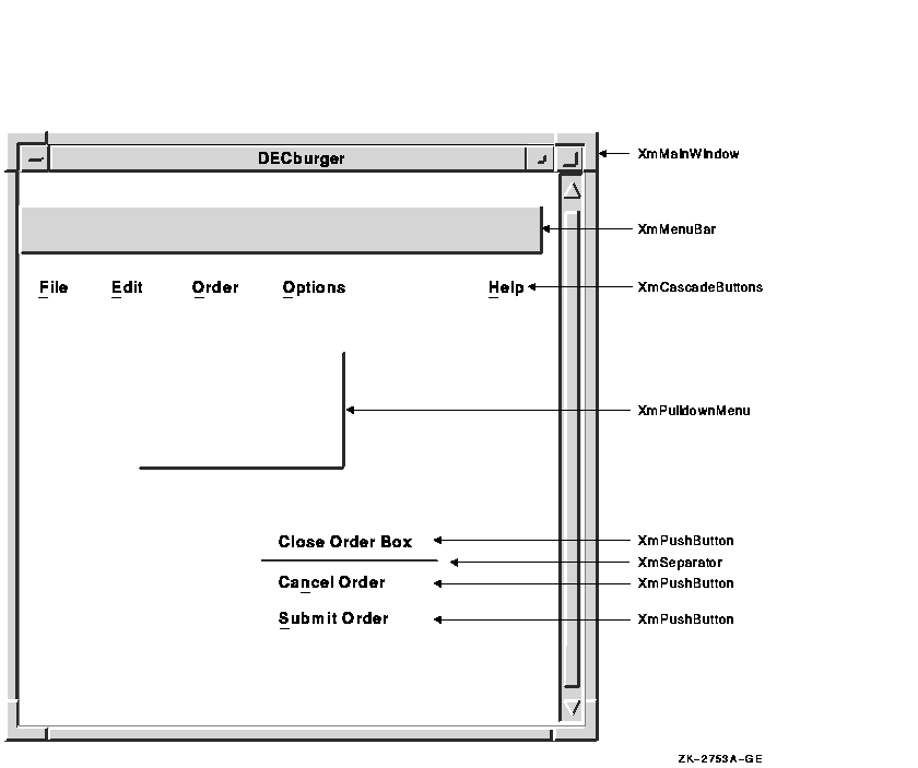
At the top of the application widget hierarchy of the DECburger program is the application shell widget. The application shell widget acts as the mediator between the application program and the workstation environment in which the application runs. Every application must have a shell widget at the top of its application widget hierarchy.
The main widget of the DECburger application is an XmMainWindow widget. This widget is the child of the application shell widget (an application shell widget can have only one child). The XmMainWindow widget has two children, an XmMenuBar and an XmScrolledList (not shown in the figure). The XmScrolledList widget creates the scroll bar.
The XmMenuBar widget creates a blank menu bar. To add menu entries to the menu bar, the XmMenuBar widget has four XmCascadeButton widget children: File, Edit, Order, and Help. (In the case of a color system, DECburger has a fifth XmCascadeButton for customizing colors.)
The XmCascadeButton widgets use pull-down menus to present choices to the user. Therefore, each XmCascadeButton widget controls one XmPulldownMenu widget child.
The XmPulldownMenu widgets create empty pull-down menus. To control the contents of the pull-down menus, the XmPulldownMenu widgets have XmPushButton gadget children. For example, the Order XmPulldownMenu widget controls three XmPushButton gadgets (Dismiss, Cancel, and Submit) and a separator gadget.
The XmPushButton gadgets do not support children.
1.4.3 Form Versus Function
The fundamental concept of programming with the Toolkit is the separation of form and function. Using the Toolkit, you can consider the form your application takes---its user interface---separately from the routines that implement the functions of your application.
The form of an application defines its appearance, not how it functions. You can consider the form of an application to be its facade; your application's function routines provide the support structure.
This separation lets you create applications by using widgets and groups of widgets as building blocks; once you create widgets, you group them together in different combinations to build applications. From a programming perspective, it takes less time to modify an existing widget than to create a new one.
For example, you can create an XmPushButton widget without having to specify what happens when a user clicks MB1 on the button, as shown in Example 1-2.
| Example 1-2 Form Versus Function |
|---|
object
        do_button : XmPushButton {

            arguments {
                XmNlabelString = compound_string("do label");
                XmNaccelerator = compound_string("do label");
                XmNacceleratorText = compound_string("do text");
                XmNmnemonic = keysym("D");
            };

            callbacks {
                XmNactivateCallback = procedure do_proc();
            };
        };
|
This UIL code fragment creates an XmPushButton widget but does not specify what happens when a user clicks MB1 on this button. Widgets use callback routines to specify what happens when a particular action or set of actions occurs. (Callbacks are described in more detail in Section 1.4.4.)
The application's activate routine (in this case do_proc) is called when a user clicks MB1 on the push-button widget. This routine determines what action the program takes as a result of the button being pressed.
Because the push-button widget is not inherently tied to a function, you can use this code fragment wherever you need a push button and change the activate callback procedure as needed. For example, by changing the label string and activate callback associated with the push button, you could use this push button as an OK, Cancel, or Apply push button.
You could also use the generic pull-down menu created in Example 1-3 and then modify this menu as needed.
| Example 1-3 Form Versus Function---Generic Pull-down Menu |
|---|
object
    my_menu : XmPulldownMenu {
        controls {
            XmPushButton do_button;
            XmPushButton clear_button;
            XmPushButton save_button;
        };
        callbacks {
            MrmNcreateCallback = procedure create_proc (k_my_menu);
            XmNhelpCallback = procedure sens_help_proc(k_my_menu);
        };
    };


object
        do_button : XmPushButton {

            arguments {
                XmNlabelString = k_do_label_text;
                XmNaccelerator = k_do_accelerator;
                XmNacceleratorText = k_do_accelerator_text;
                XmNmnemonic = keysym("D");
            };

            callbacks {
                XmNactivateCallback = procedure do_proc();
            };
        };


object
        clear_button : XmPushButton {

            arguments {
                XmNlabelString = k_clear_label_text;
                XmNaccelerator = k_clear_accelerator;
                XmNacceleratorText = k_clear_accelerator_text;
                XmNmnemonic = keysym("C");
            };

            callbacks {
                XmNactivateCallback = procedure clear_proc();
            };
        };

object
        save_button : XmPushButton {

            arguments {
                XmNlabelString = k_save_label_text;
                XmNaccelerator = k_save_accelerator;
                XmNacceleratorText = k_save_accelerator_text;
                XmNmnemonic = keysym("S");
            };

            callbacks {
                XmNactivateCallback = procedure save_proc();
            };
        };

   .
   .
   .
|
Once you create this pull-down menu, you can use it without change, or modify it to suit the needs of your applications. You could, for example, change the push buttons' labels to Clear and Cut and modify their activate callbacks accordingly.
The building block approach is not unique to UIL; you could also create these widgets with the Toolkit routines and use them as needed. |
When a user invokes a DECwindows application program, the application's initial user interface appears on the display. The application then waits in an infinite loop for the user to interact with its interface. Applications running in the DECwindows environment perform their functions only in response to user interaction with the interface.
When a user of your application uses the mouse or keyboard to perform an action, that action causes a change in the state of the widget. Each widget supports a specific set of such changes in its state that cause it to notify an application. This flow of data from the interface to the application at run time is accomplished through the callback mechanism. The callback mechanism provides a one-way path of communication from the interface to the application. This is the primary means an application has of getting input from its interface.
A widget can define one or more callbacks, depending on how many changes in its state it is willing to communicate. Each particular set of user actions that triggers a callback is called a reason. When a change of state in the widget triggers a callback, your application executes the routine you have associated with the widget. This routine is called a callback routine. In this way, you associate the routines that implement the functions of your application with the widgets that make up the user interface of your application. You can associate more than one callback routine with a single callback reason. When there is more than one callback routine, the routines are executed in the order in which you specify them.
Note that reasons are not actions in the way that "MB1" is an action. Reasons represent a more abstract concept, such as "activate". For example, the push-button widget defines the MB1 down/MB1 up sequence of events as the activate callback reason.
The X Window System, on which the Toolkit is based, defines an action
(such as MB1 up) that occurs in a window as an event.
The server is responsible for noting when an event occurs in a window.
In general, an application that uses Toolkit widgets need not be
concerned with events. Toolkit widgets automatically notify
applications when the event or sequence of events the widget defines as
a reason occurs.
1.4.5 Using Widget Attributes in Applications
Every Toolkit widget supports a set of attributes you can use to customize aspects of its appearance and function. A subset of these widget attributes is supported by every Toolkit widget. These are called common widget attributes. In addition, most widgets support their own unique attributes. The OSF/Motif Programmer's Reference describes the complete set of attributes that each widget supports.
All widgets support the following basic types of attributes:
The sections that follow briefly describe programming considerations
for using widgets in applications. See the OSF/Motif Programmer's Guide for additional
information.
1.4.5.1 Size and Position Attributes
All widgets support size and position attributes. Table 1-1 lists these attributes.
| Attribute | Description |
|---|---|
| XmNwidth | Specifies the width of the widget. |
| XmNheight | Specifies the height of the widget. |
| XmNx | Specifies the x-coordinate of the upper left corner of the widget. |
| XmNy | Specifies the y-coordinate of the upper left corner of the widget. |
Note that, while you can specify the size and position of a widget
using these attributes, for many widgets it is preferable to let the
widget define its own size and position in the context in which it is
used. The size and position of a widget is controlled by its parent. A
child can request to be a certain size, but its parent makes the final
decision. Parent widgets must weigh the sizing and positioning needs of
their other children. In addition, parent widgets are children
themselves and must negotiate their space requirements with their
parent. This negotiation between parent and child for display space is
called geometry management.
1.4.5.2 Appearance Attributes
All Toolkit widgets support attributes that specify aspects of their appearance. Many of these attributes are unique to each widget. For example, the XmPushButton widget appears on the display with a shadow to give a three-dimensional impression. However, you can create push-buttons with a different shadow thickness by setting the push-button widget XmNshadowThickness resource to a value other than the default of 2.
If you do not set an appearance resource of a widget, the Toolkit uses
a default value. The default values for widget attributes create
widgets that conform to the recommendations of the OSF/Motif Style Guide.
1.4.5.3 Callback Attributes
All Toolkit widgets support attributes that let you associate callback routines with their callback reasons. For example, Table 1-2 lists the callback attributes supported by the XmPushButton widget.
| XmNactivateCallback | Callback performed when a user clicks MB1 inside the push-button widget |
| XmNarmCallback | Callback performed when a user holds down MB1 inside the push-button widget |
| XmNdisarmCallback | Callback performed when a user moves the pointer cursor off the push-button widget without releasing MB1 |
| XmNhelpCallback | Callback performed when a user presses the Help key and clicks MB1 in the push-button widget |
| XmNdestroyCallback | Callback performed when a push-button widget is destroyed |
When you create a widget, the Toolkit determines the initial settings of widget attributes by checking the following sources:
The Toolkit first checks the argument list for resource values. You assign values to widget attributes when you create the widget using Toolkit routines or UIL/MRM. If you have specified any resource values in an argument list, the Toolkit assigns these values to the widget when it creates it.
For any attribute to which you do not assign a value, the Toolkit retrieves a default value from a database of resource values.
If the Toolkit cannot find a value for a resource in an argument list
or a resource database, the default value contained in the widget
itself is used. Each widget contains a default value for every resource
it supports.
1.5 Using the OpenVMS DECburger Demo Application
The OpenVMS DECburger demo application implements an order-entry system for a fictitious fast-food restaurant. In DECburger, the user interface is made up of dozens of widgets (and gadgets). To become familiar with a basic DECwindows application, run the DECburger application. Note that the DECburger application is available only on OpenVMS systems; it is not available on Digital UNIX or Windows NT systems.
The C language and UIL source files for the DECburger sample application are included in the examples directory (DECW$EXAMPLES). The DECW$EXAMPLES:DECBURGER.COM command procedure compiles the DECburger C language program, links it with the Toolkit and Xlib shareable images, creates the help library, and runs the DECburger executable image.
DECW$EXAMPLES:DECBURGER.COM also uses the UIL compiler to compile the UIL module that defines the user interface of the DECburger application. This command procedure produces DECBURGER.UID and DECBURGER.EXE files. To run the procedure, enter the following command:
$ @DECW$EXAMPLES:DECBURGER.COM |
The DECwindows Motif for OpenVMS Guide to Non-C Bindings contains language binding information for Ada, FORTRAN, and Pascal. Ada and FORTRAN versions of the HelloMotif and Motifburger programs are included in DECW$EXAMPLES.
| Previous | Next | Contents | Index |