| Previous | Contents | Index |
This chapter discusses the design of a DECwindows application
interface. The chapter includes a description of the OpenVMS DECburger
demo application interface.
2.1 Designing a DECwindows Application---Where to Begin
The first step in designing a DECwindows application interface is to become familiar with the application interface guidelines contained in the DECwindows Companion to the OSF/Motif Style Guide, the definitive reference on the look and feel of a DECwindows application. If you design your application in accordance with the guidelines of the DECwindows Companion to the OSF/Motif Style Guide, you can be certain that your application interface will be consistent with other DECwindows applications.
Once you are familiar with the application interface guidelines, you
can decide the form of the application; that is, what you want your
application to look like. You might want to sketch out how you want
your application to look before you create it. A sketch also helps you
to visualize the parent/child relationships of the widgets in your
interface, as described in Section 1.4.1.
2.1.1 Application Design Topics
Answering the following questions can help you design your application interface:
XmNbottomShadowColor
XmNbottomShadowPixmap
XmNforeground
XmNhighlightColor
XmNhighlightPixmap
XmNtopShadowColor
XmNtopShadowPixmap
Remember that callbacks are the connection between the application
interface and your functional code. As you design your user interface,
try to equate a user action with the callback to be generated; that is,
if you want the user to perform an action such as cancel, a cancel push
button should be available.
2.1.3 Making Assumptions About Resources
As you design your application, be careful about assumptions you make about available resources. DECwindows applications are likely to be displayed on a variety of hardware platforms and your application should provide for differing screen sizes, availability of color resources, and so forth.
Depending on your application, you might want to selectively reduce functionality if you are unable to allocate sufficient resources. This requires that you determine the minimum operating environment your application needs and reduce functionality until you reach that environment.
Chapter 10 describes a set of interoperability coding recommendations that you should follow if you are writing DECwindows applications for multiple hardware platforms. Chapter 10 provides information on the following topics:
After you have determined what your application will look like, check the OSF/Motif Programmer's Guide for the widgets that most closely implement your planned user interface.
As described in Section 1.1.2, there are three major types of widgets in the Toolkit:
As described in Section 1.4.3, you might find that you can use part of an existing application to build a new application. That is, if you already have written an application that uses an XmMainWindow widget, consider reusing that code with different callbacks.
You should use existing Toolkit widgets whenever possible. However, if
you cannot find a widget that suits your needs, you can create your own
widget, as described in the X Window System Toolkit. Note that, if you create your
own widgets, you become responsible for implementing the DECwindows
look and feel.
2.1.5 Widgets in the OpenVMS DECburger Application
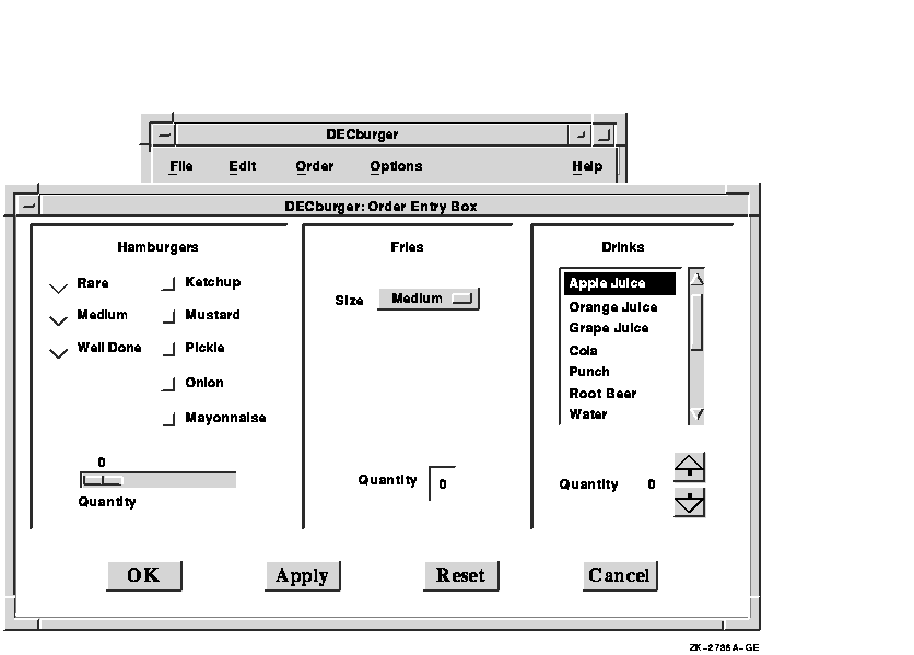
This section describes the reasons for using the various widgets in the OpenVMS DECburger demo application. Figure 2-1 shows the OSF/Motif widgets as used in the DECburger user interface. The widgets provided by Digital are shown in subsequent chapters.
Figure 2-1 OpenVMS DECburger User Interface
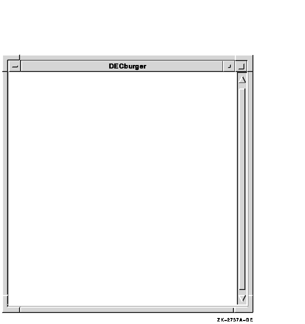
The OpenVMS DECburger demo application uses an XmMainWindow widget as the base of the application, as shown in Figure 2-2.
Figure 2-2 OpenVMS DECburger XmMainWindow Widget
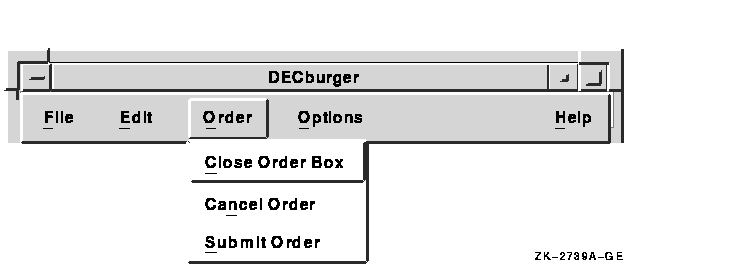
The main window widget presents some of the OpenVMS DECburger application's basic functions, such as placing an order, as items in a menu bar widget. The DECburger XmMenuBar widget contains the four XmCascadeButton menu entries shown in Figure 2-3. (The menu bar widget also contains an Options menu entry on color systems.)
Figure 2-3 OpenVMS DECburger XmMenuBar Widget

Each XmCascadeButton controls an XmPulldownMenu widget. When the user selects one of the entries in the menu bar widget, a pull-down menu widget appears on the screen. The pull-down menu widget disappears when the user releases MB1.
The XmPulldownMenu displayed in Figure 2-4 is the Order pull-down menu widget DECburger uses when the order box is already displayed. The contents of this menu vary depending on whether the order-entry box is visible.
Figure 2-4 OpenVMS DECburger XmPulldownMenu Widget
The OpenVMS DECburger Order-Entry Box shown in Figure 2-5 is an XmFormDialog widget, which is a general container widget that imposes geometry management on its children. Dialog widgets can extend beyond the boundaries of their parent widgets, and the DECburger Order-Entry Box does so.
Figure 2-5 OpenVMS DECburger XmFormDialog Widget

To distinguish each XmForm widget in the Order-Entry Box, DECburger includes a descriptive text label at the top of each section. Each of these text labels is an XmLabel gadget.
DECburger uses the XmRadioBox widget shown in Figure 2-6 to present a list of choices from which the user can choose only one item at a time. Each item in the radio box widget is implemented by an XmToggleButton gadget.
Figure 2-6 OpenVMS DECburger XmRadioBox Widget

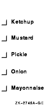
To present a list of choices from which the user can select any number of items, DECburger uses an XmRowColumn widget, as shown in Figure 2-7. Each item in the menu is an XmToggleButton gadget.
Figure 2-7 OpenVMS DECburger XmRowColumn Widget
To solicit quantity information, DECburger uses an XmScale widget, as shown in Figure 2-8. Because scale widgets graphically present a range of values, they prevent users from entering an incorrect value.
Figure 2-8 OpenVMS DECburger XmScale Widget
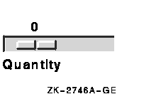
DECburger uses an XmOptionMenu widget to present a list of choices from which only one item can be selected at a time, as shown in Figure 2-9. Each item in the option menu widget is an XmPushButton gadget. As with the pull-down menu widget, the option menu appears on the display only when the user presses MB1. In this way, the list of items does not take up any display space until it is invoked. The option menu widget always displays its current selection.
Figure 2-9 OpenVMS DECburger XmOptionMenu Widget

DECburger uses an XmText widget to handle another quantity choice, as shown in Figure 2-10. The text widget lets the user enter text from the keyboard.
Figure 2-10 OpenVMS DECburger XmText Widget

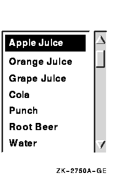
To present a long list of choices, DECburger uses the XmScrolledList widget shown in Figure 2-11. Only a portion of the entire list of items is visible in the scrolled list as it appears on the display. XmScrolledList widgets can be configured to allow users to select more than one item at a time.
Figure 2-11 OpenVMS DECburger XmScrolledList Widget
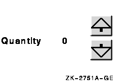
DECburger uses the XmForm widget shown in Figure 2-12 to implement drink quantity selection. The XmForm widget includes two XmPushButton widgets with pixmap labels. The "up arrow" XmPushButton increases the drink quantity; the "down arrow" XmPushButton decreases the drink quantity. (Note that XmPushButton widgets are used instead of gadgets because you cannot use pixmap labels with XmPushButton gadgets.) The XmForm widget also includes two XmLabel gadgets to display descriptive text and to present the current value selected by the user.
Figure 2-12 OpenVMS DECburger XmForm Widget
DECburger uses an XmFormDialog widget containing four XmPushButton widgets to implement the OK, Apply, Reset, and Cancel functions, as shown in Figure 2-13. Note the use of widgets instead of gadgets to allow DECburger to specify a larger font size to emphasize these important functions. You cannot specify the font in a gadget; gadgets use the font specified in their parent. (The figure does not represent the actual font used in these buttons. To see this attribute, run the DECburger application.)
The XmNshowAsDefault resource identifies the OK XmPushButton as the default; the XmNdefaultButtonShadowThickness is set to one for all of the XmPushButton widgets so that they have the same size when selected.
Figure 2-13 OpenVMS DECburger XmFormDialog Widget

As described in Section 1.1.8, your application can use intrinsic routines to initialize the Toolkit, get information about the screen and display, map and unmap widgets to the screen, process input from an application end user, and so forth.
For example, the OpenVMS DECburger demo program uses the following intrinsic routines:
XtAppContext app_context;
   .
   .
   .

toplevel_widget = XtAppInitialize(&app_context, "DECburger", NULL, 0,
                                  &argc, argv, &fallback, NULL, 0);
|
XQueryColor(the_display,
                  XDefaultColormapOfScreen(the_screen), &newcolor);
|
the_screen = XtScreen(toplevel_widget); |
XtSetMappedWhenManaged(widget_array[k_options_pdme], TRUE); |
XtManageChild(main_window_widget); |
XtUnmanageChild(widget_array[k_order_box]); |
XtRealizeWidget(toplevel_widget); |
XtAppMainLoop(app_context); |
XtSetArg (arglist[0], DXmNfirstTopic, help_topic); |
XtSetArg (arglist[0], DXmNfirstTopic, help_topic); XtSetValues (help_widget[help_num], arglist, 1); |
XtSetArg(arglist[0], XmNbackground, &newcolor.pixel); XtGetValues(main_window_widget, arglist, 1); |
if (XtIsManaged(main_help_widget)) {
|
| Previous | Next | Contents | Index |