![[Compaq]](../../images/compaq.gif)
![[Go to the documentation home page]](../../images/buttons/bn_site_home.gif)
![[How to order documentation]](../../images/buttons/bn_order_docs.gif)
![[Help on this site]](../../images/buttons/bn_site_help.gif)
![[How to contact us]](../../images/buttons/bn_comments.gif)
![[OpenVMS documentation]](../../images/ovmsdoc_sec_head.gif)
| Document revision date: 10 November 2000 | |
|
|
|
|
|
|
| Previous | Contents | Index |
The Additional topics portion of the Help window allows users to get further help on the current Help topic or topics related to the current topic. Involve users in testing to determine how many and what type of additional topics are best.
To select and display an additional topic, users position the pointer
over the topic, click MB1, and then choose the Go To menu item from the
View menu. Users can also double click on the topic.
5.3.1.5 Push Buttons
The Help window includes two push buttons:
For more information on using the Help widget, see the DECwindows
Motif Guide to Application Programming and the DECwindows
Extensions to Motif.
5.3.2 Using the DECwindows Motif Help System
The DECwindows Motif Help System uses Bookreader to display the online help file. Digital provides three routines for allowing users to access online help files in Bookreader format. These routines are documented in the DECwindows Motif Guide to Application Programming. Users can invoke the DECwindows Motif Help System from the Help menu, the Help command, the Help push button or the Help key.
The DECwindows Motif Help System includes the following features:
For more information on Bookreader, see the DECwindows Motif Guide to Application Programming.
You can use any of the following tools to create DECwindows Motif Help System files:
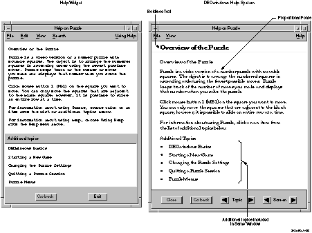
Table 5-1 compares the features of the Help Widget to the features of the DECwindows Motif Help System, and Figure 5-9 shows some of the differences in the Help windows.
| Feature | Help Widget | DECwindows Motif Help System |
|---|---|---|
| Text | Small, monospaced font | Multiple fonts, including italics and boldface and multiple point sizes |
| Performance | Adequate for large help libraries | Better for large help libraries |
| Graphics | No support | FSE binary file format for graphics |
| Navigation | Additional topics list | Hotspots |
| Tables | No support | Supported |
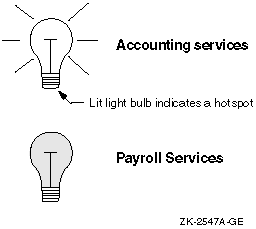
Figure 5-9 Comparison of Help Widget and DECwindows Motif Help System Windows
This chapter describes design and style considerations for the additional widgets that Digital provides with its offering of Motif, or that Digital sells as layered products. The additional widgets that Digital provides with its offering of Motif are the following:
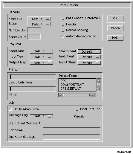
You can use Digital's Print widget in any application that allows users to print files on OpenVMS, UNIX, or Windows NT systems. It consists of a primary dialog box (as shown in Figure 6-1) and a secondary dialog box that is invoked by pressing the Options... push button. The secondary dialog box varies depending upon the operating system; Figure 6-2 shows the secondary dialog box on OpenVMS systems.
Figure 6-1 Print Widget's Primary Dialog Box
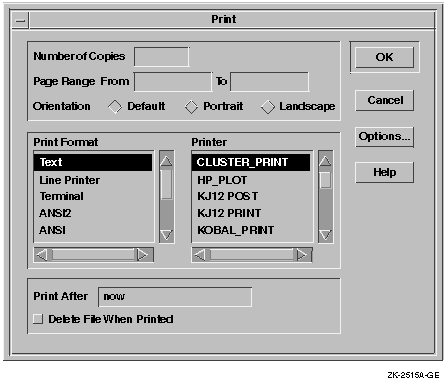
Figure 6-2 Print Widget's Secondary Dialog Box on OpenVMS Systems
In the primary Print dialog box, users can change any of the following settings:
The secondary dialog box varies greatly depending on the operating system on which it is being used.
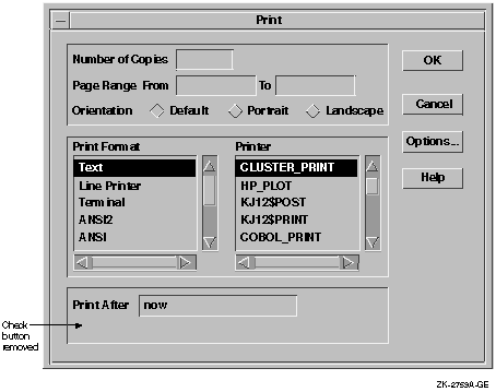
You can customize the Print widget dialog boxes to meet the printing needs of your application. For example, in some applications the Delete File When Printed check button is not appropriate. The Print widget allows you to erase such tab groups easily so that they do not appear in the dialog box, as shown in Figure 6-3.
Figure 6-3 Erasing Tab Groups Users Do Not Need
Because the Print widget does not provide a mechanism for allowing users to save their print settings, provide a way for them to do so. For example, have the Save Options menu item from the Options menu automatically save print settings, or add a Save Print Options menu item to the Options menu.
For more information about the Print widget, see the DECwindows
Motif Guide to Application Programming and the DECwindows
Extensions to Motif.
6.2 Using the Structured Visual Navigation Widget
You can use the Structured Visual Navigation (SVN) widget to create hierarchies of information in an application; it allows users to access and restructure information in a hierarchical way. You can think of SVN as being able to display levels of information. Users can have it display only the top level of information, or they can expand that level to display the information under the top level.
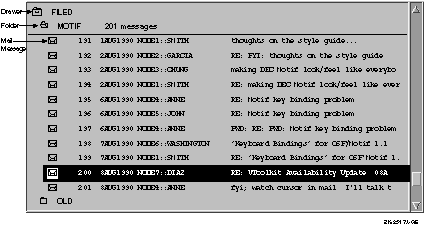
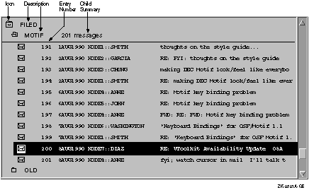
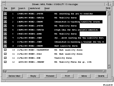
For example, in OpenVMS DECwindows Mail, users can create drawers that contain folders, and folders that contain messages. In displaying this hierarchy, they can show just the drawers (the highest level of information hierarchy), they can "open" a drawer to display all the folders within it, and "open" a folder to display all the mail messages in the folder, as shown in Figure 6-4.
Figure 6-4 Using the Outline Format to Show SVN Hierarchy
 You can use SVN to allow users to display hierarchical information in
three different formats, or modes:
You can use SVN to allow users to display hierarchical information in
three different formats, or modes:
Figure 6-5 SVN Tree Format
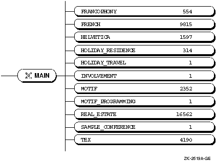
Figure 6-6 SVN Column Format
In addition to the three formats, SVN has other features that you can use to create an interface that helps users navigate through hierarchical information. For example, SVN allows you to create outer arrows on a scroll bar (shown in Figure 6-6), and an index window (shown in Figure 6-7).
Outer arrows perform operations that are a magnitude greater than the stepper (inner) arrows. Clicking on the upper stepper arrow moves the display up one unit. Clicking on the upper outer arrow moves the display to the top of the level of hierarchy that users are currently seeing. For example, if a screen displays messages 20 through 40 in a folder that contains 200 mail messages, clicking on the upper outer arrow would cause messages 1 to 20 to be displayed; clicking on the lower outer arrow would cause messages 180 to 200 to be displayed.
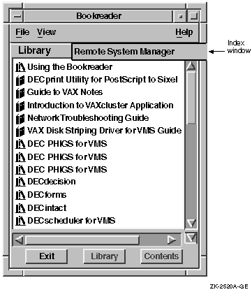
The index window is a special window, attached to the scroll bar that offers a guide to the material to be displayed in the window when users release the mouse button. In Figure 6-7, you can see an index window displaying book titles from a Bookreader library. In addition, SVN provides live scrolling, sometimes called smooth scrolling. When you enable live scrolling, the display changes dynamically when you move the slider; without live scrolling, when you move the slider on the scroll bar, the display does not move until after you move the slider.
Figure 6-7 SVN Index Window
6.2.1 Determining the Components of an Entry
Each SVN entry, or line, in your hierarchy may display as many as 30
components of information. Each component is one of three types:
Figure 6-8 illustrates SVN entries using pixmaps (icons) and text.
Figure 6-8 Components in an SVN Entry
The highlighted entry (near the bottom of the illustration) has four components:
The appearance of the hierarchy greatly influences users' ability to grasp the information it contains. A hierarchy that displays entries in an organized manner is more likely to be understood than one that does not. The following elements help to create a well organized hierarchy:
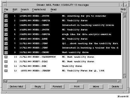
The icon must be able to represent either the expanded or collapsed state of the entry. An expanded entry displays the entries in the level below it. A collapsed entry does not. For example, the folder icon in OpenVMS DECwindows Mail can show a closed folder for an unexpanded entry, or an open folder for an expanded entry, as shown in Figure 6-9.
Figure 6-9 Expanded and Collapsed SVN Icon States
Align the children of an entry along a common line. This gives the
hierarchy an even, ordered appearance and enables users to distinguish
one level of hierarchy from another. For example, the hierarchy of mail
messages to folders to drawers is clear because mail messages are
indented under folders, and folders are indented under drawers, as
shown in Figure 6-4.
6.2.2.3 Using Fonts Within a Hierarchy
The size and type of font style you use throughout your SVN hierarchy will determine how quickly and efficiently users perceive information. Although this choice is highly subjective, there are a few guidelines to follow when you design the appearance of the hierarchy.
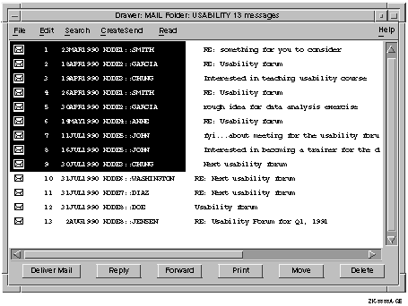
There are two selection modes in SVN: full and limited selection. In full selection line mode, when users select any component in an entry line, the entire entry is selected; that is, every component of the entry is automatically selected. An example of full selection is shown in Figure 6-10.
Figure 6-10 SVN Selection with a Full Selection Line
In limited selection line mode, users can select individual components within the entry, as shown in Figure 6-11. SVN does not support both selection modes within one application, so choose the selection mode that best suits the users' needs.
Figure 6-11 SVN Selection with a Limited Selection Line
Within each selection mode are two selection line lengths that you can choose: fixed and variable. With a fixed-length selection line, the entire length of the entry appears selected, as shown in Figure 6-10. However, with a variable-length selection line, only the part of the component field that displays user information appears selected, as shown in Figure 6-12.
Figure 6-12 SVN with a Variable-Length Selection Line
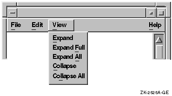
When you use SVN in any window except a dialog box, allow users to quickly expand and collapse multiple entries by providing the following items in the View menu:
Figure 6-13 SVN Menu Items in the View Menu
 For more information on creating interfaces with SVN, see the
DECwindows Motif Guide to Application Programming and the
DECwindows Extensions to Motif.
For more information on creating interfaces with SVN, see the
DECwindows Motif Guide to Application Programming and the
DECwindows Extensions to Motif.
This chapter describes LinkWorks and discusses user interface issues
related to creating a hyperapplication (an application that
participates in a LinkWorks environment). For more information on
hyperapplication design and implementation, see the LinkWorks
Developer's Guide. Note that LinksWorks is available on OpenVMS
and Digital UNIX systems, but not on Windows NT systems.
7.1 What Is LinkWorks?
LinkWorks provides the ability to link related pieces of information, regardless of where this information is stored. Providing LinkWorks support in your application involves using a set of routines. You include calls to these routines to enable users of your application to make and follow links between pieces of information in your own application and in other applications that provide LinkWorks support. When your application includes calls to these routines, it can be called a hyperapplication.
For example, users who have made a link between a Mail message and a Calendar time slot can move directly from the time slot to the Mail message using LinkWorks.
Many applications provide LinkWorks support; your application may be a candidate for becoming part of the hyperinformation environment. If so, the essential tasks for you as an application developer are as follows:
LinkWorks is analogous to an online clipboard. Some of the similarities include the following:
As an application developer, you must decide what objects in your application you will support as linkable objects. That is, you must decide what types of information users will want to have connected. It is possible for every object in your application to be a linkable object, but this may not be feasible, nor is it necessarily helpful for the users. Allow only the most important application objects to be linkable.
Use the following questions to help guide your choice of linkable objects:
For example, Bookreader includes the following information as LinkWorks linkable objects:
When you are deciding what objects to support as linkable objects,
remember that users may be making links both within your application
and between your application and other applications.
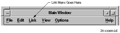
7.3 Adding the Link Menu
To let users know that an application has LinkWorks support, add the Link menu in the menu bar of each window that can display a linkable object, as shown in Figure 7-1.
When you purchase the LinkWorks Developer's Tools, you receive the LinkWorks Services. These services provide the Link menu and associated dialog boxes. All you need to do is place this menu to the immediate right of Edit in the menu bar. If there is no Edit menu, place the Link menu to the right of the File menu and to the left of the View or Options menus.
Figure 7-1 Link Menu
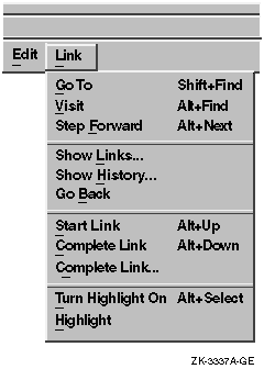
The standard Link menu allows users to follow established links and create new ones. Figure 7-2 shows that the LinkWorks menu is divided into sections that do the following:
Figure 7-2 LinkWorks Menu Items
There are two ways that you might consider customizing the Link menu:
Users can request that linked objects be explicitly identified
(highlighted) in your application displays. It is up to you to
determine the most effective techniques for highlighting these linkable
objects. Base the technique you use on the type of information being
displayed.
7.4.1 Guidelines for Highlighting
The following are suggested guidelines for using highlighting. If you must violate these guidelines, try to minimize any disruptive impact.
Figure 7-3 Two Link Icons
| Previous | Next | Contents | Index |
|
|
| privacy and legal statement | ||
| 5637PRO_007.HTML | ||